ESPN's iPad Experience: Choose Your Own Adventure

I write a lot about the importance of getting product, messaging and promotion "in the river" (in other words: making sure that messages are delivered inside the core experience and to the respective audience - good example by Facebook here). Here is a great example by ESPN. When you visit ESPN via the iPad, it presents you with three options: 1. Visit the iPad optimized site (ideal for 3G usage) 2. Visit ESPN.com's full site 3. Download the new ESPN Scorecenter App for the iPad

The first two options were always present for iPad users, but now that they have an iPad app (that is pretty good by the way), ESPN has decided to promote it to all iPad owners.... this is more effective of a marketing campaign than running site-wide banners on ESPN.com.

Gilt Groupe Gives Free Shipping for 10 Invites

Social commerce sites like Gilt, Rue La La, ShoeDazzle, Groupon and LivingSocial have been among the leaders in 'social marketing'... and they find success through relatively straightforward, sometimes simple products and promotions. Here is a great example: Gilt is running a promotion where users who invite 10 friends to the service get free shipping. Clear value proposition and very simple process to invite. Furthermore, it is an attainable result (not tied to purchases and not a crazy number of invites).

And of course the site / brand itself is 'share-worthy' - if Gilt provided a poor experience, these sorts of promotions wouldn't result in sharing or ROI.

"Got 10 Friends? Get Free Shipping" "Invite 10 friends to Gilt and enjoy free shipping on your next order. Spreading the word is always in style."

Welcome to RockMelt: Great Product Marketing Introduction

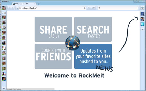
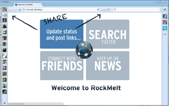
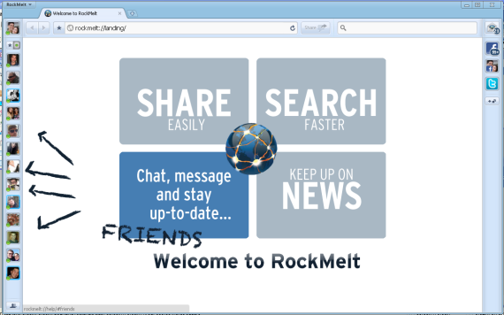
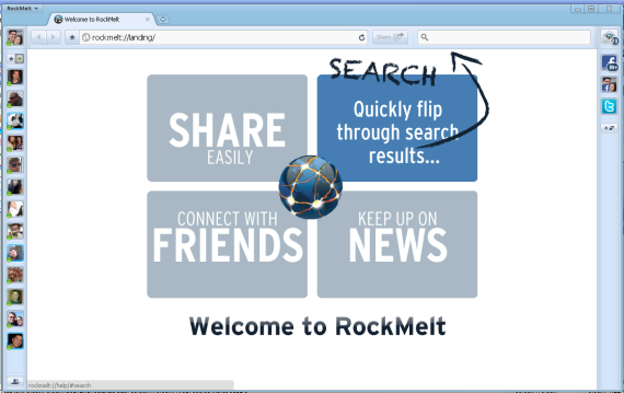
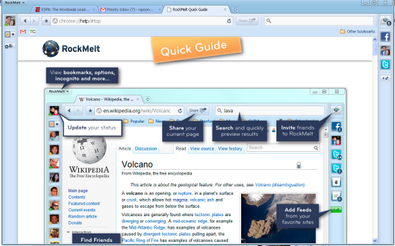
RockMelt has a rather big product marketing challenge: explain to users how their new, social web browser works. It is not overly complicated - but it is quite different from what users are accustomed to. Most products display the equivalent of a "Read Me" introduction upon installation / first use. These are usually text heavy, step-by-steps tutorials... and they are often optional. RockMelt recognizes that the browsing capability itself is explanatory ... but it is also ordinary. The social elements are what makes RockMelt compelling - so upon download, they overtake the browser with a great, visual introduction. It can't be missed and focuses only on the social elements (assuming that you are do not need help with normal browser functionality). And in addition to being useful, the intro is far more inviting and enjoyable than the normal "Welcome!" experience.

Facebook Rolling Out Commenting System

Earlier today, Facebook announced their Bing integration and the post on Facebook included a new Facebook commenting system. TechCrunch has since covered and confirmed that a larger commenting upgrade / system is coming.

A couple very quick thoughts:

1. It is a no-brainer that Facebook would apply their graph to commenting... it fits nicely alongside the like button (which also includes expanding comments).

2. It is a no-brainer that Facebook will gain distribution rather quickly since: A. The integration should be relatively simple (as the Like button is) B. It could tie-in very nicely to the already-existing FB widgets, buttons, etc C. It could drive significant traffic to the publishers via on-Facebook promotion

3. It again represents Facebook's ability to build social search. Prior thoughts here.

4. It potentially represents a rethinking of on-Facebook commenting / threading as well.

I will try to have Facebook comments live on RyanSpoon.com once available.

The Impact of Facebook on Image Presentation?

Facebook has quickly become the largest sharing and storage platform for photos. It is in part because of the social desire to share, part because of the newsfeed and part because of the simple mobile integration. The below screenshots should look familiar. First is a newsfeed preview of a photo gallery and below is a gallery's homepage. Both layouts are tiled and offer very little content / description (only available after the click or within comments):

The phenomenon of big, colorful tiles as a navigational system isn't new... but it certainly is more prevalent and seems to be popularized by services like Facebook. Here are a few more examples of different types. Remember that for each of these, the prior convention was typically top-to-bottom content / navigation:

- For content (news, blogs, etc) the mainstays focus on title / text and often move north / south - For e-commerce, Amazon, eBay, etc move north/south (though are experimenting with new formats like the iPad)

Navigation

Here is Facebook's new navigation panel for Facebook Pages. Notice that it is entirely visual - there is no text or context (ie number of fans, description, etc)

Content Site

This is popular blog Good.is and, below that, a popular personal site HugsforMonsters.com. More and more blogging templates are moving this direction and it certainly redefines how you think about navigation on content sites.

E-commerce

Neither imagery nor horizontal browsing are new to e-commerce. But the trend seems to be larger, more interactive images with the content (description, ratings, etc) reserved for the product details page

Great Action Buttons in Mobile Apps (Instagram as Example)

Have a key action you want to highlight for users? You could takeover the application as Facebook did to promote Places. You could create a persistent notification bar as Quora does. Or you could make the key action button really stand out... as upcoming application Instagram does (read about Instagram on TechCrunch. They are a Dogpatch Labs company.)

Instagram is a photography / photo sharing application (download it in the iTunes App Store)... and the most important action is sharing photos. So while there are other important actions (which all get buttons across the footer: feed, favorites, profile, notifications) - the Share button prominently sits in the middle and is raised above the others. It also protrudes onto the body of the application... such that is is always visible and very clear as to what the application's focus is.

Also worth noting: Instagram has a very clever header. It is slightly transparent, contains the photographer's profile and image title, and it becomes persistent only when you scroll through a specific photograph and it's comments. Once you get to the next photo, the header changes. Great looking, unobtrusive and informative.

Sample picture from Instagram - just to give you a taste of the application. It is a picture from Lake Tahoe:

Twitter's Surprising iPhone App UI

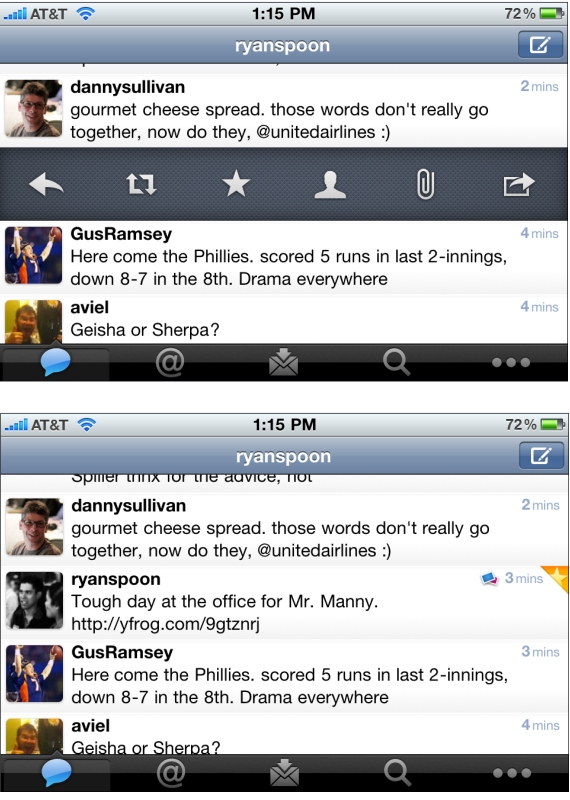
Not previously known as a leading designer, Twitter has been on a roll with their latest iPhone app, iPad app, and New Twitter. Here is a good example of why - but with some learnings / advice on how to design features. Twitter has to accommodate for lots of functionality: reply, retweet, search, favorite, quote, etc. You can easily imagine an application overwhelmed with buttons. Twitter solves this by having the core functions available via footer buttons, a "more" ('...') button and a surprising single tweet pane.

I call it surprising because it was not clear to me that this functionality existed... but if you swipe a tweet to the right, a pane appears that allows for quick functions of that tweet: reply, retweet, favorite, email, user info, etc. It is super useful... but is also surprising because I only discovered it accidentally. And this is a complaint I hear a lot from products trying to solve numerous tasks (no matter how elegant the solution may be). A consequence of simplifying complexity is often having to hide functionality... and that itself can lead to confusion.

It is difficult to boil down layers of options into a simple interface. It is equally difficult to make the interface intuitive and the functionality easy to uncover. That's why it's an art!

One other note: I love the small interactions that Twitter layers in... in the second screenshot, notice the small star that appears is uncovered in the upper right corner. That appears when a tweet is favorited.

ESPN's Persistent Score Panel... Very App-like

There's lots of innovation currently around persistant headers, footers, and bars. I wrote about Quora's notification 'panel' last week. You can also check out Apture (which I had been testing), Meebo, Wibya, etc. As with Quora, the 'bar' phenomenon is making its way to the publisher side. And it is being used creatively to deliver key news (ie Quora :: notifications), navigational flows, or promotional content.

Here is another good example.

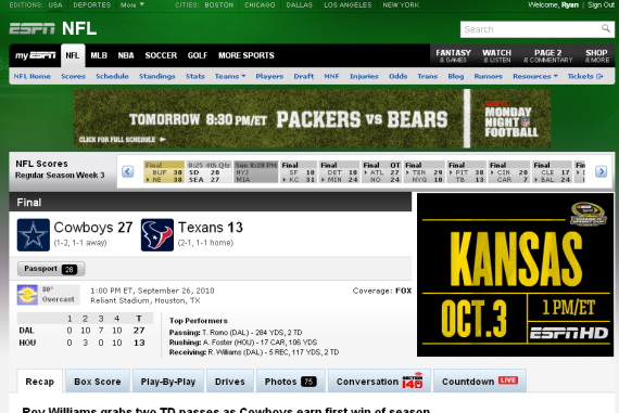
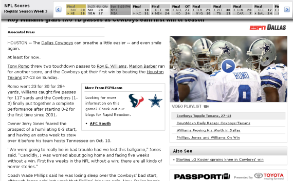
Months ago, ESPN introduced an interactive score panel (almost like the sports ticker that sits persistently on ESPN's TV channels). When browsing content within in a particular sport / league, ESPN now has the that panel lock atop the screen to provide persistent live scoring. The UI is very slick as the bar is glossy, animates nicely and maneuvers down the pages seamlessly.

Expect to see more and more of this around the web (and mobile). The experience itself is very much like mobile applications... and the web itself is starting to look and interact more like apps.

Here is the NFL score header on ESPN

As you scroll down, the scores panel attaches itself atop the screen and follows

Gilt City's Cleverly Designed iPhone App

Gilt Group has rolled out their new group-buying / coupon site Gilt City to six cities (New York, Boston, Los Angeles, San Francisco, Miami and Chicago). With it comes the Gilt City iPhone app. There isn't much to write about about the couponing model as it is very much like others in the space (see Groupon, LivingSocial, Yelp, etc). Over time, we will tell if Gilt Group is able to win share through unique offerings, integration with Gilt Group, etc.

I did want to quickly touch on the application's design... which as you would expect with Gilt Group, is glossy and very visual. The background of each city page is themed respectively. Below, for instance, is Gilt City San Francisco - which has a vivid picture of San Francisco scenery. Big, splashy images are becoming very popular (see my post on About.me) - and, with a relatively straight-forward product offering, it is one way to stand out, localize the experience and stay on Gilt's brand.

And with the emergence of big screen devices like the iPad, it is again a reminder that design and color are play an important role in the experience: