What are the do's and don'ts when introducing game mechanics in a website?

What are the do's and don'ts when introducing game mechanics in a website? Note: this is my answer to a Quora question. I post them to my blog from time to time... which you can view here.

People can chime in with specific, tactical responses to the question... but my simplest response is probably the best: Game mechanics must be natural, rewarding and straightforward.

Think about classic examples of game mechanics: - eBay's feedback rating - Twitter followers - MySpace friends - Amazing Review counts - Quora answer votes - etc.

They share the same common characteristics: the mechanics fit clearly into the site experience and are unique to that environment. Furthermore, they are integrated deeply enough into the product / experience that they are never interpreted as 'game mechanics'.

Sites struggle when game mechanics become one of two things:

1) a superficial layer - ala creating a badge strategy that is neither rewarding nor core to the web experience.

and / or

2) too complicated - for instance, badges and rewards for a myriad of activities. Simpler is easier to digest and therefore easier to incentivize. This too is exacerbated by not being core to the experience.

Write Once, Read Anywhere (Evernote Example)

Earlier in the week, I listed the productivity and work applications that I use daily. I concluded that the applications I most rely on not those that are the most robust... rather, its those that are most portable and efficient. A great example of that: Evernote.

Note taking can be done in many forms: word docs, notepad, email, competitors, etc. But what makes Evernote so appealing though is that it is available everywhere:

- Web - Chrome App - Chrome Extension - Desktop App - iPhone App - iPad App - Email - etc...

What is notable is that each of Evernote's applications / versions have specific use-cases for that environment. The Chrome extension, for instance, is focused entirely on web-clippings. And the iPad App is very different than the iPhone app. When most properties think of building for different platforms - it is often recreating an experience (which is often the web). Evernote shows the power of building for multiple environments and building tools specific to each environment.

The Key to Conversion Rates

The key to strong conversion rates? Squiggly lines. That's right: squiggly lines must help with conversions... otherwise they wouldn't appear on every imaginable registration / new-user page. Right?

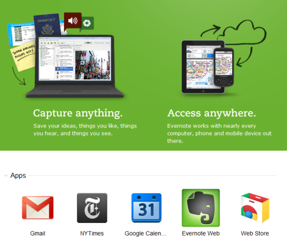
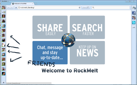
Here are examples from Evernote, Highrise, Rockmelt, and Springpad. And that too just a moment to come up with:

Exclusivity And Facebook Fan Pages - Whats the Incentive?

Over the summer I wrote about the four keys to Facebook page marketing: authenticity, consistency, regularity and engagement. Particularly for those in the e-commerce space... and for those trying to tackle "social shopping"... there is a fifth: exclusivity.

I am not sure that 'exclusivity' is the best word, but the point is twofold:

1. Why should I become a fan? as you think about 'acquiring' fans - what is the incentive? 2. How do you drive engagement?

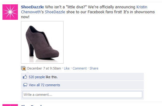
Exclusivity is the key to both. Portfolio company ShoeDazzle is terrific at this: their 500,000+ Facebook fans get special insights, contests, and behind the scenes access.

I was reminded of this by an email from Rue La La today... who are selling exclusive products today only to Facebook fans:

Facebook's Latest "Friend Finder" - Universal Login

I have written several times about Facebook's continued promotion of the Friend Finder tool ... which one attempt by Facebook to encourage user invites. Here is the latest Friend Finder 'widget' which sits on the right column of your newsfeed (underneath the Events and above Sponsored unit). Two things are worth noting:

First - and most noticeably - there is no call out for particular services (like AOL, GMail, Skype, etc). It appears to be a universal login. This is bold, creative and mildly confusing. I am not sure that I would know what credentials to login with... and I *am* sure that, if I found a similar widget' on off-Facebook.com, I would absolutely not enter anything (particularly true if on Gawker!).

Second, I really like the creative. The social content makes it hyper-targeted: "Friend XYZ found you and N more friends using the friend finder." I love how it tells you which friend(s) connected specifically with you via the tool. Ahh... the power of social ads and targeting.

Facebook Photo Zoom Chrome Extension: Applied to the Web?

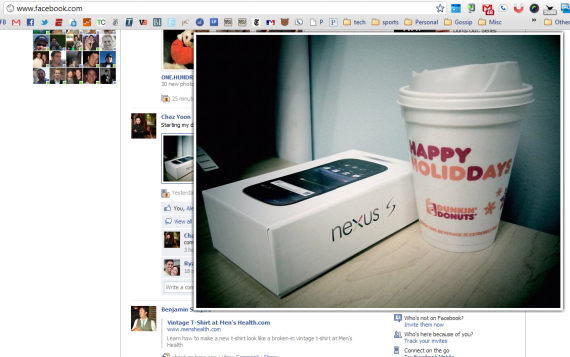
I have been playing with several Chrome extensions and applications... and while several are great utilities / efficiency improvements, one in particular has made me rethink web experience: Facebook Photo Zoom. It's function is simple: hover over any photo on Facebook and the high resolution version instantly appears:

It is very intuitive: turn the extension on and no other configuration is needed. And from there, the interaction is natural, lightweight and fast.

It is responsive: some sites have tried to integrate big visuals but the interaction is sluggish and therefore painful to use. Perhaps because of its simplicity or perhaps because it is built on Chrome, Facebook Photo Zoom moves as quickly as Facebook.

It prevents distractions: rather than having to visit a new page for every photo, the expansion occurs within the feed.

And it is fun: bigger, higher resolution imagery improves the feed experience and still allows for serendipitous browsing.

I have caught myself on e-commerce sites wondering why this experience isn't duplicated (even in less-bold ways). For product browsing and education, something along these lines makes sense.

It's All About Personalization (2011)

Two years ago (somehow it's been that long), I gave 20 predictions for digital media & e-commerce in 2009. This year, I am going to do it slightly differently and write individual posts about various themes / predictions in 2011. You can follow them at the tag "predictions". Today's is simple: it's all about personalization. I was reminded this yesterday while spending the day at the-very-exciting ShoeDazzle (note: Polaris is an investor, and you can see more about ShoeDazzle on TechCrunch TV). ShoeDazzle has built a business in part on great product, in part on a great & differentiated shopping experience, and also in part on the power of personalized & social shopping.

And I was reminded again this morning by an email from Gilt Group which looks different than their ordinary daily emails. Rather than a list of today's deals, the email noted items available for my specific shoe size (based on a Gilt purchase months ago). Among a slew of unread emails (some important, some not; some shopping, some personal) - Gilt's stood out because it spoke directly to me.

And as folks' like Gilt look for ways to resonate with their customers, drive conversion efficiency and optimize everything from the experience to search results to the pixel's creating an ad unit... personalization will be the differentiator. In addition, personalization has the opportunity to improve more than the middle of the funnel (conversions) - it can affect the top of the funnel through virality.

Facebook, Twitter and the loads of data that we each produce (and the companies sit atop) enable personalization is ways that previously were not possible. Some of those solutions are out-of-the-box scripts and widgets - others will be baked directly into the product, experience and brand.

If it wasn't a core discussion for you in 2010, personalization should be in 2011. And it should be a discussion for each component of the organization: what does it mean for:

- Product - User acquisition: advertising, virality and social - Conversions & retention: email marketing, search, customer support, landing pages

Two More Examples of "In the River" Promotions: Google & Yelp

Have you gotten sick of my writing about getting your marketing and product promotions "in the river"? "In the river" is my terminology for making sure that messages are delivered inside the core experience and to the respective audience. We used the term frequently at eBay to make sure that products weren't fully integrated into the core experience and would reach enough users (and more importantly: enough of the right). Here are two more examples:

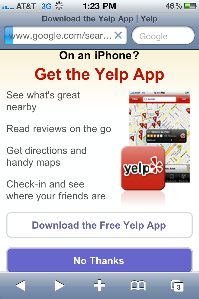
1. Visit Yelp on the iPhone's web browser and you'll be presented with an unmistakable promotion for the iPhone app. Targeted audience already interested in the brand:

2. Lots of iPhone applications try to get users to turn notifications on... Google's app goes a step further and presents a takeover unit that encourages users to turn notifications on (also explaining the benefits).