Square's App Download Page

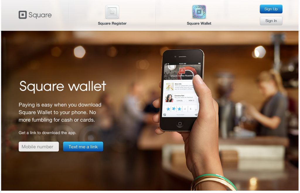
I have written in the past about designing for web-to-mobile downloads. Some treatments are effective (ie Jetsetter) despite most being ineffective. Square has built a very simple, good looking page similar to Jetsetter's. The beauty of course is that there is one call to action and then Square can do work on the backend to send the right product information for your device. And if there is breakage in the conversion funnel, they have your mobile number and can reengage.

Smart for Square. Easy for the consumer.

Jetsetter Navigation Panel - More UI and Design from Jetsetter.

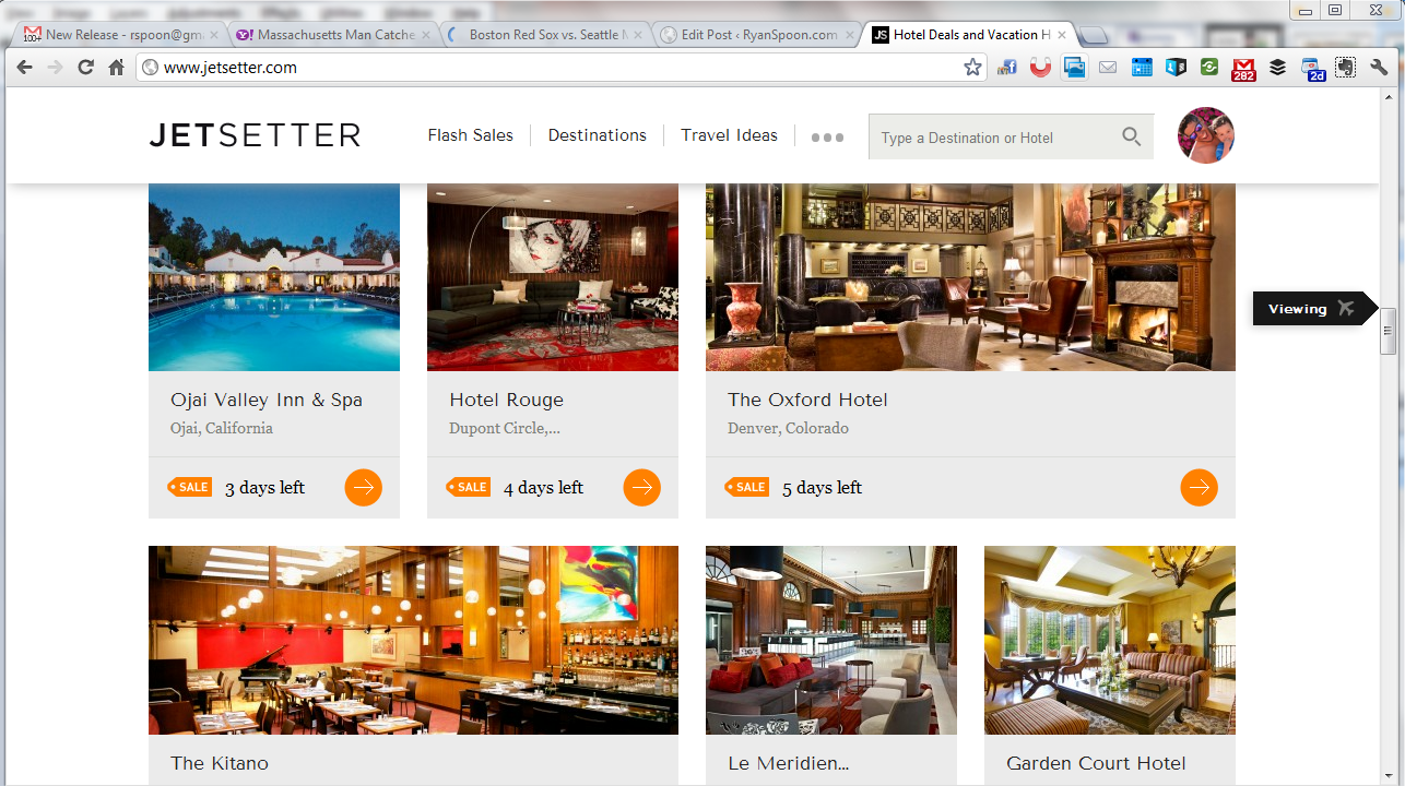
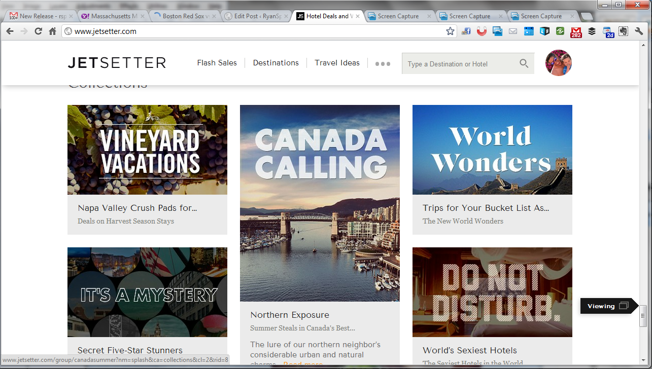
Jetsetter is known for great design (see here) and here is a nice little UI treatment that we recently saw on The Verge (who uses it on mobile and web). As you scroll through Jetsetter's sale page, an icon scrolls alongside the right progress column. It serves two functions: 1. telling users what kind of content they are viewing, ie vacations or curated lists. 2. showcasing the depth of product / offering that Jetsetter offers. In other words: there's a lot more than what I've seen!

Jetsetter Mobile App: Effective App Promotion & Conversions

Jetsetter is known for great design (see here). Here is a good example of good design and effective mobile promotion. I have written before that promoting mobile applications via the web is challenging: for instance, conversions are weak due to web to download and data is limited (device, OS, etc). SMS and email are powerful ways to promote applications because they are consumed directly on the device. Good examples by: Sparrow, Redbox, Groupon and Gilt.

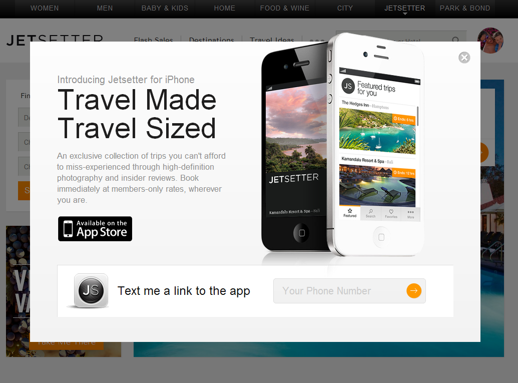
Here is another good example by Jetsetter (whose parent is Gilt). Login and you get the following promotion: - awesome slogan: "travel made, travel sized" - good looking promotion - big action item of downloading the app via SMS (enter your cell number)

Much cleaner for users and more powerful for the brand.

Jetsetter's Email Preference Flow

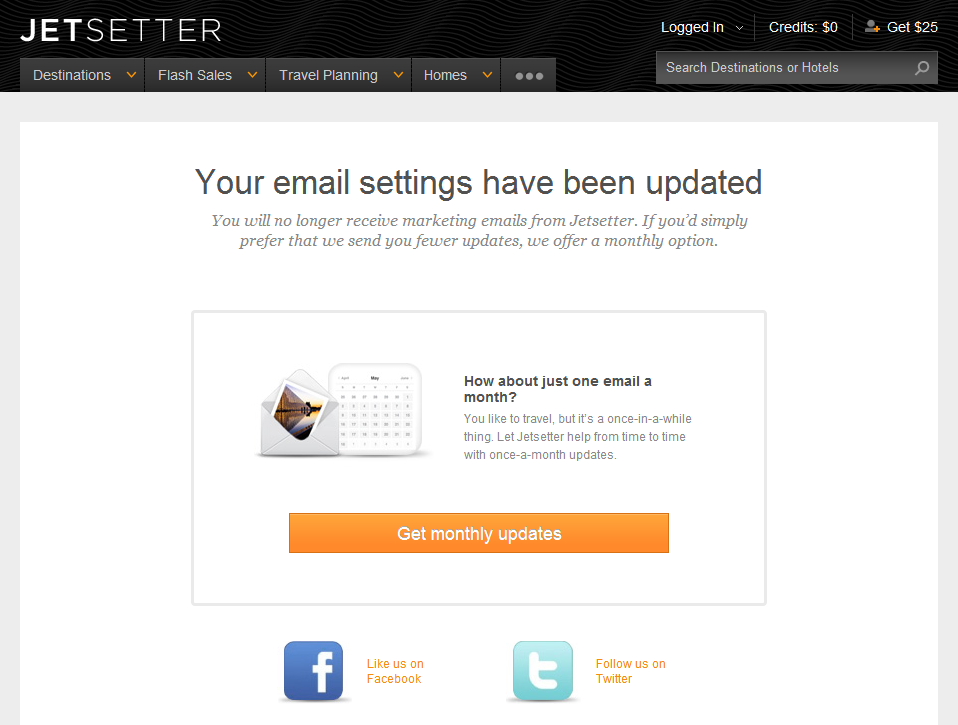
Email unsubscribe flows are typically binary: either super simple to unsubscribe (how it should be) or super convoluted (having to uncheck preferences, confirm email addresses, etc). This is a clever flow by Jetsetter because it is in fact super simple (just one click)... but it gently 'upsells' users: "How about just one email a month?" First, that's such a gentler, kinder way to ask for email access than having me check a slew of boxes.

Second, it comes after they have unsubscribed me - so there is established trust. When they say "just one email a month", I believe it.

Lastly, Jetsetter promotes their Facebook and Twitter pages. If you are going to lose an access point to your customers - might as well push other avenues to communicate and interact with them.

Jetsetter + Pinterest: "Pin It to Win It" Contest Drives Travel Curation

With the rise of Pinterest, I have enjoyed tracking the brands and campaigns racing to leverage the platform and be early movers. For instance, a couple weeks ago, I highlighted Harrod's Pinterest / curator contest. Here is relatively similar program from Jetsetter. Like Harrods, Jetsetter is using Pinterest to drive curation:

"Our fans ask us all the time how they can become Jetsetter curators. Now's your chance to show us you have what it takes. Using Pinterest, create the ultimate destination pinboard..."

It is effectively a way to:

1. drive best-of-lists (ala early Yelp and eBay efforts) 2. understand data and users preference 3. and drive viral traffic by rewarding social sharing on Pinterest ("Pin it to win it in our Pinterest Giveaway")

It's simple, clever and amazingly low-cost. Furthermore, it seeds usage and drives followers on a growing platform where most brands are still slow to adopt.

JetSetter's Search Box Promotion

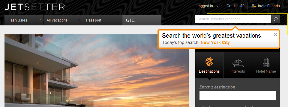
I like the highlight examples of effective "in the river" marketing - the concept of placing product, promotion and marketing messages in relevant, active parts of the web experience. Lots of examples here... Here is another example from Gilt Group's JetSetter (which is one of the better designed and visually appealing websites).

The fundamental JetSetter experience is browsing really compelling, great-looking travel offers. Even with no intention of planning travel, I can waste dozens of clicks browsing JetSetter's delicious offers.

And while browse is JetSetter's primary experience, they are trying to drive search activity and have introduced both a search box and top searches. This is an obvious revelation because JetSetter overlays the message (along with today's top search) atop today's offer. It is bold, colorful and extends onto the offer and the right navigation pane. It also fades in (quickly and lightly) - in the rare case that you missed the unit.

On a side note: the "top searches" concept is interesting because it creates another browse + search experience that, in my opinion, is more shop-able. I believe that most significant travel (cost, distance, time) is *not* booked spontaneously... so the ability to search JetSetter deals for specific locations makes JetSetter more usable.... while still keeping the brand and web-experience in-tact.

The Curated Web. Three Examples: Content, E-Commerce & Social Commerce.

The web is fragmented.That fragmentation gave rise to search. And it's given rise to the role of social within finding. The 'finding' problem exacerbates as content / product grows. Great examples of the problem: eBay, Amazon and iTunes have nearly unlimited inventory and are often painful to explore (for that precise reason). One solution: curation. It is a trend that I have written much about... and it's a trend that will (and should) continue. Three examples:

- Content: my reliance on Twitter and Facebook for news is an example of content curated by my trusted social graph.

- E-commerce: Experts delivering their picks is a compelling way to drive conversions through curated expertise. Below is an example from JetSetter with "Molly Sims Inspired Travel". Each Sunday, the Golf Warehouse (TGW.com) features the clubs and products in the bag of that week's PGA winner. Of course, you can then shop his bag. And here is Nike's Li Na storefront which launched minutes after she won the French Open.

- Social Commerce: much of the movement from e-commerce to "social commerce" is predicated on experience being built atop social recommendations, sharing & findability.

As you try to distinguish yourself from the web's myriad of sites and products, think about how you can apply the concept of curation (experts, friends, taste-makers, etc) to improve findability, drive conversions, and establish marketing / viral programs.