Apple's Best Apps of 2014: Top Free, Paid and Grossing Apps

It's always interesting and valuable to explore Apple's Best of 2014: Top Lists. Below are screenshots of the Top Free, Top Grossing and Top Paid iOS Apps. You'll notice a few things:

Top Free: it's a list dominated by big brands. - Facebook has #1, #4, #5 and #11 with Messenger, Facebook, Instagram and WhatsApp respective. - Snapchat is #2. - Google has #3, #7, #12 with YouTube, Google Maps and Google. - Pandora is #6. Spotify is #9.

Top Paid: There is some variety here, Of the top 20 - 14 are games - 4 are Photo and Video - 2 Health and Fitness

Top Grossing: This gets slightly more interesting. - All of the top grossing applications feature in-app purchases. - Games still dominate: 18 of the top 20 are games. - Pandora is #3 overall and the only of the Top Grossing to also be a Top Free app. - Zoosk is the lone other top 20 app that is not a game. - Of the games, big names matter: King owns 3 of hte top 8 apps and SuperCell has 3 of the top 11

best of itunes 2014

Facebook's Mobile App Install Ads Now Driving iTunes Movies, Downloads

Facebook's mobile app install units are a hit. In spring 2013, Facebook had announced that 25 million app downloads had been driven through the iTunes App Store and Google Play. At the time, over 40 of the top 100 top grossing apps for both iOS and Android were leveraging Facebook's mobile install units.

The unit's success makes sense because:

1) those applications are natively integrated with Facebook (so it's efficient, familiar and easy) 2) they are social and data rich (ie "150 friends are using the application") 3) ... which in turn means that the game / application itself is inherently social and welcoming

Yesterday, I saw the following unit for the first time, which is a natural extension of the install unit... but driving traffic around media. The unit promotes the movie Elysium and links directly to iTunes. As Facebook experiments more and more with ratings, reviews and public content (ie hashtags, celebrities, etc) - this becomes more and more engaging.

Photo Dec 05, 9 16 27 PM

Photo Dec 05, 9 16 35 PM

Hello SportsCenter App & 8 Takeaways

On Thursday, we launched the new SportsCenter Application, an update to ESPN's existing and popular ScoreCenter application. With 50m downloads and millions of daily users, ScoreCenter is certainly successful and our hallmark application. We didn't set out to replace it; rather, we set out to expand the experience and better present the vast array of content that makes ESPN so special: video, articles, imagery, television clips, social activity, statistics, and more. You can get it here: - for iOS: http://es.pn/scapp - for Android: http://es.pn/scappandroid - Or, dial **SC from your cell phone

sportscenter app

A handful of product highlights

- Scores / News / Now: ScoreCenter delivered scores and stats... SportsCenter does that alongside News (video, highlights, articles, analysis) and ESPN Now (tweets and live scores) - SportsCenter's Best Of: The SportsCenter Tab is the best stuff of the day (games, breaking news, analysis), merged with your favorite team scores. - Personalization & Inbox: The focus of the app is on delivering a personalized experience through alerts, favorite teams, and the new Fan Inbox (which is a personalized feed of your favorite teams' news, highlights and scoring alerts). - 
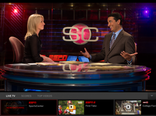
Clubhouses: My favorite enhancement is the introduction of Team Clubhouses. Fans can quickly access each team's scoreboard, newsfeed and social feed... and set alerts directly within the Clubhouse.

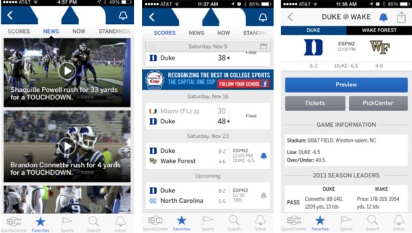
Here is a screenshot of the Duke Football Clubhouse which is noteworthy for a few reasons. First, it is relatively long-tail content that would not elevate to the national level - but it is important to me. Second, the content is fantastic. These are in-game highlights, streaming live into the feed seconds after they occur on the field. It's a tremendous experience that is highly personalized.

duke clubhouse

That's the new app. I hope you download it, enjoy it and pass along feedback. I also thought it would be worthwhile to share some takeaways:

It's a Mobile World

A couple weeks ago, I wrote about ESPN's recent digital patterns. September was a record month for ESPN in three ways: 1. we saw record overall traffic 2. during that period, more fans accessed ESPN via mobile than desktop 3. over 36% of users accessed ESPN exclusively via mobile

It's a mobile world. The focus on re-imagining ScoreCenter was predicated on better serving our fans in an increasingly mobile world. And if you haven't done so already, read Benedict Evan's Mobile is Eating the World deck.

It's a Native Mobile World

It's a mobile world... but it's also a native world for applications. Long gone are the days or porting a single app from platform to platform. Users don't want this... and neither do the platforms themselves. Experiences have to be built and designed specifically for the platform and the device portfolio. The challenge of course is to maintain brand familiarity and consistency while also designing differently and specifically for each platform. It's a difficult but critical balance.

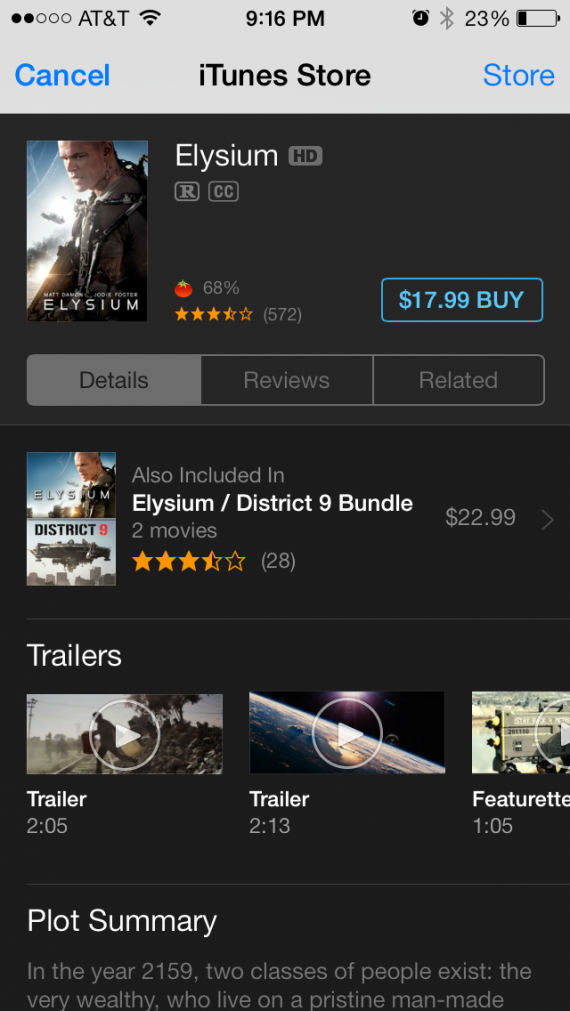
Native also applies to platforms beyond the mobile operating systems (ie iOS, Android, etc). For instance, we took care to make sure that the application leverages native integrations with Twitter and Facebook - both within the application and within their own platforms. This, for instance, is a screenshot of the new Twitter Card integration:

twitter cards

Disrupt Yourself

AllThingsD wrote a nice piece on the SportsCenter launch entitled: "ESPN ScoreCenter App Is a Hit, but It’s Getting an Overhaul Anyway: New Name, More Video, More Stuff". It's an important mentality: don't wait for something to break before considering / forcing change. The world changes too fast - technology, platforms, standards, habits - to sit still.

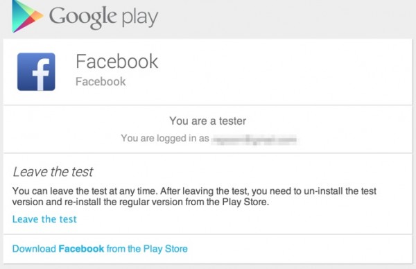
Scaled, Pre-launch Distribution and Usage

Between services like TestFlight and Google Beta, it is relatively painless to distribute pre-launch builds and collect usage data / feedback from large numbers of relevant users. It's the purest form of user-testing and user-feedback. For SportsCenter, somewhere around 1,500 fans played with the application ahead of launch. Others like Facebook are doing that at grand scale using the Google Beta program:

facebook google play

Press as Pre-Launch Users

My friend Matt Schlicht of Hipset recently wrote a nice Medium piece about driving press for your startup. My strong opinion here: treat everyone as a user and a fan. SportsCenter received some excellent coverage and those writers had access to the test builds of the application for several days (or more). That translates into more organic coverage (good or bad), deep insight, and some unique perspectives. It is also how pieces like Ryan Lawler's on TechCrunch get written - where he had a fantastic, in-depth usage video.

Advice: trust that your product is high-quality and give users and writer's full, early access.

A couple other pieces: - TechCrunch: ESPN’s SportsCenter App Combines News And Highlights With New Personalization Features - AllThingsD: ESPN ScoreCenter App Is a Hit, but It’s Getting an Overhaul Anyway: New Name, More Video, More Stuff - PandoDaily: ESPN Launches Personalized SportsCenter Feed Web App, Proves It Just Gets Digital - AdAge: This Is 'SportsCenter'...on Your iPhone

Twitter As Real-Time Customer Service

This is obvious for most: Twitter is immensely powerful as a real-time insights and customer support platform. During launch, we were seeing 50+ tweets per minute. Between sentiment tracking, bug monitoring and usage habits - we had an immediate understanding of how fans were engaging and interacting. This isn't shocking to anyone... but one point worth noting: I have spent a lot of time responding to tweets of all ranges: positive, negative, open questions, etc. Users were almost always happy to hear from someone connected to the product. Feedback was universally helpful and, even when a user was unhappy, the outcome was positive.

It's Iterative

There are things we got wrong. There are things we had to cut due to time. And there are things we didn't get to but are on the roadmap.

It's an iterative process. It has to be... in part because user feedback will dictate changes and time won't allow for everything to built. The challenge is determining what viable release requirements are... and communicating iteration to users.

I'm Old

Along with the core team, we read every single tweet. The big lesson: my vocabulary is very out of date, emoji are king, and I'm clearly old.

twitteremoji

Introducing the Watch ESPN Live Toolbar

We just released a major update to the WatchESPN app on iOS for iPhone and iPad. The latest WatchESPN version introduces several new enhancements, including Live Toolbar, which enhances content discovery and introduces more interactivity. Live Toolbar – available for iPad only – is designed with three main tabs across the bottom scroll of the screen.

- Live TV Lineup – an interactive channel guide that allows fans to easily navigate between ESPN live programming without exiting video - Scores – allows fans to navigate between live, upcoming and concluded games with scores, stats and video highlights - Top Videos – robust on-demand video offering of the latest news, highlights and analysis. Fans are able to watch Top Videos in spilt screen mode simultaneously with live programming Additional enhancements to the update for iPad, iPhone and iPod touch include:

- Access to ESPN3 for college students and military personnel on the WatchESPN app via on-campus (.edu) and on-base (.mil) Wi-Fi networks - App to app linking to the WatchABC app which enables easier navigation to view ESPN on ABC events

You can download the WatchESPN application here.

WatchESPN_iOSAppUpdate_LiveTV_081513-730x547

WatchESPN_iOSAppUpdate_TopVideos_081513-730x547

More:

- Todd Spangler / Variety: Fox Sports TV Everywhere Service Is No-Show, as ESPN Beefs Up iPad App - Peter Kafka / AllThingsD: Multitask Nation: ESPN Lets iPad Users Call Up Scores, Clips, While they Watch Live Video - Ryan Lawler / TechCrunch: ESPN's WatchESPN iPad App Adds A Live Toolbar With Scores, Stats, And On-Demand Clips - Jordan Golson / MacRumors: WatchESPN Updated With - Split-Screen Live and On-Demand Viewing for iPad [iOS Blog] - Jordan Kahn / 9to5Mac: WatchESPN app updated for iOS 7, adds ‘Live Toolbar’ that lets you stream two videos at once - Janko Roettgers / GigaOM: Good news, college students: ESPN now lets you stream for free to the iPad - Paul Sawers / The Next Web: WatchESPN for iPad now serves up stats, scores and on-demand clips via a live toolbar

Mailbox and Innovation Around the Mailbox

I have intentionally attempted to shift my mobile habits to take advantage of new, well-done applications. I tried to replace iOS's safari with Google's Chrome application. And now I am trying to replace the core iOS mail app with Mailbox. In trying to do so, three obvious points come along: 1. There is much innovation to be done around core experiences. Ones that come to mind: MessageMe for messaging, Mailbox for mail, Chrome for browser, Tempo for calendar, etc.

2. It is really hard to break personal habits. Regardless of whether or not I prefer Chrome to Safari - I am rooted historically and routinely in Safari. I like the Chrome browser a lot, but find the littlest things annoying - not because they are poorly designed or created, but because they are different than where I habitually expect them to be.

This of course is in conflict with point #1 above: innovation challenges habit. And habits are hard to break.

3. It is far harder (nearly impossible?) to break device habits. What I mean by this: if you really prefer Mailbox to iOS mail - you have to go out of your way to use it as a default... and it is even more challenging in the Chrome example. Being built into the core OS is such a huge hurdle to overcome - and while it may not stifle innovation, it stifles adoption.

Of course it is different from OS to OS (Android's flexibility is why apps like SwiftKey are so great and so popular) - and even more complicated with various device / hardware layers.

mailbox app

Google Chrome for iOS: Two Unique, Nice UI Treatments

With the launch of Google Chrome for iOS, I committed to swapping out my iPhone and iPad's Safari browser (of course I can only do this on the dock - Safari cannot be replaced as the browser from core applications like email, etc). I did this in part because: 1. I wanted to try Chrome (as compared to Safari) 2. I was drawn to the Google account syncing and UI enhancements 3. I wanted to understand whether a browser shift is really doable (considering Safari integration, habit, etc)... no matter how great Chrome may or may not be.

The attraction to chrome is it's gloss: it's really a beautiful product and interface. Two small examples I wanted to highlight:

1. When you open the browser, it inherits the last-opened page and renders it in black & white while the page refreshes. I have no idea why I find this is great... but I really do. It's more 'cool' and good-looking that useful - but it there is a benefit to it: it shows that the page is out of date and reloading.

2. For whatever reason, most iOS applications (both by Apple and third parties) use horizontal sorting - in other words, you navigate by moving right or left (ala the homepage). Google Chrome's 'tabs' concepts moves vertically. Pages layer atop one another and you drag through them to access other open tabs. Based on the speed and touch, it either scrolls or highlights a particular tab. It's a very natural way to sort and is also good looking.

Two Small Features of Facebook's Camera iPhone App

Over the last week, I have been using the Facebook Camera application as my default mobile camera - in part as a test and in part because I love the ability to upload multiple pictures / create albums (that feature alone is a time saver). Here are two small features I like and noticed... and note: this is my last Facebook Camera post!:

1. When you upload an album, Facebook inherits the location from the iPhone geo-tag. Seems like a small and relatively obvious aspect - but it is strangely not done by other photo-heavy apps like Path. And it is particularly useful when uploading albums - which often happens after the event and therefore offsite. As an example, the below screenshot remembers the location of the photos (even when I am physically away) - in the core Facebook App, location is determined by proximity - meaning that tagging has to happen when on / near premise.

Big time-saver. Very smart.

2. When you like a photo from within the app, Facebook illuminates the like button and gives it color. It's the first time I've seen Facebook do this and, although it is a very small UI tweak, it signifies that an interaction has been done (a current problem for Facebook's core mobile app) and it adds some color & some fun.

Facebook Camera iOS App Knows Who You Are On Install

Two weeks ago, Facebook launched their Facebook Pages iOS app. And last week, Facebook launched their Facebook Camera app.

One of the interesting aspects of the two applications is that their welcome screens greet you with the following pages: blue screen, big get started button, and (in the Facebook Camera example) a greeting specifically for me ("Continue as Ryan Spoon").

The Pages example is easy to explain: press "log in" and Facebook authenticates the user via the core Facebook Application already installed on the device. Easy. And of course an user of the Pages app will already have the Facebook app... it's easy to be presumptuous when you have Facebook's reach / scale.

The Camera app is more interesting - and the first time I have seen an example like this. It is also something only someone like Facebook can do (few others have that reach). It is remarkably fast, efficient, cool.... and effective - no worry about conversions, funnels, etc.

How do they do it? Here's a Quora post explaining:

Most Important Feature of Facebook for iPad, iPhone: "Apps"

The most important part about Facebook's new iOS apps that they unveiled yesterday? For starters, the app actually works and I had given up using Facebook for iPhone (which failed 90+% of the time. But other than the obvious... the below screenshot is the most impactful aspect of the new mobile suite. It gives users the ability to access and use applications directly from within Facebook Mobile. That is convenient for users and represents future opportunities for deeper developer & Facebook integrations (think 'canvas apps' within the Facebook apps). And to developers / publishers, this is remarkably valuable real estate that drives engagement and mobile usage / downloading: for instance, when I clicked on Instagram, it took me directly to iTunes to download the application (I have it on iPhone but not iPad).

Also interesting: Facebook clusters their own products within "Apps" - and it is done alphabetically (I would think they would mark their products atop the list): Events, Messages, Photos, etc.