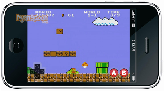
In late March, I wrote that the next step for iPhone game developers was to go 'backwards' by mimicking control pads found on old gaming systems like Nintendo NES and GameBoy:

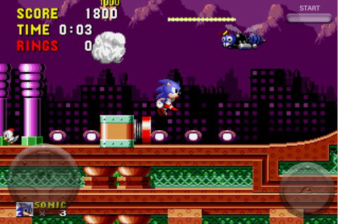
Well the iPhone has really gone retro by releasing Sonic the Hedgehog with a two-button control pad. TechCrunch's Jason Kincaid isn't a fan: "I’m not a fan of the control scheme some developers are adopting to port these classic games, which typically consists of a virtual joypad in the bottom left hand corner of the screen with a few virtual buttons on the right side. Visually the buttons successully mimic the gamepads of yore, but they lack any tactile feedback at all, which gets frustrating when you’re trying to dodge bullets or leap from cliffs and you accidentally hit the wrong button."

Similar feedback was given in the comments from my earlier post. Commenters pointed out that some other games have virtual "d-pads" that have similar issues:
"It's already out there. Though having used these apps, this setup is still difficult to actually play with. There's no tactile feedback to the buttons, making playing very difficult."
If tactical feedback is the primary issue, perhaps the pad / buttons need to be more prominently displayed and provide more obvious visual feedback upon touch.
... Or you could always buy the new Sony PSP that featured a slide-out controller pad, carry yet another device in your pocket and purchase more expensive games. My bet - iPhone developers will figure it out and users will get accustomed to it.

