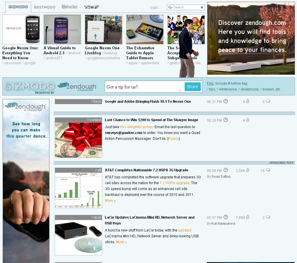
Gizmodo continues to be a great example of cutting-edge rich advertising units. As I have written before, they do a great job of laying out the site in a way that gives advertisers large, interactive and cohesive advertising units across all of the content; furthermore, the units do a great job of interacting with the standard Gizmodo content (sitting beside and/or fading behind).
Here is another example of a rich campaign on Gizmodo. Much like the recent eBay "Come to Think of It" campaign, this comes from Zendough. The ads begin by taking over the "top stories" bar and then fade into the traditional Gizmodo layout (as the person walks across the screen). On the page, Zendough has five integrated units:
- the interactive "top stories" bar that fades out - the rich square in the upper right corner - the sponsored search bar - the rich skyscraper which parallels the activity above - the rich horizontal 'page-break' unit which is 8 stores down Clearly it is a custom campaign - much like the eBay one - but it is very nicely integrated within the Gizmodo layout and amongst itself: all of the units symmetrically speak to one another and therefore gently capture the audience's attention / interest.


