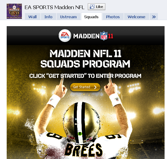
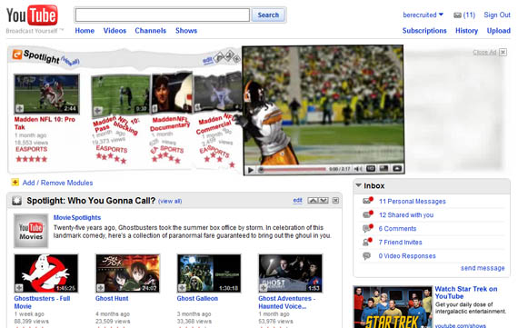
Last year I covered the Madden 10 advertising blitz that took over ESPN and YouTube's homepage with slick, expanding units that interacted with the pages' content. I have always been impressed by ad units that disrupt a page's live content - but ultimately the units are built individually for each site and thus don't scale.... so it's no wonder that the Madden 11 advertising blitz is different: Madden 10 YouTube Takeover
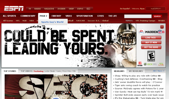
Unsurprisingly, the Madden 11 ad units are quite different. In addition to being contained within their pixel real estate... the big focus is Facebook and social sharing.
Here is the primary unit on ESPN.com's homepage. The unit itself contracts after several seconds of viewership. Most interestingly, is the order of the ad's three call to action buttons:
1. Like This (on Facebook) 2. Buy it Now 3. Get the Demo
By getting the demo, you are able to view HD video content within the ad unit:
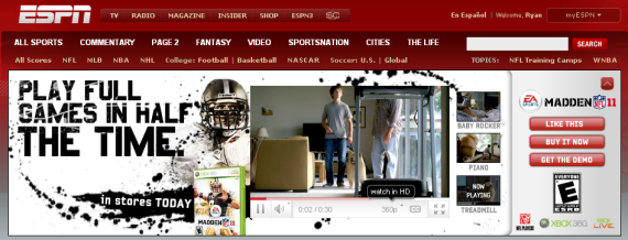
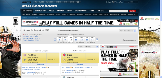
Notice that the Madden 11 campaign extended beyond ESPN's homepage... or even their NFL section. Here is a more aggressive takeover of the MLB Scores section. There is more Madden content above the fold than actual content:
And lastly, when you visit the Madden Facebook page - the focus again is to drive "Likes". Drew Brees points towards the Like button and the 'Get Started' button begins with driving Facebook fans:
