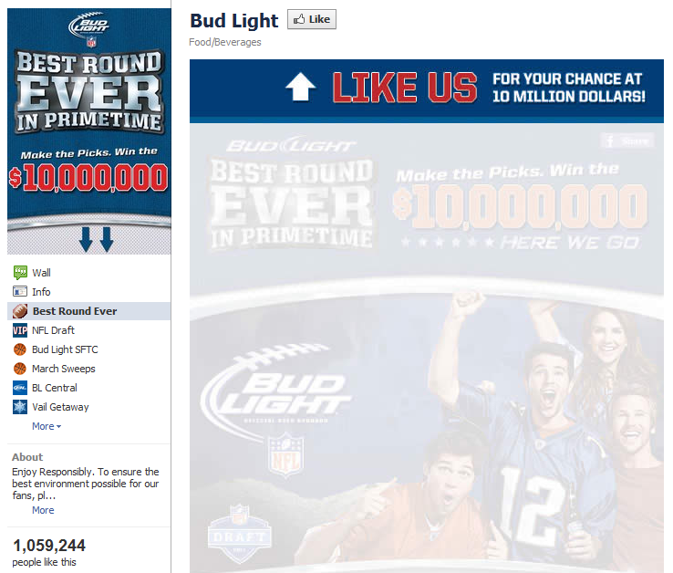
Brands have used all sorts of mechanisms and promotions to drive social activity (see Redbox example)... and Facebook's new page layout has complicated that. Here is Bud Light's approach: 1. Drive Like's
Bud Light is running a $10,000,000 promotion... and the only way to access and enter the page is to Like the Facebook page. Once you like the page, the promotion is no longer grayed out and it is accessible. Of course, to get access - you need to become a fan.
2. Improve Page Navigation / Findability
One of the complications for brands on Facebook is that users generally do not move across the page's various 'tabs' (formerlly were laid out more prominently across the top - now they are buried horizontally beneath the page logo). Bud Light defaults to landing visitors on the wall (my strong recommendation!) and, to drive awareness of their promotion has done something interesting: promote the "Best Round Ever" tab with prominent arrows in the logo.
#1 is probably more effective... but #2 is a clever, free way to drive awareness. Ultimately, the most effective action is to cleverly promote via the newsfeed (great, engaging content).

