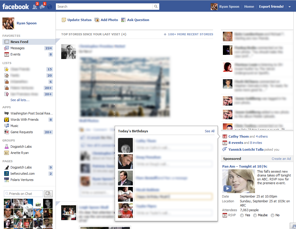
If you've spent time with the new Facebook layout, you will notice how much the interface now leverages in-line expansions (I like to call them 'blooms'). Blooms are when a click prompts an in-line, expanded unit rather than a new pageview. I attribute this trend to two things: 1. Increased complexity in functionality(s): I am not suggesting that Facebook's features are more complex -but the number of features creates complexity. Blooms are an effort to solve that. This is true across other busy sites and apps: Google Plus, GMail, Chrome extensions, etc.
2. The "Chrome-ification" of the web: using apps, buttons, etc as a layer atop the core pageview.
The example here is Facebook's new Birthday unit. With the introduction of the Ticker, Facebook has pushed the birthday and events box down the page. With real estate tighter, Facebook has stopped showing the name of each Birthday boy / girl. So now, when you click the birthday link, it pops up a "Today's Birthday" unit that also allows in-line commenting. Slick.

