A New ESPN.com Is Coming

espn-redesign1 
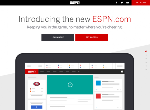
Earlier today, we began to open the doors to a small group of ESPN users for the new, redesigned ESPN.com. It is the first day of our Beta process - a multi-month process in which we will gradually open the doors to more and more fans, continuously test and iterate, and build towards the eventual site launch. Mashable covered the redesign last night (you can read here).

And you can learn more about the redesign and request early access here.

espn-redesign3

Below are some questions and my answers from the Mashable article:

What are the goals for the new ESPN.com?

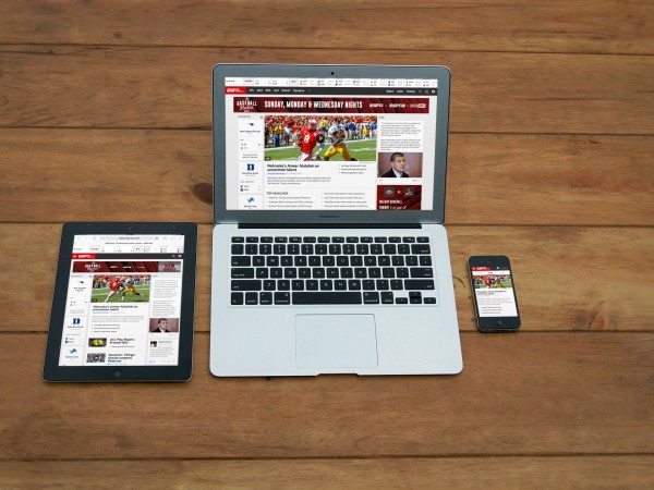
Simply put, we set out to build a modern ESPN.com that showcases our expansive content (scores, analysis, highlights videos, and games) beautifully and intuitively across all devices and screen sizes. Furthermore, we aimed to create a cohesive aesthetic and experience across the new ESPN.com and our native applications like SportsCenter and Fantasy Football. Over time, you will hopefully notice that our site and our applications feel connected and familiar.

How were those goals translated into the current beta? And how much will that evolve over the next several months, based on user feedback?

Hopefully that vision is are strongly evidenced within the beta site, which is an ever-evolving product experience. Rather than building in wireframes and static files, we have stressed working and living in live, beta-experiences… so we have been using some form of the Beta internally and using it for extensive user-testing and experimentation. That will continue as we now open the beta publicly – the site will change routinely, we will launch and test new product and content experiences, and we will learn from fan feedback and interactions. The Beta site – like the eventual site launch – is an evolving, living organism.

Why did you choose for it to look, feel and function the way it does?

Aesthetically, we are aiming for a clean, modern look that works intuitively across all screen sizes and feels connected to our mobile applications. The site is designed responsively, starting first with the mobile phone and responding to larger screens (tablet and beyond). You will notice that the site is organized into three distinct pillars:

Favorites: prominently delivering *your* teams, news, and fantasy scores… this has been a tremendous hit with fans during user-testing

News: the best news of the day, as delivered by our amazing content team. It is organized in an ever-scrolling news feed, rich with video and big imagery

ESPN Now: this is a new content experience that brings together lively and real-time content from what’s happening in the sports world now, at this moment. Content comes from our news desk, Twitter, Facebook, Instagram, and more – and it too is rich with video and imagery.

These all sit beneath a much-simplified navigational header and a cleaner, more visual scoreboard.

introducing espn

iTunes Welcome Screen, Appified

I wrote about the appification of software as a thematic takeaway of 2012. Here is a great - but very different - example. The newest iTunes might not behave like an app - but it certainly takes cues from popular app designs / trends. This starting screen for the entirely revamped iTunes product looks exactly like a starting screen for other iPad applications. Soft arrows pointing out specific changes or user behaviors.

It's a familiar way of making an unfamiliar product (after all, this is new) familiar again.

Appification of iTunes

Amazon Most Gifted Tagline, Promotion

The "most gifted" tagline and promotion is effective... particularly in the web's largest marketplace with the web's largest collection of products. And that's why it looks so similar to how they market year after year. And that's why I like it year after year!

Note: here is the original announcement in November 2009:

"Amazon.com, Inc. (NASDAQ:AMZN – News) today announced that November is already the best sales month ever for Kindle, even before Cyber Monday. Kindle continues to be the most wished for, the most gifted, and the #1 bestselling product across all product categories on Amazon."

Square's App Download Page

I have written in the past about designing for web-to-mobile downloads. Some treatments are effective (ie Jetsetter) despite most being ineffective. Square has built a very simple, good looking page similar to Jetsetter's. The beauty of course is that there is one call to action and then Square can do work on the backend to send the right product information for your device. And if there is breakage in the conversion funnel, they have your mobile number and can reengage.

Smart for Square. Easy for the consumer.

Facebook Gifts, Reminiscent of Facebook Offers

Three things to note about Facebook Gifts: 1. Fascinating - and yet powerful - that the only promotion of Facebook Gifts is within the birthday alerts. It's the definition of "in the river" marketing and promotion. 2. This was the first time I noticed that the gift icon showcases friends who have sent gifts (when available). So not only is it in the river, it is socially relevant ... and therefor has some social pressure!

3. That aspect looks a lot like Facebook Deals.

Amazon's Beautiful Cloud Drive for Android Splash Page

I love this graphic / splash page for Amazon's new Cloud Drive Photos for Android application. Beautiful and really, really well done:

"Cloud Drive Photos for Android lets you protect your photos in the cloud and puts your albums at your fingertips from any Android phone or tablet. Start using your 5 GB of free Cloud Drive storage today. Get the app from the Amazon Appstore or from Google Play."

Facebook Gifts Design Treatment

Below is a screenshot from Facebook's new Gifts product. It is not yet publicly usable - but gifts are appearing in the wild from early users (see below). Two interesting points per the feed graphic: 1. It is a clever use of naming layered atop the graphic (for Dan, from Justin). It really stands out and plays to Facebook's social strength.

2. Per ongoing "in the river" theme, the unit has a very prominent "Learn More" ribbon and button beneath the graphic. Interesting to see if this persists over time, as the product ages - or if it is an onboarding treatment.

Facebook's Inline Comment Alerts

Facebook's redesigned iPhone App (which is outstanding!) features in-line alerts for new content in the newsfeed. The treatment and interface are well done: simple, nonintrusive, yet obvious. Furthermore, it has become a familiar behavior (Twitter.com, Facebook.com and others). I had not noticed, however, that a similar treatment was provided for comments. When viewing a post, comment alerts appear in real-time via the below treatment. Again: it is a simple yet powerful visual. And because it

1) appears in real-time, and 2) is directly related to the piece of content you are reading

It drives users to read the comment, interact and spend more time. Small enhancement that is contextual and powerful:

Spotify Embeddable Widgets (Twitter & Facebook Too)

Nothing groundbreaking here but I thinks its worth showcasing visually:

Spotify yesterday promoted their embeddable play buttons and playlists via Facebook and Twitter yesterday. Those 'widgets' can appear on sites, blogs, etc and play in-line much like it works on Facebook within the newsfeed / ticker.

Those tweets are then embeddable as well - and you have started to see more and tweets appear in-line within stories, blog posts, etc. As Twitter content becomes more and more of a starting point for conversation (on and off Twitter), those embeddable widgets are terrifically useful.

And back to the Spotify post: notice the Facebook Social Plugin (right column). So the main post shows in-line playlists and play buttons - and the right column shows MY Facebook friends and their recent LISTENING activity within Spotify (on Spotify.com, on Facebook, and now through the web).

Big, virtuous cycle. And an example of Spotify, Twitter and Facebook moving beyond their .com homes.