Square's App Download Page

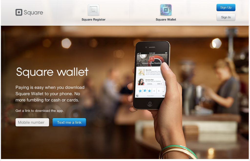
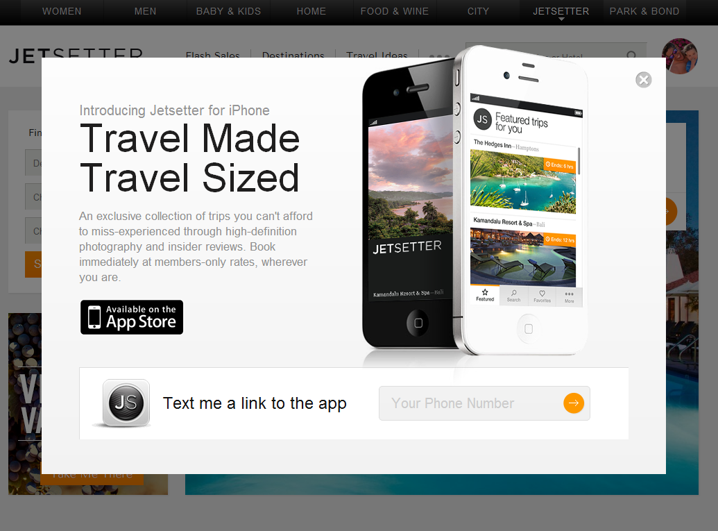
I have written in the past about designing for web-to-mobile downloads. Some treatments are effective (ie Jetsetter) despite most being ineffective. Square has built a very simple, good looking page similar to Jetsetter's. The beauty of course is that there is one call to action and then Square can do work on the backend to send the right product information for your device. And if there is breakage in the conversion funnel, they have your mobile number and can reengage.

Smart for Square. Easy for the consumer.

The Phone as an Extension

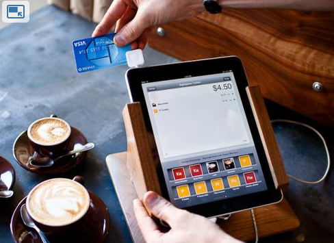
Square: an attachable payments mechanism. PayPal's Square competitor.

The Mophie: a removable juice pack that fits atop the iPhone like an ordinary sleeve. It's a must have for travelers (and got a great TechCrunch write up).

iCache's Geode: an attachable, secure wallet for your iPhone. Remarkably cool.

What's the similarity here? There is a great innovation occurring both at the app level and, more recently, at the device / peripheral level. It's yet another reminder that the future of the web consumption is mobile and companies are racing to improve the phone itself (ie battery) or extend its definition (ie square into a register / payment terminal and Geode into a wallet).

Image credit: USAToday.com

Why It's Easier to Start Up Today... Than Ever Before.

Forbes spotlighted LegalZoom earlier in the week: "Silicon Valley Sees Gold In Internet Legal Services" (a Polaris Ventures backed company). It got me thinking about the earliest days of beRecruited.com and what it took to get the company off the ground... before beginning the real work. And that obviously got me thinking about how much things have changed since I started the company in my dorm room in late 1999:

- I payed $1,000s to incorporate the company (and it took weeks). In fact, this was the single biggest expenditure of the first year. - Signed a 2 year merchant account to to accept credit cards (which included a physical credit card processor and "we accept Visa / Mastercard" decals....!) - Signed a similar hosting agreement for web service... which we outgrew quickly. - Worked hard convince a proper bank to support us (also expensive and out of date). - And received reams of paperwork and contracts and monthly account summaries.
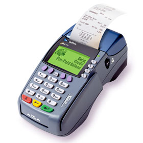
Companies like LegalZoom and Amazon have totally changed that process.

Just think about Dogpatch Labs as an example: - founders walk in with nothing more than (usually) a Macbook Air. - They hook into our wifi (no such thing as a server room). - They run atop of Amazon web services. - They can accept payments almost immediately with services like PayPal, Square, or even set up recurring billing with Recurly (also a Polaris company) - They can announce their launch with companies like Sendgrid, Constant Contact, etc. - And they can look to Facebook, Twitter, etc to find pools of users.

I get asked all the time about why so many companies are starting these days. The most important factor is because it is easier to start today than ever before. And it is easier to attract users today than it has every been.

That doesn't mean it's easier to build a lasting business... but it does mean that you can start working on the business and product faster. And you'll get user feedback on product / market fit faster. And you'll succeed, fail and/or pivot faster.
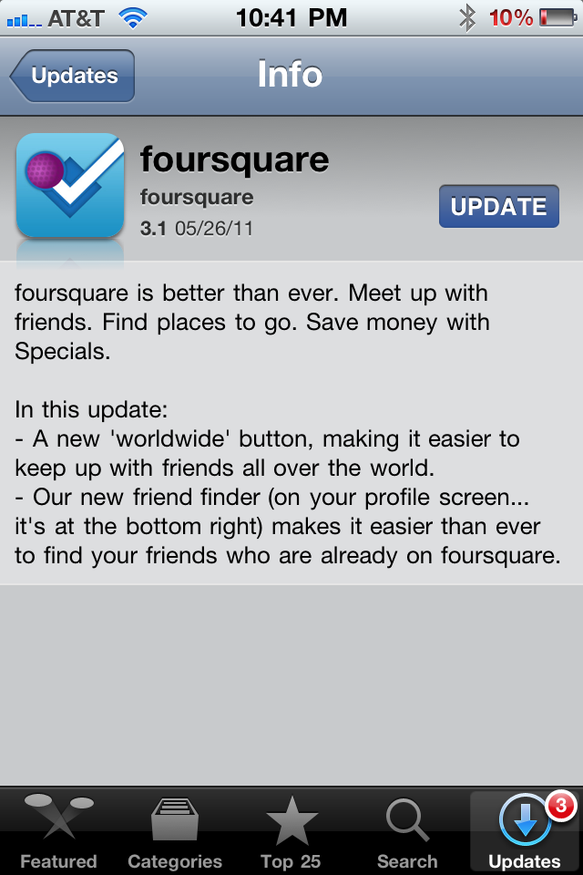
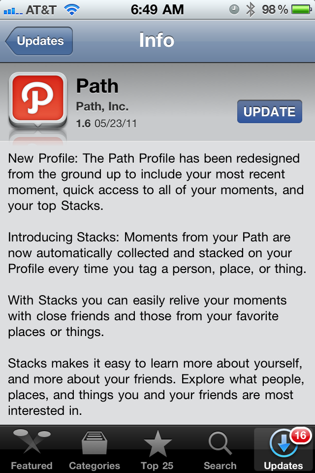
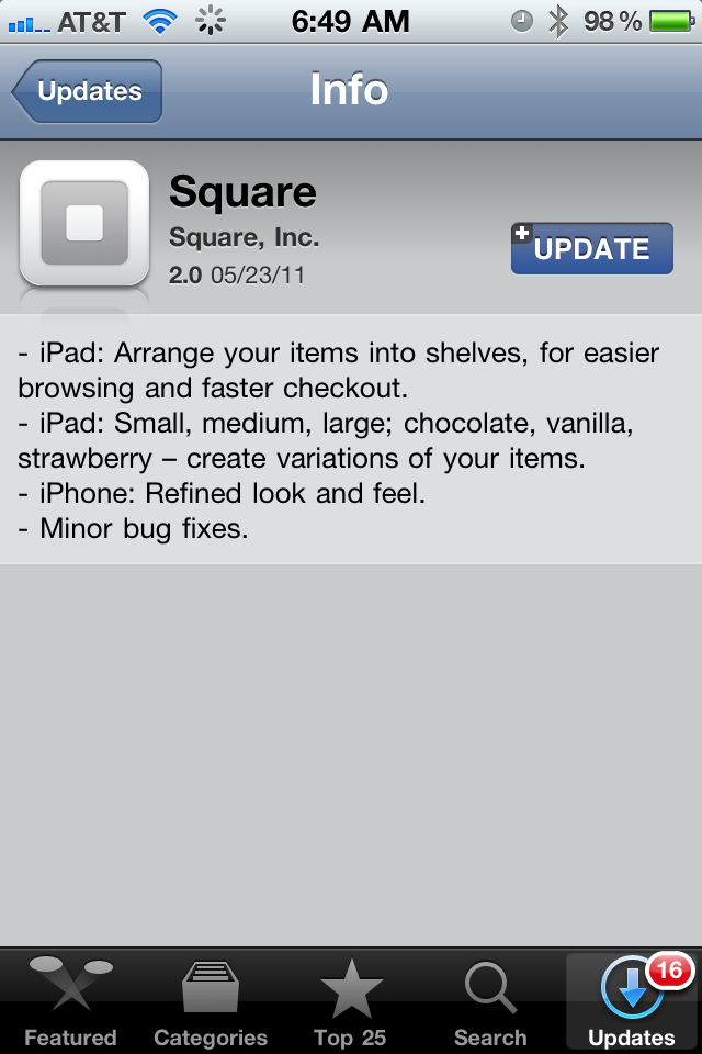
Utilize the Mobile App Update Section. Examples of FourSquare, Path & Square.

Maybe I am too much of a geek, but I actually enjoy reading application version updates. I assume most people do not read them thoroughly (many do not regularly update their apps either), but it is a really simple way to communicate with users and share what's new. It is so simple to do... and yet so often forgotten.

Most app updates read something along the lines of: - "fixed crashes" - "fixed various bugs" - "app runs faster"

In fact, I've seen many that say "the free version now has ads". Yeah, that's going to make me download the update!

Here are three great examples from three great apps: Foursquare, Path and Square. I particularly like the Path update because the app underwent a significant product change... this update is their first opportunity to introduce existing users to the changes. Of course, the app experience itself should also introduce / familiarize those changes.... but this is such an easy way to get started. And because so many developers overlook it, the mere attempt to communicate changes distinguishes these apps: