Twitter's In the River Module for User Messaging

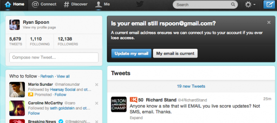
Facebook is the king of in-the-river promotions - perhaps because they roll out so many new features, promotions, toggles, etc and it's the most effective way to alert users of changes. Here is a great example by Twitter and it's worth showcasing for three reasons:

1. It is a balance of really obvious but in-line. The promotion box sits atop the feed and therefore feels natural - as opposed to an overlay of some sort. Nevertheless, it cannot be missed.

2. It is not done to promote a new feature. It is done to message active users. Better than an email.

3. The focus is on ensuring accurate email addresses and user data. The best to do that, per point #2, message active users in line.

twitter in the river

Great Rose Bowl Social Ad From Vizio

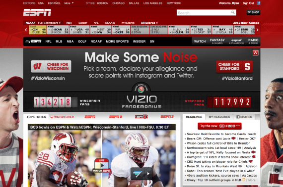
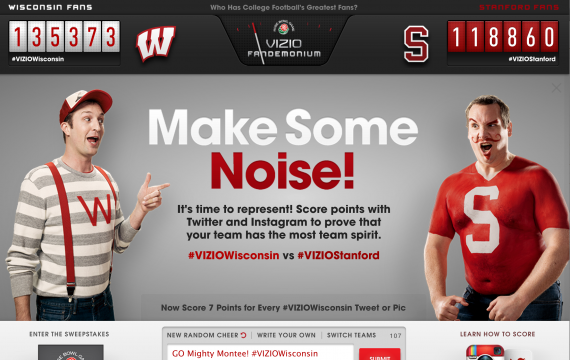
You can watch the Rose Bowl (Stanford vs. Wisconsin) on ESPN right now and on WatchESPN. You can follow on the new SportsCenter Feed and ScoreCenter. And you can cheer socially on ESPN's homepage with the current Vizio Fandemonium ad on ESPN's homepage that allows fans to support either Wisconsin or Stanford via Twitter. Very cool, fun experience and very timely given today's game and the engaged audience.

rosebowl

vizio fandimonium

Amazon Most Gifted Tagline, Promotion

The "most gifted" tagline and promotion is effective... particularly in the web's largest marketplace with the web's largest collection of products. And that's why it looks so similar to how they market year after year. And that's why I like it year after year!

Note: here is the original announcement in November 2009:

"Amazon.com, Inc. (NASDAQ:AMZN – News) today announced that November is already the best sales month ever for Kindle, even before Cyber Monday. Kindle continues to be the most wished for, the most gifted, and the #1 bestselling product across all product categories on Amazon."

Square's App Download Page

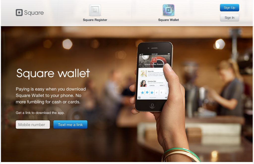
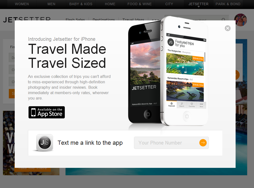
I have written in the past about designing for web-to-mobile downloads. Some treatments are effective (ie Jetsetter) despite most being ineffective. Square has built a very simple, good looking page similar to Jetsetter's. The beauty of course is that there is one call to action and then Square can do work on the backend to send the right product information for your device. And if there is breakage in the conversion funnel, they have your mobile number and can reengage.

Smart for Square. Easy for the consumer.

Facebook Gifts, Reminiscent of Facebook Offers

Three things to note about Facebook Gifts: 1. Fascinating - and yet powerful - that the only promotion of Facebook Gifts is within the birthday alerts. It's the definition of "in the river" marketing and promotion. 2. This was the first time I noticed that the gift icon showcases friends who have sent gifts (when available). So not only is it in the river, it is socially relevant ... and therefor has some social pressure!

3. That aspect looks a lot like Facebook Deals.

Reaching Targeted Users with Log Out Pages: Facebook + Fab

I have written before about the value of Facebook's homepage for logged out users: both from a promotional (huge lift for Facebook; both Facebook + Twitter do it) and advertising perspective (eBay example). Last week Fab ran a great ad placement for logged out Facebook users. No doubt he got significant reach and is effective because Fab does such a great job with social shopping / Facebook integration. However, it is still a strange concept to see - and market against - "everyone who logs out of Facebook today sees our branding."

Install Now: Driving Installs in Addition to Likes

I have written about Facebook's AppCenter before and how it represents the focus on mobile and on Facebook's platform... and opens up a monetizable, interaction beyond "Like": "Install". (And by the way: you could easily argue that "install" is a more valuable action thank "like" or "follow"). Here's a screenshot within the mobile web promoting Fab with a sponsored unit that is visual, includes ratings, reveals friends who use the app and, most importantly, a big "install Now" button.

Google+ Interactive Ad Layer

I have written before about Google / Google Plus and their interactive, actionable ad units (here is a great example from Google Offers and one for Google's emailable ads here). Below is an example of Google Plus being integrated into an otherwise standard ad unit. Natural evolution and integration here - it sits atop the add and creates a social layer that:

1. The brands welcome. There is action and benefit beyond the click-through.

2. Google loves. They drive usage of Google Plus and give advertiser another medium to extract & measure value.

Should Facebook Ads move off-Facebook.com - these interactions will be really key (point 2 here).

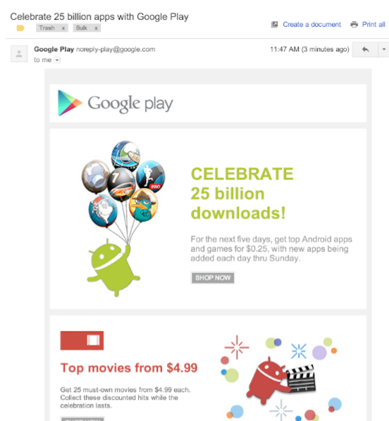
Google Play: 25B Downloads & $0.25 Apps.

25 billion app downloads. That's the big number & achievement that Google Play is celebrating. And to celebrate, Google is delivering popular paid apps for the very-discounted price of $0.25. Note: popular movies are $4.99, magazines are $1.99 and books $0.99. As I remarked last week (see here), it is one of the differences between Apple / iTunes and Google / Google Play. Just very different strategies and experiences. We have seen Amazon find success on the Kindle Fire and their app store with similar marketing -

and it goes well alongside Google's delivery of Play credits with new devices (like the Nexus 7) and Google Wallet