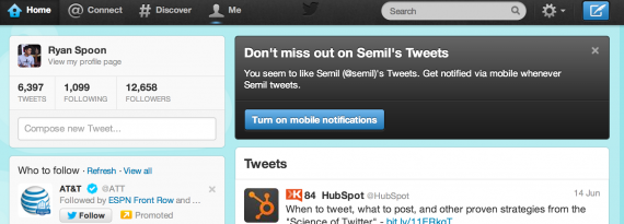
One of the great (maybe most under used?) Twitter features is mobile notifications. They are very valuable when used properly (ie following the right users) and overwhelming when used incorrectly (ie following too many people) - and Twitter recognizes this. Hence, Twitter is now recommending mobile notifications of recommended users on Twitter.com. Great in-the-river promotion that encourages cross device use (from web to mobile) and for users / content that they believe I will appreciate.
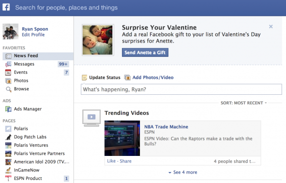
A Valentines Reminder from Facebook
In case you forgot...
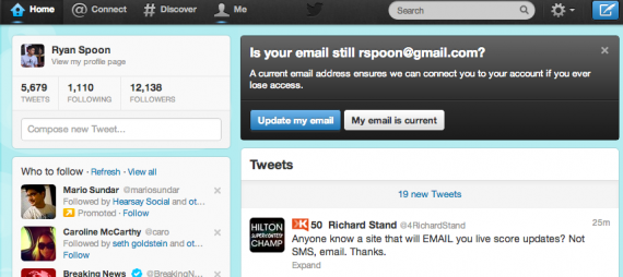
Twitter's In the River Module for User Messaging
Facebook is the king of in-the-river promotions - perhaps because they roll out so many new features, promotions, toggles, etc and it's the most effective way to alert users of changes. Here is a great example by Twitter and it's worth showcasing for three reasons:
1. It is a balance of really obvious but in-line. The promotion box sits atop the feed and therefore feels natural - as opposed to an overlay of some sort. Nevertheless, it cannot be missed.
2. It is not done to promote a new feature. It is done to message active users. Better than an email.
3. The focus is on ensuring accurate email addresses and user data. The best to do that, per point #2, message active users in line.
Facebook Gifts, Reminiscent of Facebook Offers
Three things to note about Facebook Gifts: 1. Fascinating - and yet powerful - that the only promotion of Facebook Gifts is within the birthday alerts. It's the definition of "in the river" marketing and promotion. 2. This was the first time I noticed that the gift icon showcases friends who have sent gifts (when available). So not only is it in the river, it is socially relevant ... and therefor has some social pressure!
3. That aspect looks a lot like Facebook Deals.

Facebook Launches Mobile Friend Finder, Overtakes Mobile App
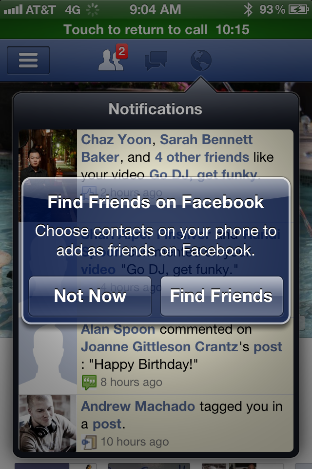
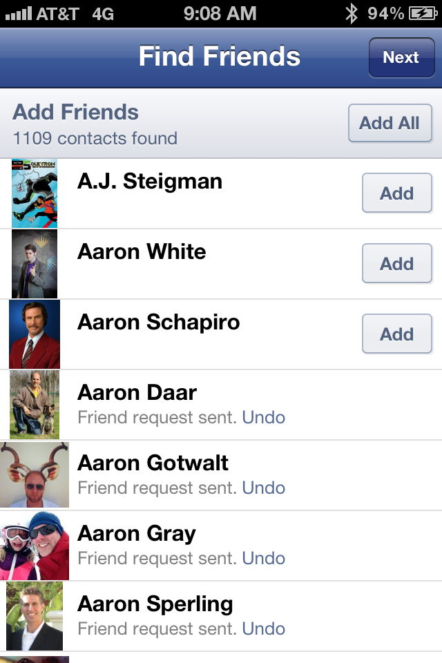
Below is a series of screenshots from within the Facebook iOS app that allows users to match their Facebook friends against their iPhone Contacts: "Find Friends on Facebook: Choose contacts on your phone to add as friends on Facebook." It's a basic concept - but it's tremendously powerful since your mobile contact list is really your tightest, most significant network.... and those users are surely also Facebook users. Of course Apple performs the matching by uploading contacts from the device and then sorting them on Facebook's servers. You may remember this practice was critiqued publicly - but Facebook is very clear about how they are using the contacts.
It is also worth noting that Facebook is clearly aware of the potential growth here (in one click I can add 1,109 new friends!) but wants to balance some quality control: "Please send invites only to friends who will be glad to get them."

Facebook Offers In The River Promotion
Two trends within Facebook that I have written frequently about: - Facebook Offers: which has morphed from a Groupon-like platform to an extension of their sponsored ad format - In the River Marketing: which is particularly important for large products / platforms like Facebook (examples here: New Facebook Photos and Facebook Places)
Combine those and you have the following series of screenshots: Facebook's In the River promotion of their new Facebook Offers product. When you visit your Facebook page, you are prompted with a takeover atop the status box:
"Welcome to Facebook Offers: Drive people to your busienss with an offer that people can share with their friends." Various examples are cycled through - starting with Red Robin in this case ($5 off).
You can then "take the tour" and Facebook walks you through the various components and how to set up a campaign. Notably, its placed in-line next to the Status and Photo box.... that is prime real estate.
The walkthrough itself is not exactly noteworthy (write a strong headline! Choose a great thumbnail!) - however, the presentation of the tour and the location of the product is important. Furthermore, the final step of the tour is very interesting because it demonstrates the friction of online to offline content and commerce:
"Prepare your staff: Let your staff know about the offer so they're ready to accept it from people who show it from a mobile phone, or in printer form." Easier said than done as this is a far bigger problem than a one-line reminder to tell your staff about the coupon.
Flipboard: In the River Promotion, From iPad to iPhone?
I write a lot about targeted marketing - which means effecting messaging your users at the right moment and in the right place. I use the term "in the river marketing" to describe it. Here is a great example by Flipboard - a master at mobile design. Flipboard - which has huge distribution as an iPad app - is trying to promote their new iPhone app (which generally is a different experience and design). To do that, Flipboard gets as "in the river" as possible. The welcome screen generally displays a story from your network. In this case, it is a note directly from Flipboard's CEO Mike McCue and describes their new iPhone app. This ensures that all Flipboard users see the message and, at the very least, recognize that Flipboard now exists for iPhone. That's aggressive. But it's targeted: these are Flipboard users and iPad owners (so they likely have iPhones as well).
The major question that mobile publishers / developers struggle with: how do you then drive conversion? What next after this message? Driving downloads across device is difficult. Driving downloads from the web is even harder. Then layer on tracking to understand the efficacy of the campaign and it's unfortunately very difficult...
Sparrow, Mobile: In the River Promotion
I frequently write about two ongoing themes: 1. the importance of "in the river marketing" (reaching targeted users at relevant points in the product / experience) 2. the difficult of driving mobile downloads from web, advertisement, other devices, etc
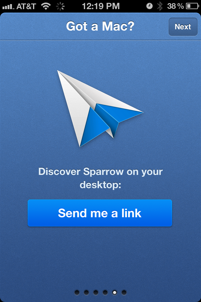
Here is a good example from Sparrow. They want to promote their popular Mac mail application to iPhone users. Within the initial product walk-through (now very popular within applications), Sparrow highlights their Mac app (Got a Mac?) and, to drive conversions, offers to send a download link. That's simple but effective (it's actionable), intelligent (captures some data / funnel measuring) and relevant (iPhone users are more likely to be Mac users than Android users).
Of course - if Sparrow were promoting their mobile product, SMS is more effective than mail. Groupon and Redbox do great work here.
Even Groupon, the King of Conversions, Battles Clutter
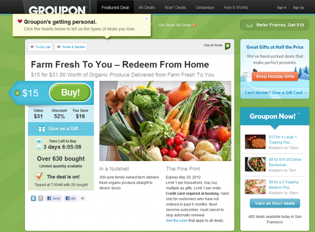
I often give the advice of studying web leaders and learning from what they are great at. For instance, Amazon is unrivaled in the ease of navigation, findability and user experience. For user acquisition, onboarding and funnel optimization - Groupon and Living Social are as good as it gets (see more here). But as Groupon tries to grow its product offering and business - it is encountering the common problem of *too much*. How do you keep the experience simple, clean and therefore optimzied with too many offerings and too much noise? It is effectively the inverse of my "In the River" concept.
Here's the example of a recent Groupon. Notice all that's going on: - the Groupon itself (the primary focus) - an expanded promotional unit for "Groupon's Getting Personal!" - Holiday Groupon Gifts - Groupon Now! - the referral program
So in addition to the primary Groupon, the user is exposed to four programs: Personal Groupon, Groupon Gifts, Groupon Now!, and the Referral Program (which has been around from the start). That's a lot!
