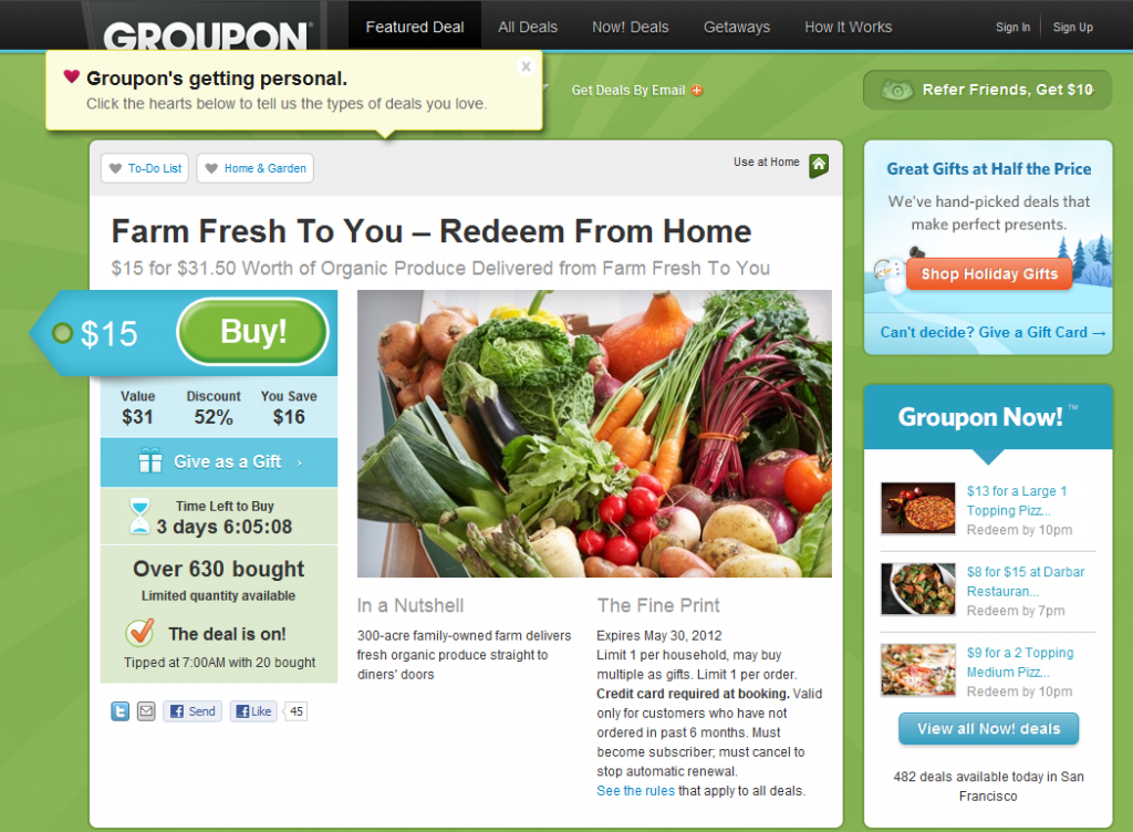
I often give the advice of studying web leaders and learning from what they are great at. For instance, Amazon is unrivaled in the ease of navigation, findability and user experience. For user acquisition, onboarding and funnel optimization - Groupon and Living Social are as good as it gets (see more here). But as Groupon tries to grow its product offering and business - it is encountering the common problem of *too much*. How do you keep the experience simple, clean and therefore optimzied with too many offerings and too much noise? It is effectively the inverse of my "In the River" concept.
Here's the example of a recent Groupon. Notice all that's going on: - the Groupon itself (the primary focus) - an expanded promotional unit for "Groupon's Getting Personal!" - Holiday Groupon Gifts - Groupon Now! - the referral program
So in addition to the primary Groupon, the user is exposed to four programs: Personal Groupon, Groupon Gifts, Groupon Now!, and the Referral Program (which has been around from the start). That's a lot!

