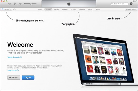
I wrote about the appification of software as a thematic takeaway of 2012. Here is a great - but very different - example. The newest iTunes might not behave like an app - but it certainly takes cues from popular app designs / trends. This starting screen for the entirely revamped iTunes product looks exactly like a starting screen for other iPad applications. Soft arrows pointing out specific changes or user behaviors.
It's a familiar way of making an unfamiliar product (after all, this is new) familiar again.

