I have blogged regularly about how much I like ESPN and their internet business. In fact, I've gone so far as to say it's difficult-to-impossible to complete with ESPN on content alone. And I've gone so far as to pay for their Premium Insider service. As an ESPN Insider, I got access to the new ESPN Beta (in other words, the new ESPN website revamp that has apparently been much of their focus for the last several months). And because I have spoken glowingly about ESPN and ESPN.com previously - I don't feel bad being sour about ESPN Beta.... but I am and here's why:
- It's too much like a magazine and too little like a sports site
- The magazine layout makes it more appropriate for People / US Weekly-like content than sports
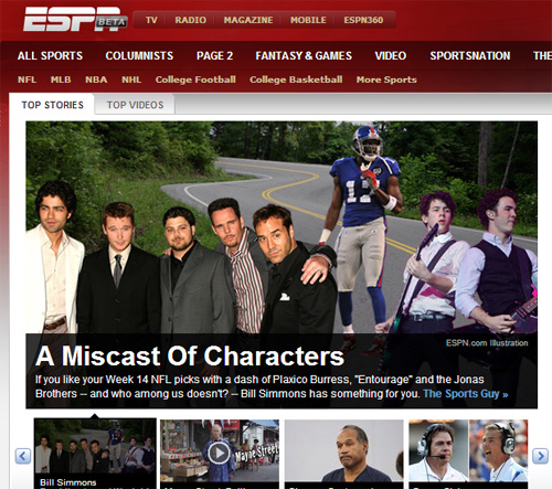
- The screen shot below demonstrates just that - the only true sports content is in small blue text on the upper right... and that's what I want to see!
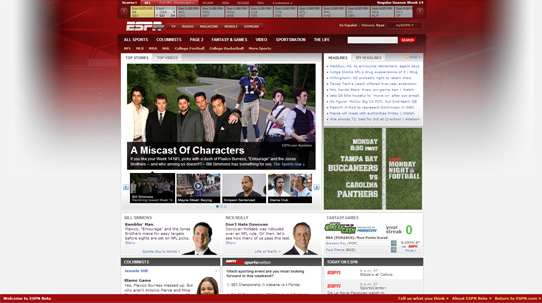
- The grid layout below the main module is visually attractive - but it's used exclusively to promote ESPN personalities rather than content
- The new header is clearly designed to increase pageviews and make hubs out of each league / sport (the navigational drop downs were removed)
- There are five headers / navigation bars: leagues, scores, ESPN properties, ESPN.com themes, sports... HUH?!
- While I like the ESPN Red color scheme, it makes the blue, gray and brown text very difficult to read
I've turned the Beta off as I am more than underwhelmed... I am struggling to use the new site.