Most advertisers will preach best practices like: - deliver a clear and concise message - keep it simple and precise - make it visual and grab the viewer's attention
By breaking most common advertising rules, PlentyofFish's ads actually caught my attention (enough so that I spent a few minutes creating the images, blogging it, etc).
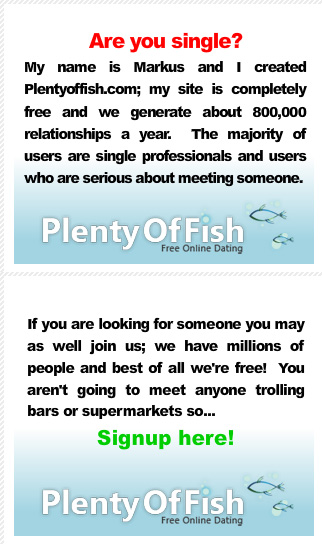
The ad flips through two units:
1. My name is Markus and I created Plentyoffish.com; my site is completely free and we generate about 800,000 relationships a year. The majority of users are single professionals and users who are serious about meeting someone. Lots of text with lots of qualifiers. Just as you would find it off-putting if your date said "me, me, me" - the use of "my name" and "my site" is awkward.
2. If you are looking for someone you may as well join us; we have millions of people and best of all we're free! You aren't going to meet anyone trolling bars or supermarkets so... signup here.
My favorite part is the very strong call to action: "You may as well join us" [followed by a semicolon].

