Yesterday, I wrote about the three keys to creating a compelling widget.
Tonight, I am moved to write about how *not* to craft compelling paid search campaigns:

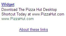
There are so many things wrong with this ad that it's tough to figure out where to start... but we can start with the ad "title" - which is perhaps the most critical component. It's the first thing a user sees and it's typically the largest, boldest font. In this case, the word "widget" is neither relevant to the rest of the ad nor particularly differentiated. The title should showcase the brand, describe the product and/or have a call to action. A generic, bland word like "widget" does not incent me to click through.
Likewise, the ad body should have a call to action and, in the few alloted characters, give an overview of what to expect after the jump. Asking a user to "download" something is rather aggressive - particular when it has no mention of the aforementioned "widget". Similarly, the text has no relevancy within itself: the words widget, download, desktop, and shortcut are used... but there is no relationship to pizza or Pizza Hut. Huh?
My favorite part of the ad is how carelessly Pizza Hut uses each of the characters (typically a very precious piece of ad). 16 characters are dedicated to spelling out www.pizzahut.com within the ad body - even though that exact same tagline is shown directly beneath it. Meanwhile, they have chosen to only utilize six characters in the title to spell out "widget".
I am guessing that it would also be a reach to assume that Pizza Hut is tracking the ad, the clickthroughs and the conversions (to an order or .com registration)...
