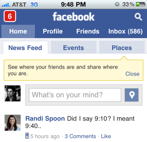
When Facebook launched Facebook Places, I wrote about how they boldly and centrally promoted their new feature. Here is a similar example from Facebook's mobile web experience - Facebook Touch. Like the YouTube HTML5 promotion, there is a spotlight box that sits between Facebook's header and the newsfeed input box... which means there is no way you can miss the unit.
In addition to the messaging, notice the Places button that offsets my profile icon and sits to the right of the input box. It is less obvious but, again, very prime real estate.
You can tell how much of a priority Places is to Facebook, a company that takes web design and each pixel very seriously:

