I have written about the design of promotion and notification units several times - pointing at examples from Facebook, YouTube, Twitter, etc. Here is an example from Quora... and while it is similar in its boldness, its very different in its style.
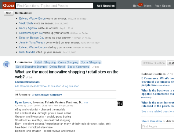
Quora notifies users of updates to questions that they are following. The notifications start on your homescreen and sit above the feed (somewhat similar to Facebook in that sense... but they are expanded by default). When you visit a particular question page, the notifications all sit above the question / answer content.
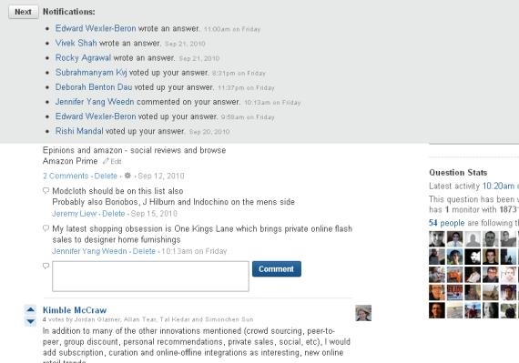
As you scroll down the page, the notifications sit persistently atop the page. It is a design style that is being used more and more... though in different shapes, sizes and formats.
We are seeing more and more persistent units at a page's header and footer. And as pages become busier and busier, persistent 'bars' (for lack of a better term) are good ways of capturing attention. Quora is interesting though because their pages are so clean and simple. But Quora's notification unit is clean and simple itself - and itself an elegant navigational panel and personal newsfeed:
Here are the notifications on the question page:
And here are the notifications sitting atop teh page as you scroll down: