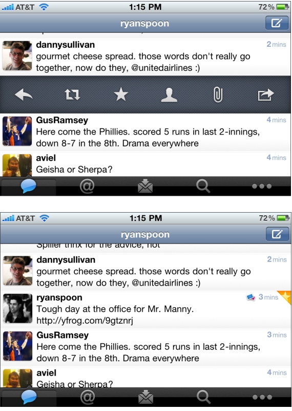
Not previously known as a leading designer, Twitter has been on a roll with their latest iPhone app, iPad app, and New Twitter. Here is a good example of why - but with some learnings / advice on how to design features. Twitter has to accommodate for lots of functionality: reply, retweet, search, favorite, quote, etc. You can easily imagine an application overwhelmed with buttons. Twitter solves this by having the core functions available via footer buttons, a "more" ('...') button and a surprising single tweet pane.
I call it surprising because it was not clear to me that this functionality existed... but if you swipe a tweet to the right, a pane appears that allows for quick functions of that tweet: reply, retweet, favorite, email, user info, etc. It is super useful... but is also surprising because I only discovered it accidentally. And this is a complaint I hear a lot from products trying to solve numerous tasks (no matter how elegant the solution may be). A consequence of simplifying complexity is often having to hide functionality... and that itself can lead to confusion.
It is difficult to boil down layers of options into a simple interface. It is equally difficult to make the interface intuitive and the functionality easy to uncover. That's why it's an art!
One other note: I love the small interactions that Twitter layers in... in the second screenshot, notice the small star that appears is uncovered in the upper right corner. That appears when a tweet is favorited.

