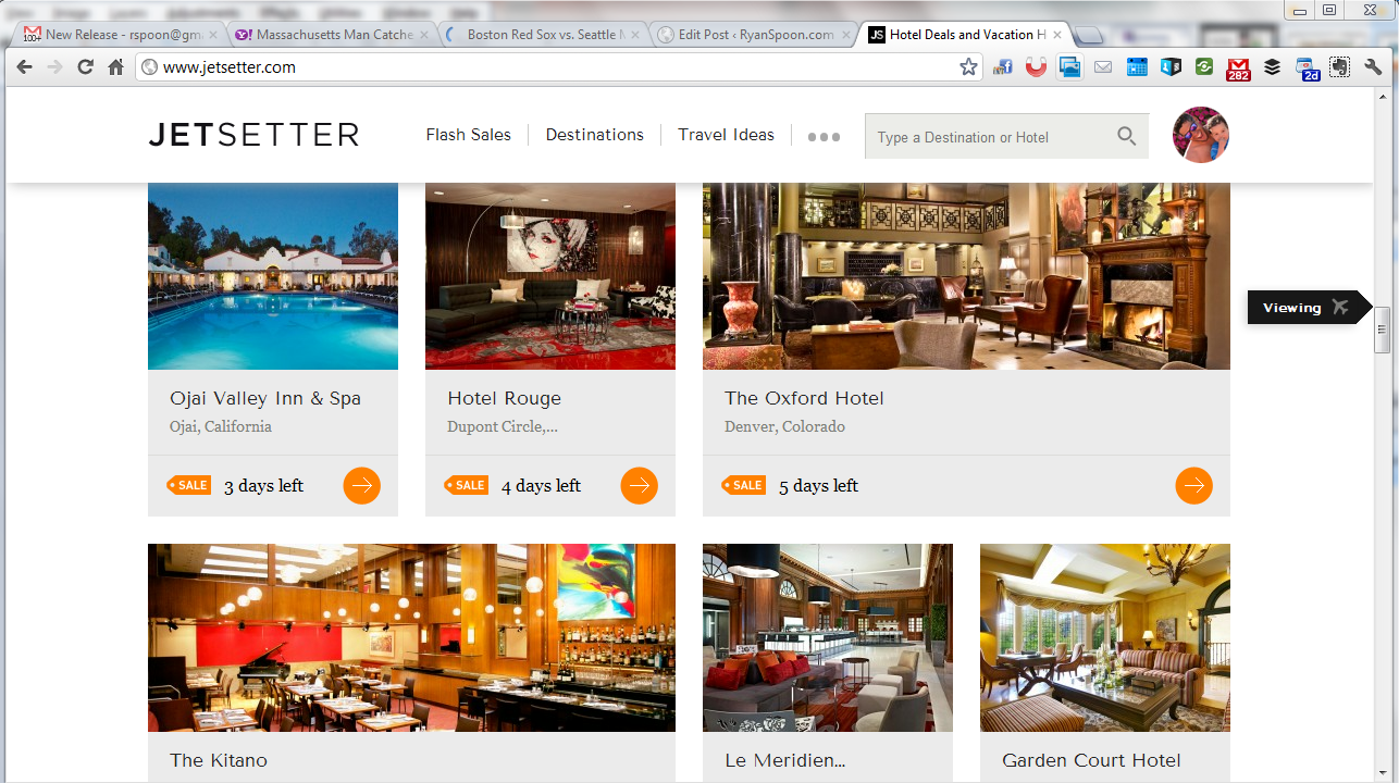
Jetsetter is known for great design (see here) and here is a nice little UI treatment that we recently saw on The Verge (who uses it on mobile and web). As you scroll through Jetsetter's sale page, an icon scrolls alongside the right progress column. It serves two functions: 1. telling users what kind of content they are viewing, ie vacations or curated lists. 2. showcasing the depth of product / offering that Jetsetter offers. In other words: there's a lot more than what I've seen!


