The New York Times iPhone App - I Love It, But Here are 10 Suggestions

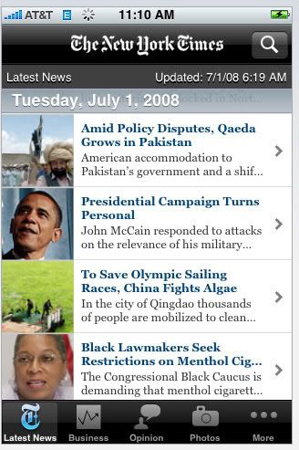
Despite getting unfairly ripped with iTunes ratings, The New York Times iPhone Application is by far and away my favorite app. Sure others are cool (MLB.com and virtually anything using the accelerometer), but the NYT app is the most useful. In fact, in just a couple weeks, it's transformed by morning ritual - I roll out of bed, thumb through the newspaper and do it without waking up Anette with the annoying Blackberry clicking noises. So we're all happy.

And while I love the NYT app and appreciate that they've made it free - I do have some suggestions... so if you're reading, how about some of these features for v2?!

1. Let me email articles directly from the app. Hugely annoying that I can't load up the contact book and/or enter an email address!

2. Use those emails to add to the 'Most Emailed' section. With the number of users actively using the app - this is a ton of useful data.

3. Let me rate articles and photos. Use my preferences and ratings to eventually build out a recommendation engine.

4. Load the app faster. The photos in particular load slower than any other app on my iPhone. I'd use it more often, if I could load pages faster.

5. Add a touch-based scroll bar to the article pages. It can take for ever to scroll through lengthy articles one thumb-touch at a time. There has to be a faster way to scroll or at least jump to the bottom of the article.

6. Get some new ads. I'm all for placing ads in the app as long as it's free... but I can only see so many Westin ads and act interested.

7. Make the author names clickable. For great articles, I'd like to read other pieces written by the author. Link the name to his / her other articles. Again - it would increase my consumption.

8. Give me a pivot point off each article page. Currently, the only option to view the next story (blindly I might add!) or pick a new category... add other options such as related articles. At the very least, add the categories that the article sits within!

9. Add a headlines / tag view I love the photos category and enjoy browsing visually. This would be equally interesting if there was a finding experience by headline or tag.

10. Allow favorite searches to be stored. There are searches that I would like to keep either as a category or (at least) within the search category. Let me store them!
The iPhone 3G is Game-Changing; Game-Ending for Google Android, Blackberry?

I'm likely not stating anything revolutionary here, but it is worth noting that what Jobs and Apple have built with the iPhone 3G is revolutionary. I traded my Blackberry in for the iPhone two days ago now (reactions are here) and the phone itself isn't the revolutionary aspect - it's the platform. I continue to be blown away by the Application platform and store that Apple released. The quality of content and innovation being put out by developers is remarkable (and we've just scratched the surface) - and both the developers and Apple's iPhone SDK / Dev Center are to thank for that. The available libraries are rich and developers are putting them to use effectively and rapidly.

And Apple's ability to leverage iTunes as a distribution lever for the App Store is immensely powerful. How can Google Android and Blackberry compete? Assume that their platform is equally robust and useful... there is a significant first mover advantage here and neither has the distribution platform that iTunes has. Will developers with already-hot iPhone apps choose to build on a new platform / library, or will they find ways to take advantage of their iPhone success with new versions and apps? And, considering their business focus, Blackberry will struggle with consumer applications... which happen to account for a large percentage of iPhone's current top paid and free apps. Meanwhile, it is yet to be seen what time of user Android will appeal to... and I don't expect that developers will dedicate resources without first understanding Android's size and type of userbase.

On a different note, I am not convinced consumers fully appreciate what Apple and the developers have put together... just two weeks after launch. Let's use the New York Times application as an example. It's a glossy, good-looking front-door to the New York Times that dynamically updates itself and allows readers to access news by category, popularity, photos, etc. And on the 3G network - it makes reading a (fast) joy.

It's the #1 'news' application and the 21st most popular free application. Oh yeah - it's 100% free. It has 239 reviews. The average rating is 2.5 stars.

Wait a second... The New York Times is giving away their newspaper in a gorgeous, routinely-updated application that sits on your phone's 'desktop' and is 100% free? And it can be downloaded over the AT&T network in a matter of seconds? And people are rating this a 2.5? Sure - the app can be improved and there are tweaks that should (and will) be made... but think about what was available two weeks ago. To read the NYT, you had to buy the paper, check your email or visit www.newyorktimes.com. Remarkable stuff is going on and the levels of innovation are eye-opening.