The Key to Conversion Rates

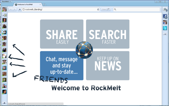
The key to strong conversion rates? Squiggly lines. That's right: squiggly lines must help with conversions... otherwise they wouldn't appear on every imaginable registration / new-user page. Right?

Here are examples from Evernote, Highrise, Rockmelt, and Springpad. And that too just a moment to come up with:

Welcome to RockMelt: Great Product Marketing Introduction

RockMelt has a rather big product marketing challenge: explain to users how their new, social web browser works. It is not overly complicated - but it is quite different from what users are accustomed to. Most products display the equivalent of a "Read Me" introduction upon installation / first use. These are usually text heavy, step-by-steps tutorials... and they are often optional. RockMelt recognizes that the browsing capability itself is explanatory ... but it is also ordinary. The social elements are what makes RockMelt compelling - so upon download, they overtake the browser with a great, visual introduction. It can't be missed and focuses only on the social elements (assuming that you are do not need help with normal browser functionality). And in addition to being useful, the intro is far more inviting and enjoyable than the normal "Welcome!" experience.