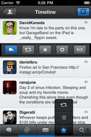
After reading the rave reviews, I traded in Twitter's iPhone App for Tweetbot. It's great - glossy, fast and customizable. And while I prefer Tweetbot to Twitter's client - it made me realize how challenging / uncomfortable unlearning and relearning certain behaviors are. After using Twitter's application for so long, I struggle each time I want to reply or favorite a tweet. It's different and therefore challenging.
I am not entirely sure what the lesson is for Tweetbot: If the interactions are too alike Twitter's, the value proposition lacks; but if it is too different, it becomes unusable. Ultimately, the burden is on the developers to:
1. create a uniquely compelling product such that it is worth exploring & learning
1A. this is more difficult when operating within an exisiting platform (ala Tweetbot :: Twitter)
2. focus on the first user experience and convey the product's functionality (and intricies) immediately
3. don't over complicate the product. This is the most difficult part: distinguishing the product while still keeping it simple.
... and, even for Twitter, that can be hard.

