There's lots of innovation currently around persistant headers, footers, and bars. I wrote about Quora's notification 'panel' last week. You can also check out Apture (which I had been testing), Meebo, Wibya, etc. As with Quora, the 'bar' phenomenon is making its way to the publisher side. And it is being used creatively to deliver key news (ie Quora :: notifications), navigational flows, or promotional content.
Here is another good example.
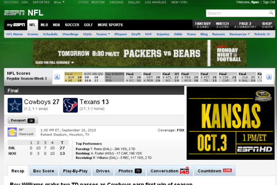
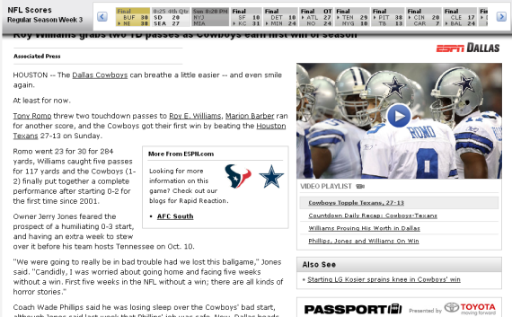
Months ago, ESPN introduced an interactive score panel (almost like the sports ticker that sits persistently on ESPN's TV channels). When browsing content within in a particular sport / league, ESPN now has the that panel lock atop the screen to provide persistent live scoring. The UI is very slick as the bar is glossy, animates nicely and maneuvers down the pages seamlessly.
Expect to see more and more of this around the web (and mobile). The experience itself is very much like mobile applications... and the web itself is starting to look and interact more like apps.
Here is the NFL score header on ESPN

As you scroll down, the scores panel attaches itself atop the screen and follows

