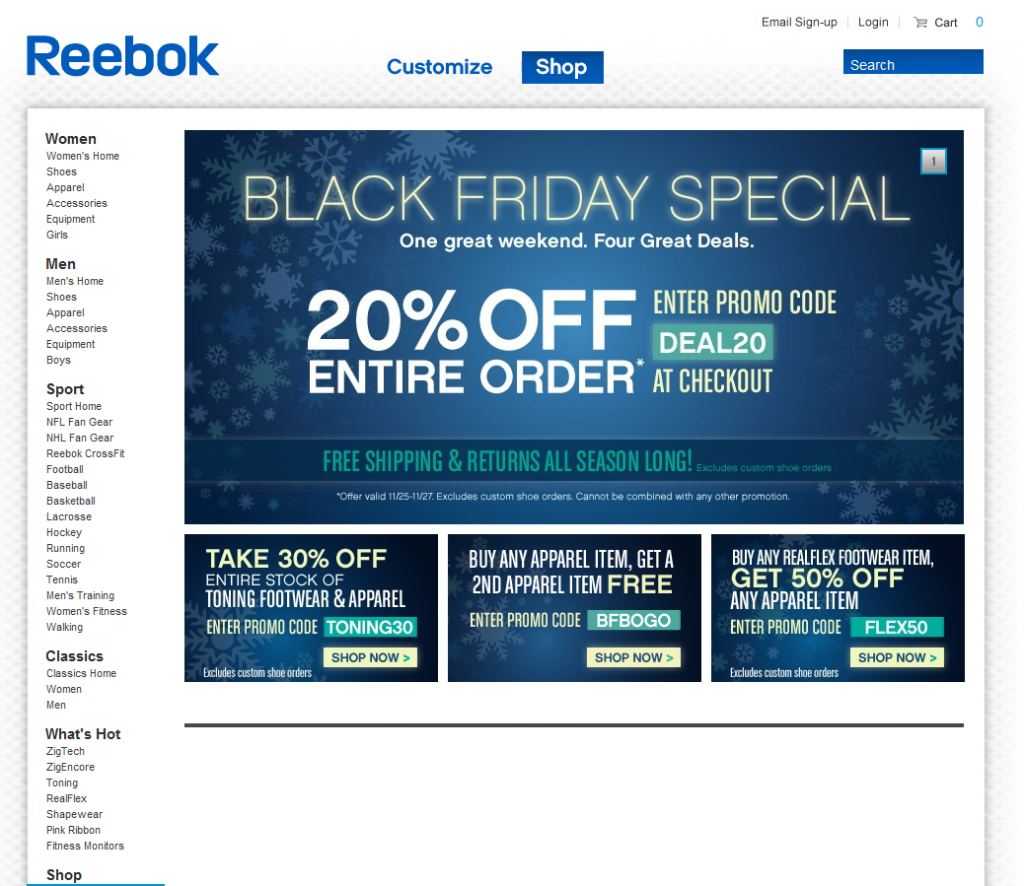
Can you tell that there is a sale?Can you tell it's Black Friday? Even though this is a screenshot from Sunday evening? Fascinating that there is no product displayed whatsoever on the page. The entire page is a promotion for various offers: 20%, 30% and 50% off. I have to imagine the promotion would convert better if product was part creative...
Twitter's Role in the NBA Lockout. Fascinating.
Sports fans today got a Black Friday present: the 149 day NBA lockout is on the verge on ending. And the result is a good thing for fans: the season will be 66 games (a better result than the normal 82!), result in greater league parity (ala the NFL), lead to a healthier league (good for everyone), and create a whirlwind December free agency period (the surprisingly great outcome of the NFL lockout). The lockout was painful, mismanaged on both sides and generally could have been avoided... or at least handled far differently and far earlier. But the 2011-2012 season is saved and hopefully goodness comes from the ugly.
One of the most interesting and overlooked aspects was the role Twitter played in a world where:
- players couldn't communicate with the league
- players themselves were not entirely knowledgeable of the latest events / outcomes
- both sides were feeling significant pressure from the public (pressure is a soft word here for disgust for most and hate for some)
- both sides were starved for communication outlets
So everyone took the Twitter: the league, the owners and the players. Some were trying to position themselves, some trying to save face and others trying to voice their opinion in a public manner (since it wasn't being heard privately). Fascinating.
So why Twitter was so important here? First, the NBA and its players could feel the public's disgust... far more publicly. In prior strikes / lockouts, the fans didn't have as much power as they do today. And in prior situations, nobody had the outlets they do today: players and owners were able to immediately express frustration, anger, etc... and to huge audiences. The result was a very public negotiation that made many of those involved come across as confused, desperate, disjointed and/or displeased.
Nevertheless, it provided a platform for all constituents to amplify their voice... and to listen. And while that was debatably an effective / ineffective exercise - it was terrifically powerful for the fans.
Here are some examples:
Miami Heat owner Micky Arison (@mickyarison) took to Twitter to express his thankfulness to his fans. This was retweeted by the NBA (@nba). Takeaway: comes across as desperate.

NBA player Luis Scola (@lscola4) took to Twitter at a time when there was debate within the players union as to whether they should pass the league's proposal. There players were beginning to fracture and many had expressed confusion over the proposal's specifics. In one of these tweets, Luis asks the NBA a question directly and publicly. Takeaway: shows player disjointedness and general player confusion with process / outcome... which shows weakness.


Here's an example of Chris Sheridan (former ESPN NBA writer) and Luis. Chris posted a critical piece about the lockout and Luis retweeted it. Takeaway: fascinating as it shows the players are reading the commentary and clearly trying to share certain opinions.

This is my favorite one. The NBA took to Twitter to do a fan Q&A session about the lockout. It was in an effort to engage fans, show appreciation and help communicate... but it was a terrible idea (and I'm shocked anyone in PR allowed this to happen). It lead to fans spewing negativity, players tweeting questions, and the league being forced to answer uncomofortable questions. Takeaway: trying to do something positive but no an intelligent move.

Let's Not Blame Groupon for its Merchants' Mistakes.
I Found the article, Groupon horror: Bakery must make 102,000 cupcakes, via Washington Post Social Reader app (written about here).

The bakery, based in Woodley, received 8,500 requests for a dozen cupcakes, far above the normally 100 it produces a month. Brown suddenly had to make 102,000 cupcakes.
Brown's company only employs eight people, and she had to bring in an outside agency to handle the orders. The temporary agency cost her $19,500, effectively wiping out her year's profits, MSNBC reported.
This is *not* a Groupon horror story. In fact, Groupon did percisely what they are supposed to do: drive immense volume.
Rather, It is a horror story about business mismanagement and the consequences of poor forecasting.
It's a lesson to be learned for all businesses - although this example demonstrates how small / medium businesses can be more dramatically impacted.

ESPN's Twitter Integration Improving.
ESPN is getting closer! I have written a lot about ESPN's usage - and potential usage - of Twitter. I have criticized and applauded. Here is an example of ESPN continuing to improve. It's a minor example, but ESPN has now allowed in-line actions on their Twitter modules (it used to be just one-way reading, mobile example here). You can now retweet, reply and favorite content inline. Novel idea right?!
It is getting closer: ideally this would be more expansive than a widgety module. It would be more deeply integrated, power group chats, include lists, etc... but, it is getting closer!

Merchandising: Put Your Best Foot Forward.
mer·chan·dis·ing/ˈmərCHənˌdīziNG/Noun: The activity of promoting the sale of goods. It goes without saying that the act of merchandising and promoting should include putting your best material forward (in the web world, that would be "the best optimized, highest converting").
And with that, this is the product details page for American Apparel's basic t-shirt (which I imagine is their best selling product... and is actually a great t-shirt..... you just wouldn't know from this view):

Evernote's Clean Homepage. What to Learn.
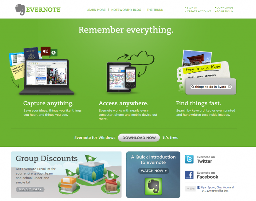
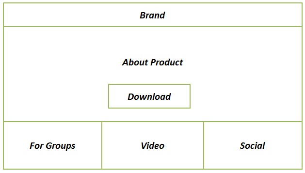
I love Evernote. It's one of the few products I use daily and on every device I own. I also love their homepage because it is super simple and focuses on two single actions: learn and download. Evernote's homepage is broken into four sections:
1. What is it. This has three simple parts: capture anything; access anywhere; find things fast. If you use Evernote, you'd agree that that's a great, simple overview.
1A. Download. The focus is the Download Evernote button which is front and center and the only actionable button on the page.
2. Group Pricing. The base is a suite of three modules that again promote learning. Here, Evernote wants to alert users that the product is both for consumers and businesses / teams.
3. Video Overview. More learning.
4. Social. This does a few things. First, it demonstrates that Evernote is massively popular - which enhances brand / familiarity / willingness to download. For instance, I am 1 / 150,000 Facebook fans. Second, it allows me to follow Evernote in-line (continuous marketing opportunity for Evernote).
Twitter's Activity Stream Speaks Specifically to Me
I give Twitter a lot of credit for rolling out their new Activity Stream.Sure, it's quite ugly... that can be fixed. And sure, it's a glorified newsfeed / timeline... but it's core to Twitter. A few thoughts:
1. Twitter, like many mass services, has a findability problem. In May 2008, I wrote that Twitter's problem was social findability. This helps.
2. The web is based on Ego and this certainly feeds to the ego. It answers in real-time what's happening around ME. That's powerful & addiction.
3. I can Twitter becoming two primary streams: tweets and activity. For publishers, activity could be a more powerful hub. For individuals, the normal stream probably is.
4. For publishers and brands, this could become the first step towards a publishing dashboard. The foundation is being laid.
5. It's ugly. Needs serious UI overhaul. Twitter is usually so elegant and simple... surprised by the visual experience here. Again, it's easily fixable.

NBA.com Demonstrates Common Oversight of Mobile E-Commerce / Promotion
If you read me regularly, you know that I have a major pet peeve around unoptimized (and often dysfunctional) mobile experiences. So often mobile is treated an extension of the web experience and that results in broken mobile experiences... and since so much of our content consumption is on mobile devices, the lack of attention to the mobile experience is both frustrating and foolish. Great example here from the NBA (who I have had lots of social advice for!):
The NBA has 3,000,000+ Twitter followers.
40% of Twitter's users access the service via mobile (not the web).
The NBA tweets a link to the newest pair of Nike Air Jordan 8.0 shoes:
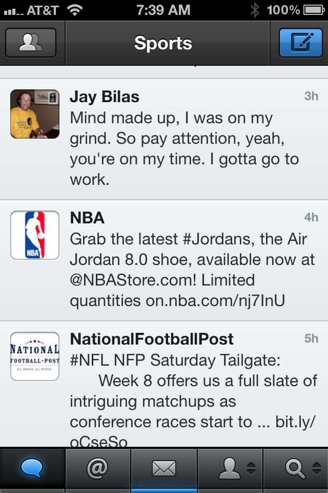
Great promotion right? When you click on the link, the NBA Store automatically redirects all mobile traffic to a defaulted storefront / homepage. And thus the frustration: 40% of those who clicked the URL, with the hope of arriving on a specific piece of content, had to give up and exit.
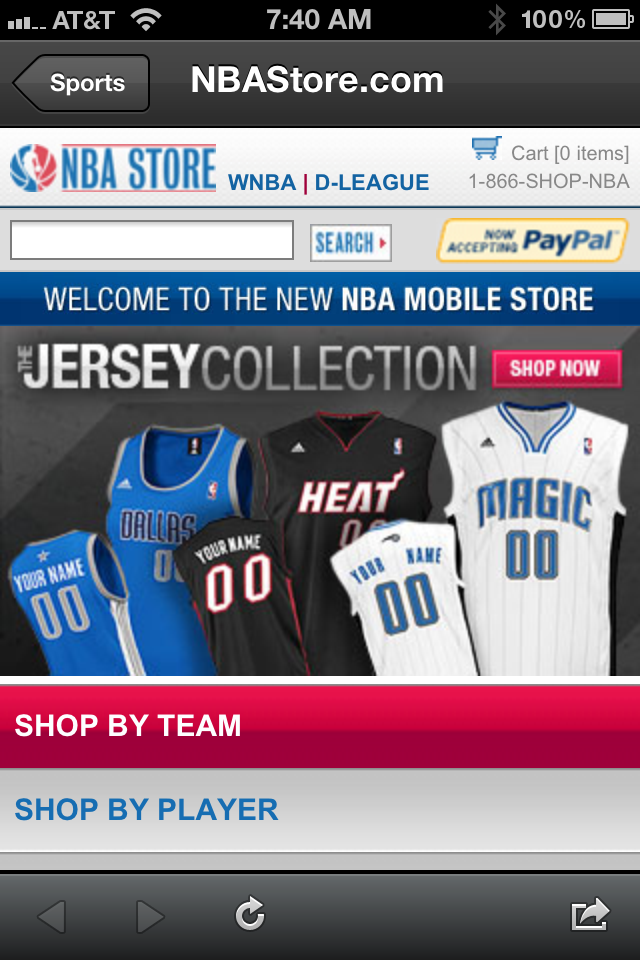
Also funny, when you go the URL from your browser, you get another frustrating experience: a totally untargetted promotion (hello Canadian users!):
Introducing Mixel
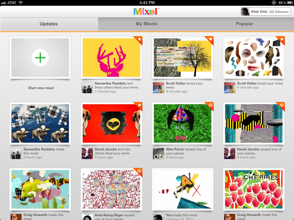
A Dogpatch Labs NYC and Polaris-backed startup, Mixel launched this morning. Using the iPad - Mixel lets you make, share and remix collages in a whole new way. You can download it in the app store here. Founded by former New York Times digital design director Khoi Vinh and Scott Ostler (dump.fm), Mixel is the first social art app for the iPad. With the free app, anyone can create and share fun digital collages, called mixels, using images from the web, Mixel’s library, or their own personal photos. Any image in Mixel can be quickly cropped, rotated, scaled or combined with other images using the simple, intuitive touch gestures familiar to iPad owners.
This excerpt from Sam Grobart's NYTimes piece ("Mixel Makes Art Social") does a great job conveying why I am excited about Mixel and the creative output that will pour from it: I watch my 1 year old son interact with the iPad the magic & delight that comes from it - Mixel has the opportunity to bring that same creativity and magic to adults who, like me, might not necessarily be artistic. That's powerful and fun:
"I tried Mixel, and it was fun and intriguing. I cannot draw to save my life, but collages? That I can do. You feel like you’re playing Art Director: Fisher-Price version. I mean that as a compliment — it’s fun to juxtapose images and text, and it’s worlds easier than, say, painting. That would’ve been enough to make a perfectly nice app, but adding the social features, where friends and others can create chains of meme-like images, turns Mixel into something more deeply compelling. It’s a conversation I’m looking forward to having."
You can read more here: - TechCrunch - NY Times - All Things D - VentureBeat - GigaOM
Introducing Mixel for iPad from Mixel App on Vimeo.
