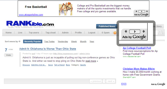
This weekend, I spent time experimenting with Pligg and have Rankible.com to show for it... and while it's not much yet (!), it's already revealed quite a lot about Google AdSense. Yesterday I wrote about the growing rich-media inventory and today I noticed a new AdSense format. Below is a screenshot of a 728x60 leaderboard that has the standard "Ads by Google" logo in the corner. But above the logo is a carousel button to navigate forward and backward... almost like the scroll through buttons on text ads. But what's unique here is that the button advances to other graphical ads - and those ads are for the same company.
I can't figure out if this is a new treatment made specifically for single advertisers / campaigns - or if the intent is to roll the format out to all ad formats such that it can showcase more units more quickly. The challenge there is that the button won't always be compatible with graphical units (size, color, etc) and auto-scrolling through units would be far more confusing than with text.
The benefit to Google? More impressions. More real estate. And a lot more data on conversions and user interaction.

