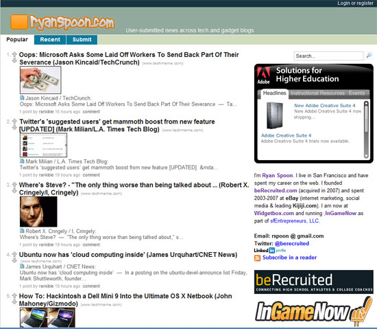
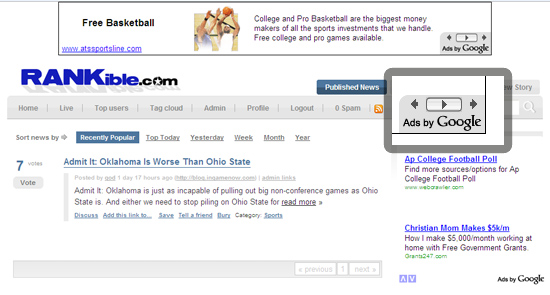
Introducing http://news.ryanspoon.com - I encourage you to test it out! About a year ago, I weened myself off of Digg (at least partially) and moved onto Hacker News. Hacker News is the best mix of technology content - from headlines to analysis to discussion.
After sifting through various services, I found SlinkSet (also a YCombinator company). Uninterested in creating a Hacker News clone or competitor, I was intrigued by the ability to 'remix' my own favorite feeds along with articles submitted by friends and readers:
It is an interesting way, if you will, to create your own 'distributed feed' (ala Facebook or Friendfeed - but without the direct network). Using SlinkSet's private mode, it is also a way to communicate with a distribution list.
SlinkSet is simple and a free service. My only critique is that it is based on iframes and consequently is not as flexible as you would like (in addition to being an SEO killer). It would be powerful to either
1. open the code (like Pligg or Wordpress) and allow users to develop against it, and/or 2. create a subscription version that allows further customization
Also worth noting, SlinkSet's custom service is terrific. They have converted an installation of SlinkSet into a feedback 'wall' and the founders interact ther directly with the users. Really a terrific example of what SlinkSet can be used for and how to interact with your userbase.


