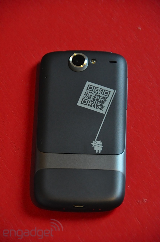
I have spent a lot of time thinking about packaging - particularly over the holidays as we all purchase and receive gifts. Companies like Amazon focus on speed and reliability while others like Rue La La put a lot of care into visuals, emotion and even virality (future post coming). As pictures and reviews of the forthcoming Google Nexus One make their way online, I was struck by the care and uniqueness of the packaging and branding by Google / Android. It is clever and powerful. It is also a stark contrast to the blunt and robotic messaging of Droid: - Droid is here: compromise officially deactivated. (ad here) - Jump from page to page like a caffeinated cricket in a room full of hungry lizards. (ad here)
Meanwhile, the Nexus One packaging oozes Google's brand and is more fun than rigid / tough (like the Droid). From the 'get started' pamphlet to the start screen to the phone's casing, it is obvious that this is: - a Google phone - an Android device - is equipped with 10,000s of applications - has character and funkiness Engadget has a great review and photo gallery of the Nexus One. Here are a handful that highlight the above points and check out all of the photos on Engadget:


