Since when did Google become such a UI / UE powerhouse? From Chrome to their Extensions to the Android branding / packaging to their holiday cards, it seems like everything coming out of Google is simple, clean and great looking. Now that the Google Nexus is available for purchase, they also have created a gorgeous product page - complete with: - checkout - product specs - 3D experience - product tour (including scale and sizing) - phone activation and shipment tracking Like Google's other recent releases, this is exceptional... particularly for a non-traditional e-commerce company. The purchase flow and the product tour are particularly powerful and clean; in fact, the only real loser of a page is the "technical specifications", which verges on too simplistic and text heavy.

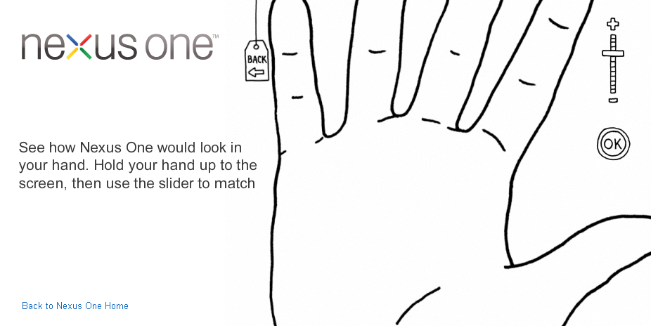
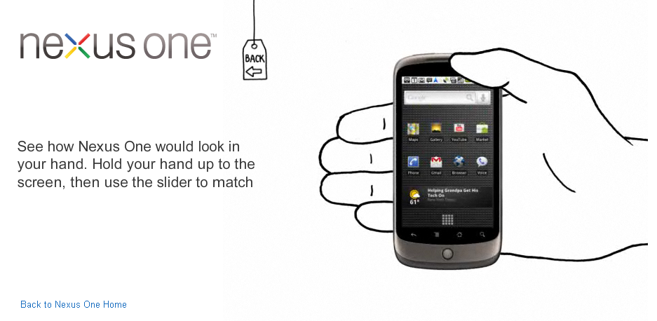
This is my favorite part of the flow. To demonstrate how small the phone is, Google shows you what it looks like within your hand... which is scaled by placing your hand against the screen and choosing the appropriate size. Clever, fun and still useful.