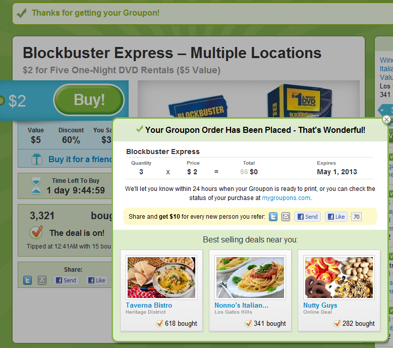
Great example of "in the river" promotion by Groupon (one of the very best at conversions and promotions). It doesn't more "in the river" than the post-purchase screen... and it doesn't distract the user during the purchase / flow. This is an obvious example but worth showing because it's clean, clear and intentionally unavoidable. Immediately post purchase:
- the screen blooms into a popup with three components
- a lightweight receipt highlighting the coupon's expiration date (important)
- a chance for users to share their purchase and receive a $10 credit (Twitter, Email, Facebook, Facebook messages). I believe it's better to promote this post purchase because you can be more aggressive (even obnoxious) about it and not interrupt the conversion
- three more deals relevant to you (as determined by sales popularity and proximity)
Also worth noting: it is far easier to A/B test and optimize these flows than it is on the purchase / check-out page. Once you've optimized this flow, you can apply those findings elsewhere.

