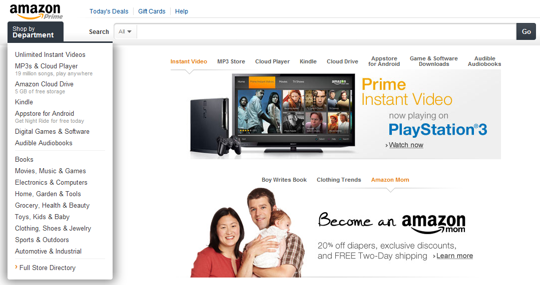
Amazon's redesign is much cleaner... and grayer than before. It also is more focused on promoting their new categories. I noted this before with their revamped navigation bar: "Amazon's Navigation bar is Revealing."
But Amazon has gone a step further here: not only does the left navigation panel promote their digital efforts ahead of physical (Instant Videos, Cloud Player, Cloud Drive, Kindle, Appstore, Games, Audiobooks, etc)... they then duplicate those categories in the center panel. Each category has it's own visual and merchandising unit.
Below the top panel is another promotional box that promotes other efforts (Amazon Mom) or curated experiences (Clothing Trends).
For what it's worth: I find the nesting of the two units a bit strange. And the units do not auto-scroll - so it's both overwhelming (and confusing) to have 10+ potential links to click.

