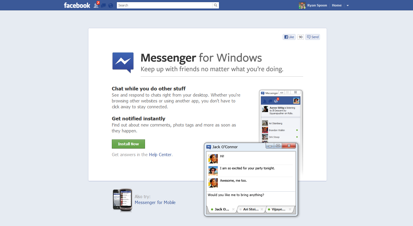
Facebook has launched Messenger for Windows. Finally - it's great. (Although I still think it's time to launch a browser!)
What's noteworthy is the download page and flow... which is unique (to me!) and a gorgeous, effective way to convert users through the download process. It's the best design of this flow I've seen.
Here's your standard marketing page - driving users to click download ("install now"). Very Facebook in its presentation.
And here is the cool part: once clicked, the lightbox appears with instructions and is situated directly over the download section of the browser (screenshot is of Chrome). The lightbox sits atop the download and instructs users through the next three steps - including getting over the biggest hurdle of the flow: converting users from download click to application open.
Beautiful and creative.


