Facebook Messenger Sans Account.

Fascinating. Really important to watch as Facebook moves to the next billion users - which is applicable to the platform and account setting here. Also marks the importance of attention to user funnels and onboarding - clearly something facebooks knows well.

20121204-095533.jpg

Facebook Launches Messenger for Windows. Gorgeous Download Design.

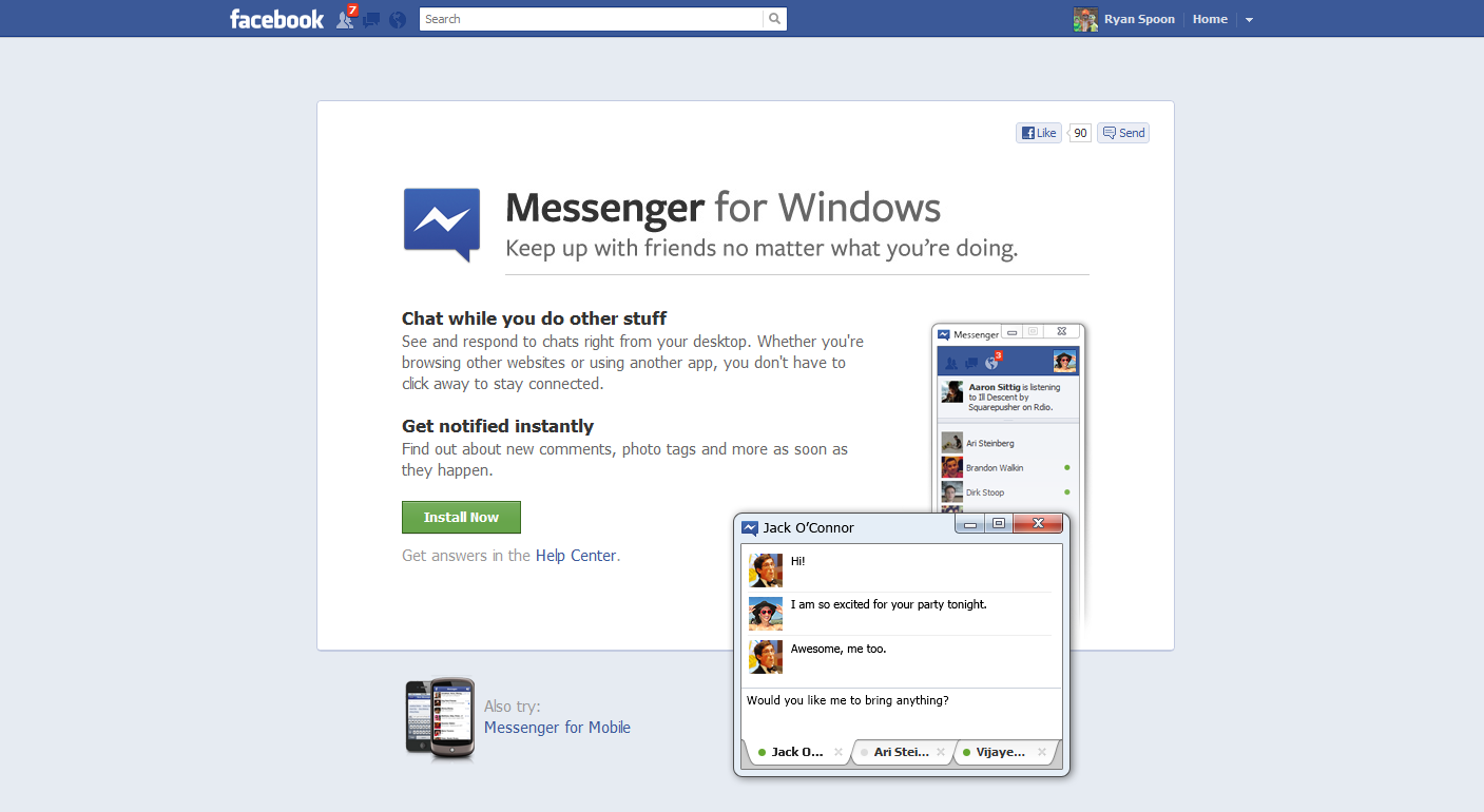
Facebook has launched Messenger for Windows. Finally - it's great. (Although I still think it's time to launch a browser!)

What's noteworthy is the download page and flow... which is unique (to me!) and a gorgeous, effective way to convert users through the download process. It's the best design of this flow I've seen.

Here's your standard marketing page - driving users to click download ("install now"). Very Facebook in its presentation.

And here is the cool part: once clicked, the lightbox appears with instructions and is situated directly over the download section of the browser (screenshot is of Chrome). The lightbox sits atop the download and instructs users through the next three steps - including getting over the biggest hurdle of the flow: converting users from download click to application open.

Beautiful and creative.

Facebook Messages: Uncomfortably Somewhere Between Chat, Messages & Email.

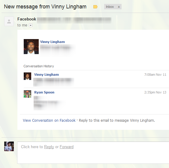
Two weeks ago I wrote that it's time for Facebook to rethink email. Facebook messages is currently a hybrid between chat and lightweight email. Considering that each of us have Facebook email addresses (ie ryanspoon@facebook.com), its could be so much more... think Google's integration of Gmail + Google Talk. Anyhow, here's another example of the confused experience between chat and email. The updates from Facebook appear less like email and more like a chat log - but they are chronologically disjointed. The top messsage is the most recent. That is followed by a randomly selected older post and that by a more recent post. Bizarre.

In the River with Twitter Images & Facebook Messenger

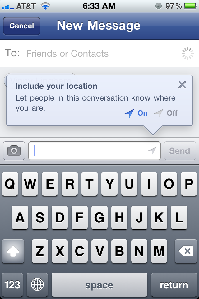
A post I drafted a few weeks ago and never published... better late than never (I think!) Two good examples of In the River promotions for two new, relatively off-stream product launches: Facebook Messenger

a new mobile application by Facebook focused on Facebook Messages. Location is a highlighted feature that is clearly more important on mobile than on the web. After download, Facebook walks users through the app's key functions - and here is how they alert you of the location feature. Impossible to miss (which is important considering privacy implications, a new feature and a small icon potentially unfamiliar to many):
Twitter Images

Very similar: Twitter released a new product feature (Twitter Images). The product concept is simple and familiar - but the act of sharing via Twitter will be unfamiliar. So Twitter displays a pop-up promotion on Twitter.com that shows the basics, the icon and a link for deeper information. Also similar to Facebook's location alert, Images is an important part of future strategy (see my thoughts here) - but also have privacy and partner implications.... so a clear product launch and description is important: