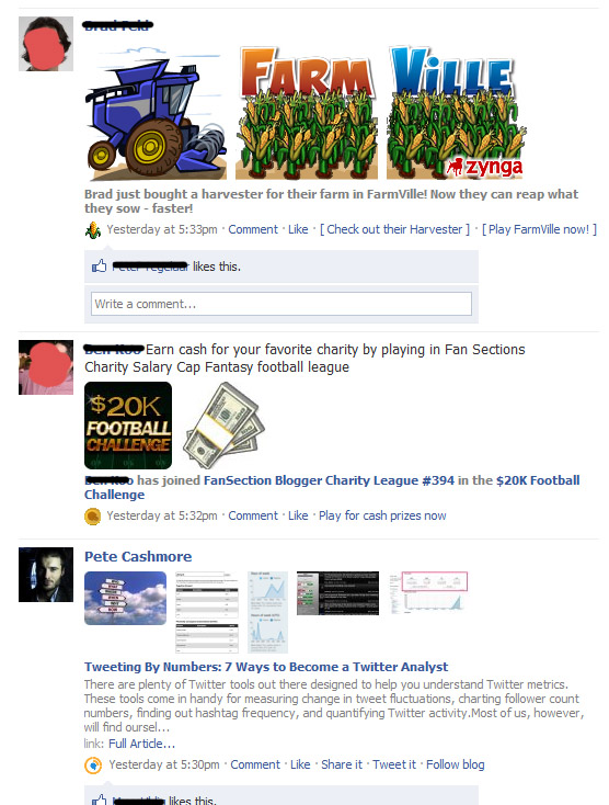
Frontierville.com: A Strange Redirect to Facebook App

Earlier this week Zynga launched their newest game Frontierville - it already has 1.3m monthly actives and 450k fans. While Frontierville's gameplay inherits many of the best practices of its siblings, its domain behavior doesn't. Zynga has made an effort to instill their own branding across the properties and place games at their own domain - like Farmville.com (screenshot at bottom). Frontierville.com however behaves differently. Rather than its own domain and embedded gameplay, it uses a frame to display the Facebook application page while maintaining the frontierville.com domain. The page itself is grayed out - but still active (showing your Facebook data and playing the Frontierville music). The page isn't actionable... but when clicked (anywhere) you are directed to the actual game and application page: http://apps.facebook.com/frontierville/

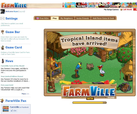
Here is Farmville.com:

Zynga's Treasure Isle: Economies of Scale in a Social World

There are two camps in the world of social gaming:- One side thinks that it has been won outright by Zynga - The other side believes that we are in the early innings of a nine-inning game No matter where you fall on this spectrum, it is clear that Zynga benefits greatly from their massive userbase (which they worked hard to amass). It is also clear that this is a major competitive advantage precisely because it is a tremendous lever to launch new titles.

Ever watched a popular television show or event and seen the constant reminder of an upcoming show on that same network? This is more powerful because it is in-browser, social and can be cleverly incentivized / connected.

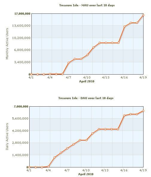
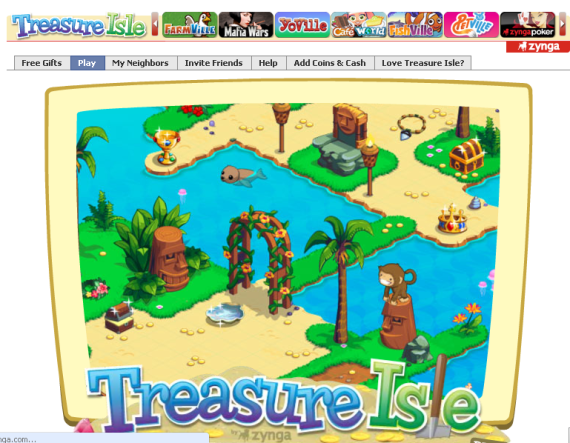
Proof: Zynga's newest title Treasure Isle is days old (launched April 6). It now has roughly 17m monthly actives and 7m daily actives. Not only does that make Treasure Isle the fastest growing Facebook App, it makes it the 16th biggest game on Facebook ... in a matter of days.

It of course helps that Treasure Isle is very well done - a generational improvement over Farmville and Cafe World. But, as many developers know well, audience collection is often tougher than building the game. Zynga has done both:

Farmville Defaults to Facebook Credits

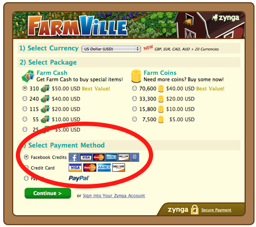
I encourage you to read Eric Eldon's piece on InsideFacebook about how Facebook's most popular game, Farmville, now defaults to Facebook Credits and Payments. As location and geo dominate the blog headlines (Twitter, Foursquare, Gowalla), Facebook Credits has managed to stay relatively under the radar... but Facebook's payments platform is important as it is going to be very big. And, despite being young, Facebook Credits is now exposed to Farmville's 84,000,000 monthly actives... that's quite the launchpad.

Facebook Widgets Play Video

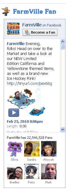
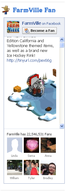
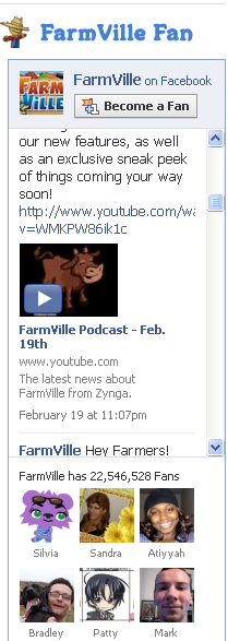
As seen in the below screenshots, Facebook Widgets now feature and play video in-line (although I am not entirely sure that this is a new release - it is my first exposure to it). These are examples from Zynga's Farmville.com - which features a Farmville Fan Widget. The widget has:

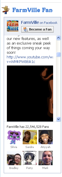
- logo - become a fan button - Farmville's feed - Farmville's fans (22.5m!) Notice that the latest newsfeed post has a video play button. Here are two examples, both of which play the video in-line: Facebook Video and YouTube. You will notice that it is still a little funky as the videos are not sized corrrectly for the widget's widget / height. Nevertheless, it makes the widget far more interactive:

Facebook Video: Example

YouTube Video: Example

Farmville + Monopoly = Settlers of Catan

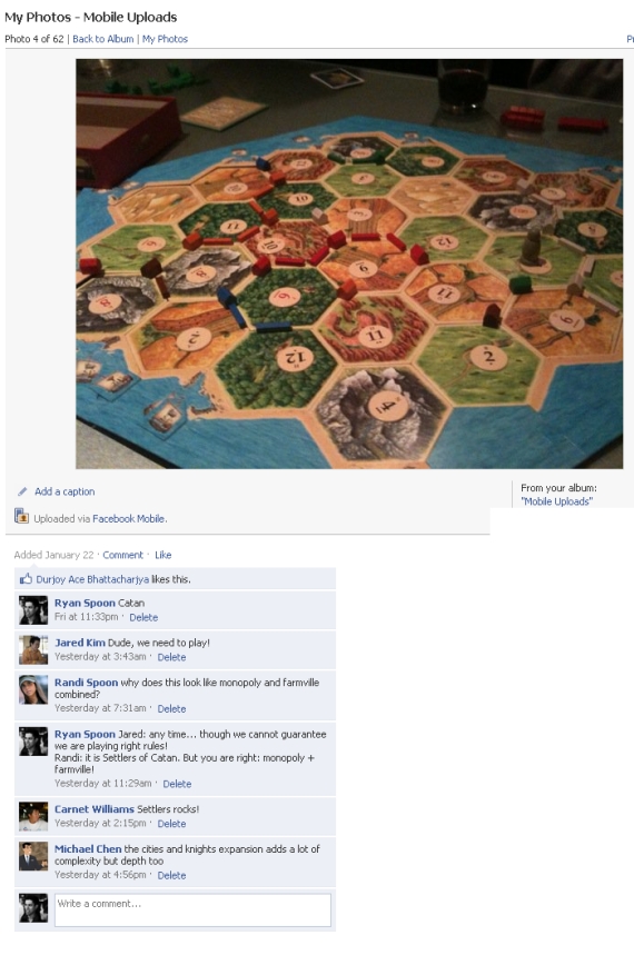
I am late the Settlers of Catan rage, which according to the Wall Street Journal, swept Silicon Valley in December. But I uploaded a photo of Catan to Facebook (shown below) and got a great comment about it: Why does this look like Monopoly and Farmville combined?

Funny how accurate this comment is and how Farmville has become a common way to describe / compare products (I recently did the same with TownMe).

MyTown Social Gaming Strategy

MyTown is best described as Zynga meets Foursquare. Take the best aspects of social gaming (Zynga) and combine them with location based networking (Foursquare, Gowalla, Yelp) and you have MyTown: a game that awards points based on live social game mechanics built atop location-based check ins. You can own real properties (akin to being the mayor) and then collect rent (similar to Mafia Wars, Farmville) based on popularity and live activity (again like Foursquare).

MyTown's point structure is particularly clever and powerful because it creates an incentive structure predicated on routine usage and social sharing. Two great examples that were perfected by Zynga:

1. Deprecation. Farmville is the master of this: because rents cap out at a specific amount, users must collect rent regularly (ie hourly) to maximize potential revenues. As a proxy, if you do not return to harvest your crops in Farmville, they actually deprecate. 2. Social Sharing. Check-ins are rewarded with points (ie 150 points). But large bounties are provided for social actions like: connecting the MyTown account to Facebook Connect, broadcasting your location via Facebook and/or Twitter, and adding commentary on the location.

Below is a strategy to MyTown from town billionaire Kirk Nguyen. Fascinating stuff:

Try to maximize your points payload with multipliers. It's a combination of using multiple multipliers, obtaining the multipliers that yield the most return, and holding out until your base check-in worth is substantial enough (think long-run diminishing returns).

Upgrade as soon as you can, but it starts to get costly after level 5 or 6. Once the upgrade cost got to $7+ million, I bought free upgrade power-ups to maintain my cash for purchasing properties padding my towns total worth.

Finally, keep an eye on trending, number of owners, and popularity - ESPECIALLY popularity: it determines the maximum property value and maximum rent cap.

And if you want to stay on top of the leaderboards for your properties (and other non-owned properties), only keep local properties in your stable. I was in SF last night and bought some high-value properties, but then realized that I couldn't buffer my leaderboard weight for them when I got back into San Jose. I'll probably sell them sometime soon. Oh well, see ya Adidas Concept Store!

All in all, I try for check-ins worth between 45k-60k points, single-ownership of long-lasting, high-popularity businesses, and I collect all 20 of my level 11 property rents with one click.

Once you start rollin', you'll see how ingenious Booyah!'s micro-transaction business is. They made it very accessible and compelling.

My town is worth $2.5 billion, but I feel I could be doing better.

Good luck and happy hunting!

The Role of Ego, Competition, Badges & Statistics on the Web

Over the last three nights and dinners, the same debate has arose among three separate groups of friends: the role of competition within the the web and user behaviors.

My strong feeling is that, other than pure content digestion (like reading the New York Times), the web is driven by ego. Ego does not necessarily mean self-adoration or superiority - but it does mean the desire to be publicly thought of as interesting, smart, authoritative, popular, etc. And, equally important, the desire to be display improvement across those traits.

Competition thus is a key component of ego and the public persona because it signifies rank and progress.... and it incents activity. It is why 100,000s of people review products on Amazon; why millions blog; millions more post status updates to Facebook and Twitter. I am guilty of all of these (and many more).

Badges play a critical role because they: 1. signify authority and reputation 2. incent continued activity and growth 3. encourage users to promote their successes From Amazon Reviews to Foursquare badges, users want to continually unlock new badges and then gloat about their 'rank' once it is achieved. When I launched eBay Reviews & Guides, our team thought long and hard about the number of badges available, how they would be represented and (importantly) the spread between different achievements. As we predicted, user activity was highly correlated with the desire to be viewed as authoritative and well-read.

Below is the profile badge for Harriet Klausner, a librarian and the #1 reviewer on Amazon with over 110,000 votes on her Amazon reviews, lists and guides. Harriet has reviewed over 20,000 items and her reviews are far from short - normally thoughtful paragraphs that are well-written. Why does she review 1,000s of items a year? I don't know but assume it is part knowledge base, part an interest in sharing and part a desire to maintain her 'fame' and #1 reviewer status:
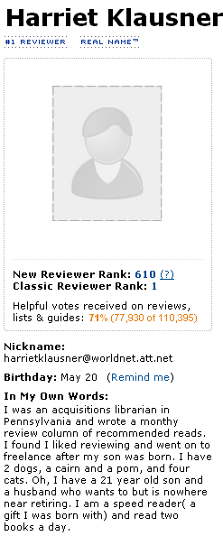
HARRIET KLAUSNER Amazon

MySpace figured this out early on by publicly displaying friend counts and lists - a public popularity widget of sorts. Have you ever been in a conversation where you are asked "How many Facebook Friends / Twitter followers or LinkedIn connections you have?" It is as much a question of curiosity as it is a measurement of their own activity.

Understanding this (and that it is subconscious root of so much of our web and social activities), I ask for more. I would like to see same game mechanics that make Farmville so popular applied to my personal web usage.

Below is a screenshot of my favorite iPhone App, Golfshot, which applies detailed statistics to your golf rounds and history. It is amazingly addictive and powerful (the data unquestionably improves my golf game):

greens in regulation

I want to see deeper statistics around the web activities I spend so much time on (Facebook, Twitter, blog, email, etc):

- Which of my Facebook posts are most popular? - Which friends interact most with my content? Does that change by content type? By interaction (like, comment, share, etc)? - How does my activity compare with others in my graph? - Who do I message most on Gtalk? Email? How often do we talk? Who responds most promptly? - How have my activity and social graph changed over time?

There are countless ways to represent activity, engagement and progress... and I want to see more - particularly presented in statistical, data-heavy manners!
Facebook Newsfeed: Now Just One Image (Rather than Three)

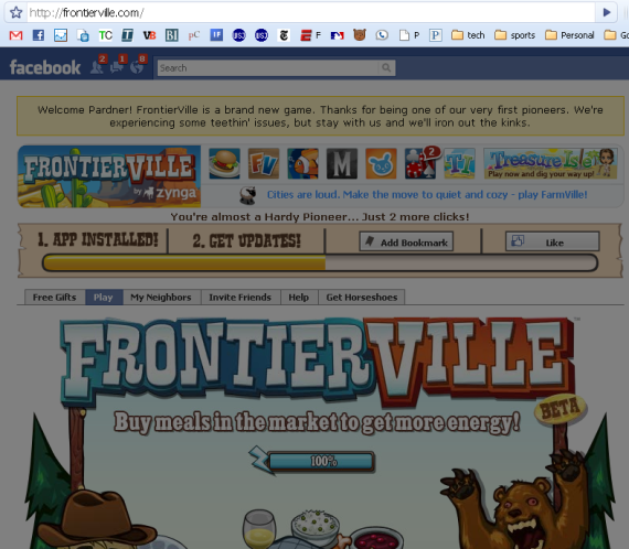
I have recently written several posts on the importance of promotion within Facebook's newsfeed and the growing trend of larger (and more annoying) imagery. Facebook has clearly noticed because, according to InsideFacebook, they have issued a new platform policy requiring publishers to use one in-stream image.... meaning, users shouldn't see three-image mosaics for applications like Farmville and Zygna:

Using Multiple Images in the Facebook Feed (Zynga's Farmville as an Example)

Facebook's newsfeed is a powerful lever to message users / fans, reach larger audiences and drive traffic. Like any marketing efforts, positioning and timing are important elements (a good reason to use services like Bit.ly and to carefully monitor referral traffic).

Publishers and application developers are well aware of this are getting more creative - and aggressive - with how they utilize the Facebook Feed. One of the most important changes is the inclusion of more imagery in the feed and through Facebook Connect - instead of publishing a single photo, developers like Zynga include multiple images to create a much-larger, more attractive one. Zynga, who is always at the leading edge of understanding and capturing virality, does this very well with their new hit (and fastest growing game yet): Farmville. The images are bold, great-looking and represent achievements related to the players' most recent activity.

farmville-icon Similar techniques are being applied by other application developers and to blogs (posts often have multiple photos). Considering that the feed updates in real-time and your network might post hundreds of times each day, standing out is as important as it is difficult.

Facebook Feed Zynga

Also of note, Rails Rumble competitor FastFeud.com employed similar techniques: when a user posts a matchup to Facebook, the feed contains an image for each item and a "vs." sign.