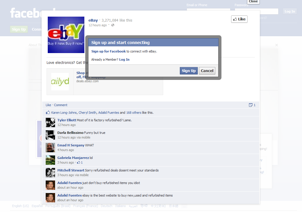
Facebook homepage ads have begun. They are effectively static full page takeovers with a Facebook module overlayed in the bottom right corner. In this example you see an ad unit for eBay's summer electronics event. On the right corner is a mini-Facebook ad unit (as you would see it on the right column of a logged-in page): it contains the copy / creative and like / share buttons. It's prime real estate and a huge unit... even if on the log-out screen. The interesting note however is that, when users are logged out, the social features are obviously not as effective... for instance, users cannot like, share or comment with a single action because they are not logged in. I suppose this is a necessary consequence of taking over the homepage. To solve this, you would need to prompt users much more intrusively: on their feed page.
Facebook as a Conversion Tool. Registration Flows as Example.
It is common to think of Facebook as user / traffic acquisition lever (perhaps the best available considering its 600m users, its viral network, and the developer platform and tools). But thanks to a recent, enlightening conversation with good friend Alex Schultz, I have been thinking of Facebook as a conversion tool. A basic example is Facebook's Like buttons and Facepile which adorn millions of webpages. Combined, they welcome new users to otherwise impersonal webpages. This adds social and personal context to individual pieces of content and increases the likelihood of engagement (whether that be pageviews, shares, etc).
Yesterday, Facebook updated its Registration Plugin to streamline user registration:

Registration flows are obviously among the most critical part of the user funnel. Flows that are too cumbersome are overwhelming and scary...and flows that are too lightweight require progressive registration processes as the user matures. The above example is an excellent example of how Facebook can affect conversions.
Here is a live example on eBay Classifieds:
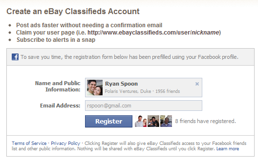
It does a four key things well:
1. It is pre-populated with key information (name, network, photo, etc). Not only does this create efficiency - it validates quality
2. Thanks to Facebook's brand, it is familiar and unintimidating.
3. The Facepile adds social context and is welcoming. Along with point #2, this is particularly important if traffic is arriving from ad campaigns, search engines, etc.
4. It is lightweight (publishers can choose to add fields relevant to the product)
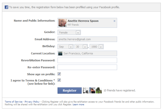
And here is another example from ReverbNation. It is a longer registration flow but you will notice that it is consistent in style and much of it is automatically populated. In fact, the only remaining step is creating a specific ReverbNation password:
Game Mechanics, Badges & eBay Feedback Ratings
Thanks to the success of Foursquare, Booyah / MyTown and Zynga, "game mechanics", "badges" and "leaderboards" have become cornerstones of any web marketer's dialect and user-acquisition strategy. What these three companies have done so well is figure out how to apply game mechanics to the core experience... in a way that is fun, on-brand and - most importantly - adds value to the users. As an example, anyone can add badges or leaderboards to their product - but if it is merely a front-end layer, it won't stick. And as more companies race to understand and apply game mechanics, differentiation and core integration becomes even more important. Not to take anything away from Foursquare or Zynga - who I have great respect for - game mechanics are not new concepts. Mainstays like eBay and Amazon have been applying game mechanics to their core businesses for years.
One of the great examples is eBay's seller rating system... which is represented by stars.
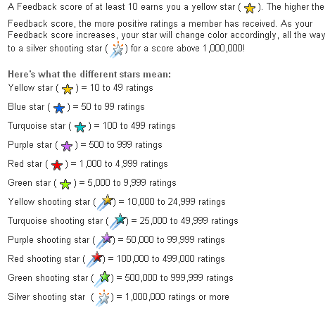
It does several things well:
1. Clarity: it clearly and obviously conveys reputation
2. Persistence: it travels alongside the username throughout the entire eBay experience
3. Value-Add: the reputation system adds value to the buyer and to the seller
4. Incents Behavior: sellers fight very hard to foster their reputation and earn new stars. It also fosters communication between buyers & sellers.
5. Drives Activity / Engagement: there are gaps between each 'reward' that drive activity and excitement. But the goal is transparent and well-defined.
6. Marketing Opportunities: for eBay marketers, it is an opportunity to engage customer segments. Your first star, for instance, is welcomed with a congratulations email and certificate.
7. Scarcity: the higher level stars are earned by a select few (1,000,000 ratings!). For them, it is a badge of honor that extends on AND off eBay.
In summary: think about how game mechanics apply to your core product and brand... and how it adds value to your users. Game mechanics are powerful only if fully weaved in to consumer experience and mentality.
For fun: check out the Wikipedia page of Foursquare's badge list.
E-Commerce on the iPad: Gilt Group & eBay Help Us Imagine
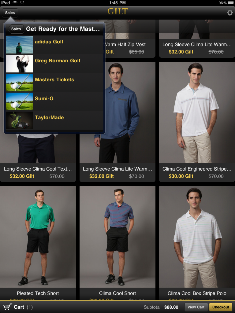
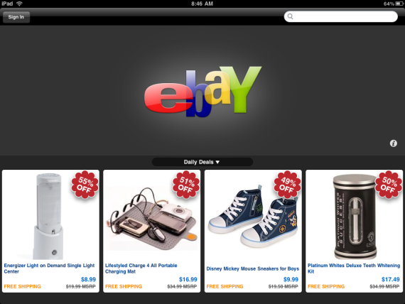
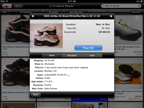
Not because I shop regularly on Gilt Group or eBay... But I encourage iPad users and folks within e-commerce to download their iPad apps... Because it represents that potential of what e-commerce can look like atop the iPad (or extracted beyond: our new wave of computing / mobile devices).
With its large, crystal clear and touch-enabled screen, the iPad enables developers and brands to think more creatively... and in the same way that we were all encourage to think about consumers in the transition from web to mobile browser / app - we again have that same opportunity. So with Gilt Group and eBay, we have two iPad applications that were available on launch, sit in the iTunes top twenty apps and provide unique, powerful experiences different than the web or iPhone apps. These are good directional glimpses of e-commerce on the iPad:
- super simple layouts with very clear action items: browse and bid/buy - both have huge, colorful pictures - with color, layout and clear actions, both encourage serendipitous browsing - images are highly interactive - swipe them to see additional views - Gilt's navigation is nested and reminiscent of the iPad's email system - very clever - Gilt also uses the push notifications to alert users of new sales (interesting concept for flash sales, low inventory, etc) - Gilt provides an incentive / reward for download: iPad owners get to circumvent the 'exclusive' invite process and register directly

Where is the Desktop Widget Innovation?
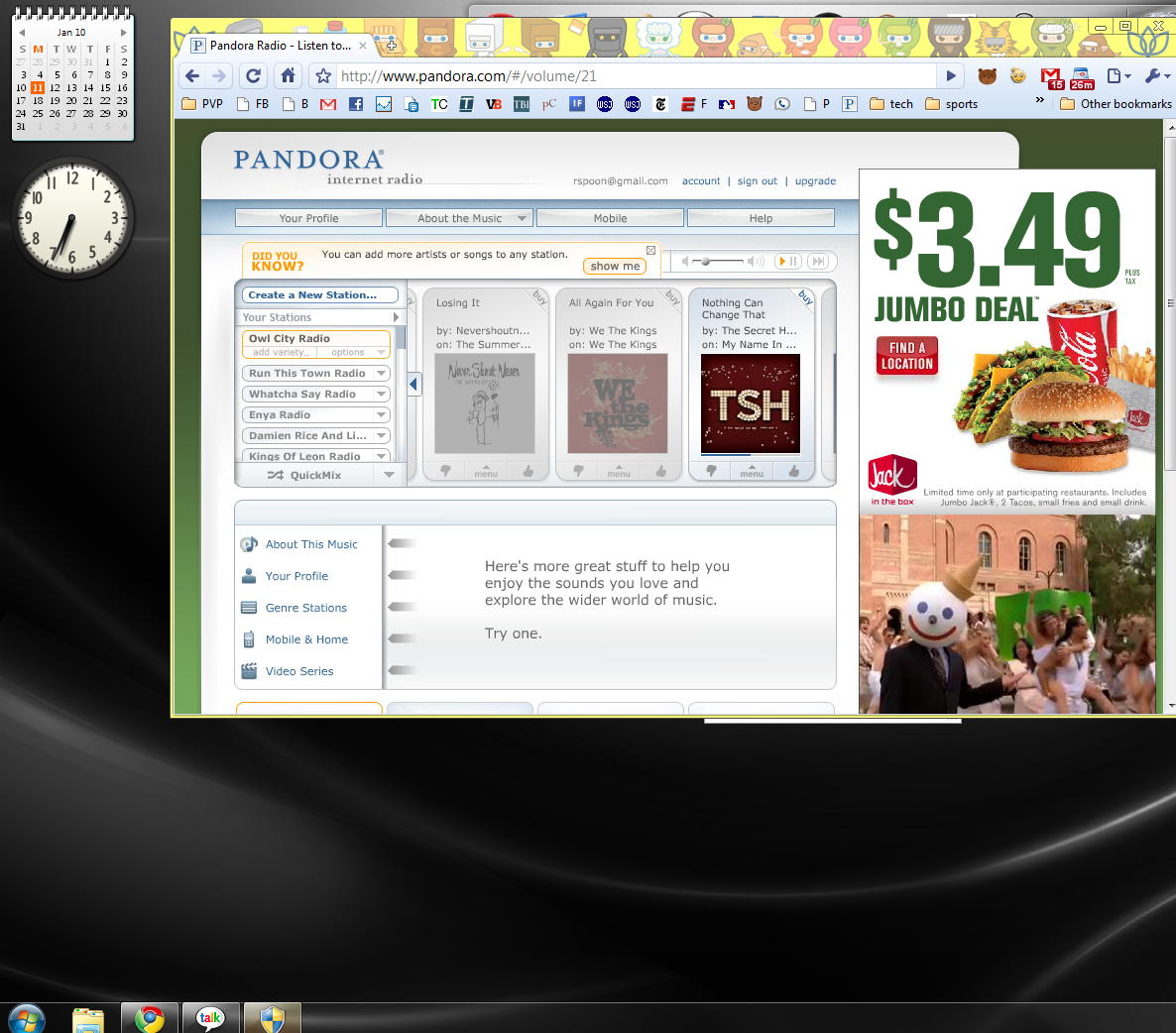
In all the developer attention paid to mobile, Facebook and web-based applications, "desktop widgets" have been the big loser. They were thought to be a major selling point when Microsoft Vista was launching - and in part because Vista was not a success, and in part because they are inherently not viral (and we now live in a viral world), there has been no significant innovation or movement in the desktop widget space. In fact, the same batch of widgets from my first developer install of Vista years ago remains the most popular and useful widgets: calendar, clock, Weatherbug, RSS and eBay. As I set up my new Windows 7 machine yesterday (Dell Inspiron Zino HD = awesome), I was struck by the lack of innovation, creativity and inventory. I certainly understand it - if you had to develop against Facebook, Android, iPhone or the desktop, there is a clear fourth place for most companies / brands. The most important factor is the viral nature of Facebook and mobile - and the available toolsets / APIs to increase virality and therefore distribution. Nevertheless, the desktop represents something very valuable and important: persistence. Mobile applications can leverage push notifications (and other hooks) to encourage engagement - but the desktop is, by definition, always there. For the right applications (weather, calendaring, etc), this is an opportunity. Think about the recent Google Chrome extensions and how quickly developers produced great applications... in a Chrome world and a Chrome OS, what if they were also desktop widgets? They would be able to function similarly and it would be another distribution lever for the developers.
eBay's "Come to Think of It" Campaign Arrives on Gizmodo
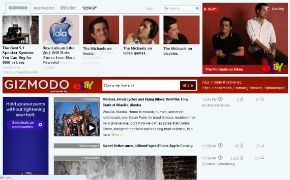
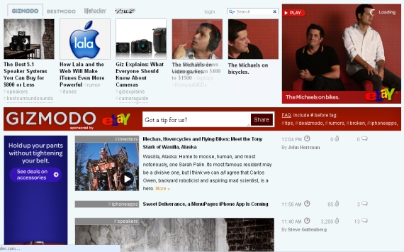
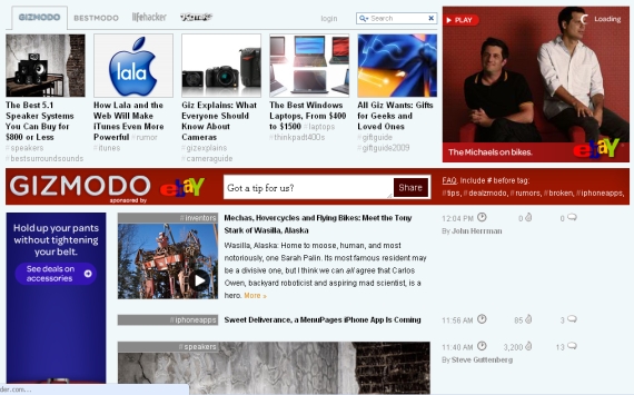
eBay's "Come to Think of It" advertising campaign is all over television... and is now making its way across the internet as well. The below screenshots are of a matching campaign on Gizmodo. The ad units feature the stars from the TV spots ("The Michaels") and the color scheme is very much eBay (which is quite bold on the Gizmodo layout). The interesting part about the ad units is its interaction with Gizmodo's standard navigation pane and content. The ad begins across the top of the page and then fades to reveal each of the 'featured' story tiles. It draws the eye to both the eBay units (including the bigger 300x300 unit) and it brings attention to the 'story' tiles (which is also in Gizmodo's benefit).
Apple's Latest iPhone Advertisement: All About Big Brands
In March, I wrote about Apple's full page advertisement in the New York Times touting the iPhone as a weekend tool: "Getting the most out of your weekend, one app at a time."
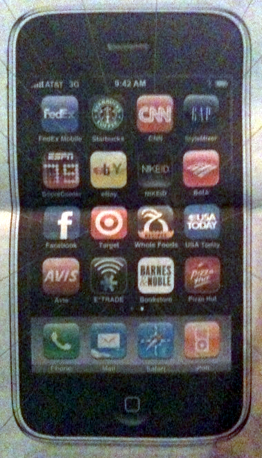
In yesterday's New York Times, they ran a continuation of the ongoing campaign - but with a slight twist: promote the branded apps (I wrote a post this week about seven of the best branded iPhone apps):
"It's pretty amazing who's on the iPhone these days. From CNN to Nike, Starbucks to FedEx, there are over 100,000 apps for just about anything. Only on the iPhone and the nation's fastest 3G network." It is a poor photo, but you can see that each of the applications comes from a very recognizable name: Nike, Starbucks, eBay, CNN, Gap, ESPN, Facebook, Target, Bank of America, Whole Foods, CNN, USA Today, Avis, eTrade, Pizza Hut and Barnes & Nobles.
Also of note, other than CNN's $1.99 app, all of these applications are free. In many of Apple's advertisements - and certainly in their app recommendations - they tend to promote paid applications... but here, the brand names are intended to sell hardware and reputation rather than micro-purchases.
The Role of Ego, Competition, Badges & Statistics on the Web
Over the last three nights and dinners, the same debate has arose among three separate groups of friends: the role of competition within the the web and user behaviors.
My strong feeling is that, other than pure content digestion (like reading the New York Times), the web is driven by ego. Ego does not necessarily mean self-adoration or superiority - but it does mean the desire to be publicly thought of as interesting, smart, authoritative, popular, etc. And, equally important, the desire to be display improvement across those traits.
Competition thus is a key component of ego and the public persona because it signifies rank and progress.... and it incents activity. It is why 100,000s of people review products on Amazon; why millions blog; millions more post status updates to Facebook and Twitter. I am guilty of all of these (and many more).
Badges play a critical role because they: 1. signify authority and reputation 2. incent continued activity and growth 3. encourage users to promote their successes From Amazon Reviews to Foursquare badges, users want to continually unlock new badges and then gloat about their 'rank' once it is achieved. When I launched eBay Reviews & Guides, our team thought long and hard about the number of badges available, how they would be represented and (importantly) the spread between different achievements. As we predicted, user activity was highly correlated with the desire to be viewed as authoritative and well-read.
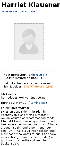
Below is the profile badge for Harriet Klausner, a librarian and the #1 reviewer on Amazon with over 110,000 votes on her Amazon reviews, lists and guides. Harriet has reviewed over 20,000 items and her reviews are far from short - normally thoughtful paragraphs that are well-written. Why does she review 1,000s of items a year? I don't know but assume it is part knowledge base, part an interest in sharing and part a desire to maintain her 'fame' and #1 reviewer status:
MySpace figured this out early on by publicly displaying friend counts and lists - a public popularity widget of sorts. Have you ever been in a conversation where you are asked "How many Facebook Friends / Twitter followers or LinkedIn connections you have?" It is as much a question of curiosity as it is a measurement of their own activity.
Understanding this (and that it is subconscious root of so much of our web and social activities), I ask for more. I would like to see same game mechanics that make Farmville so popular applied to my personal web usage.
Below is a screenshot of my favorite iPhone App, Golfshot, which applies detailed statistics to your golf rounds and history. It is amazingly addictive and powerful (the data unquestionably improves my golf game):

I want to see deeper statistics around the web activities I spend so much time on (Facebook, Twitter, blog, email, etc):
- Which of my Facebook posts are most popular? - Which friends interact most with my content? Does that change by content type? By interaction (like, comment, share, etc)? - How does my activity compare with others in my graph? - Who do I message most on Gtalk? Email? How often do we talk? Who responds most promptly? - How have my activity and social graph changed over time?
There are countless ways to represent activity, engagement and progress... and I want to see more - particularly presented in statistical, data-heavy manners!
The Changing AdWords, Paid Search Landscape - And What it Means
Interesting data out of Comscore and TechCrunch this morning that points to the slowing growth of paid search activity despite a rise in search activity. Comscore believes it is a consequence of longer search queries, but Michael Arrington has a larger picture answer (which I agree with):
U.S. Search queries are up 68% in the last year, but paid clicks are up only 18% in the same period...
he reason there are less ads on search results, I believe, is that there are, simply, less advertisers. Far less. Big spenders, the category leaders, are just gone. Sharper Image, Wickes Furniture, Levitz, Foot Locker, Wilson’s Leather, Ann Taylor, Zales, Mervyn’s, Macy’s, Circuit City and a ton of other retailers are either shutting down entirely or closing lots of stores. And more are on the way. All of these companies used to spend tons of money on paid search ads. Those budgets don’t exist any more.
Combine that with the fact that, as any paid search advertiser knows, it is downright hard to spend more money effectively. SMBs face the same problem: scaling paid search spend in both click volume and conversions.
And - let's not forget that the affiliate landscape is rapidly changing. Affiliates once accounted for a major portion of AdWords spend (either directly or by indirectly bloating the prices of keywords). As major affiliate programs have changed their policies (ie Amazin prohibiting paid search), an entire tier of sophisticated marketers disappeared.
So in a move that certainly is not coincidental, Google yesterday announced that AdWords advertisers can now bid on brand terms. Wow. That is a very significant change - both directionally and operationally (for advertisers and Google alike).
Brands spend countless hours protecting themselves. And that, until now, has included protecting themselves in paid search. Meanwhile, competitors or savvy arbitragers (affiliates, etc) have long capitalized on branded keywords. Early on at eBay, for instance, we had to specifically prohibit bidding on eBay's brand - which included numerous derivatives of eBay, Half.com, etc.
I am sure Google has operational reasons to allow brand bidding: it is both messy and intensive to protect the brand names (and not always accurate or fair). But this is clearly a move that is intended to drive revenue by reopening high-traffic keywords.
Expect related CPCs to rise, brands to complain loudly, and affiliates to scramble immediately.


