My 2013 Digital Habits

It's an annual geeky, blogging tradition: share those products and services that have made their way into your daily routines. It's a simple reflection on those experiences that have become meaningful, those that have become less relevant, and those that others find interesting and useful. Mike Arrington used to publish an annual, very simple list of "Products I Cannot Live without": 2009, 2008, 2007, 2006. And like many others, I did the same. It's fun to revisit them and see which habits have stuck and, much more likely, what's changed.

So continuing the tradition - here is a simple, incomplete version of those products I use habitually in 2013... and notice that most of mobile focused and freemium models.

Personal, Work, Utility

Spotify (Premium) I've been a paying subscriber from day one and have always thought that their pay-for-mobile-model is brilliant... it allows users to get hooked through the desktop & web (their web product is a little-known gem), build playlists & favorites on the best and biggest screen available, and then roadblocks mobility. Smart.

Side note: Sean Parker's Hipster International is a great lesson in the power curation. Forbes has a great piece on it.

spotify

Evernote (Premium) Organize the web, your email, images, and so forth. The Chrome extension is fantastically done. And their mobile application suite gives quick access to important documents from any device, anywhere.

Dropbox (Premium) Like Evernote, it's a product that I use multiple times a day - personally and professionally. And like Evernote, it becomes more powerful (and habitual) as I move between different devices and locations. Between products like Evernote, Dropbox, SpaceMonkey, iCloud, Gmail, etc - I could purchase a new computer tomorrow and be fully setup / connected minutes later.

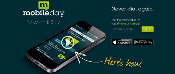
MobileDay Such a simple, time-saving app: one-touch dialing into conference calls.

MobileDay_–_One-Touch_Dial_Into_Any_Conference_Call_On_Your_iPhone_Or_Android

Nike+ Running I have used all of the wearable devices (Jawbone Up, Nike Fuelband, Fitbit) - but, while each is impressive in its own way, I haven't made one part of my daily routine. I continue to come back to the old-reliable Nike+ Running app. The app is well done, relatively accurate, social and fun.

MyFitnessPal Simply and effectively monitor your eating habits and caloric intake. The interface (on iOS and Android) is simple and many foods can be uploaded through bar code scanning. And while MyFitnessPal is part of my daily routine - the power of the application is that it changes your routine. (Note: I am an investor)

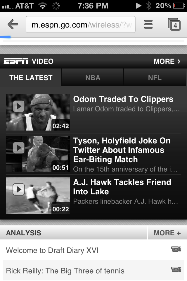
ESPN SportsCenter Of course it's a biased habit, but I use the SportsCenter application several times a day for scores, news, and video.

StoryBots This is less about my daily habit - and more about my three-year old son's... but Dillon uses the StoryBots suite of mobile applications almost daily. Their digital books and learning videos are fun and smart. StoryBots is created by JibJab and has a premium, monthly subscription. A great, related read: the New York Times' Babes in Digital Toyland piece over Christmas weekend. (Note: Polaris is an investor)

storybots

Amazon Prime (paid) Our house runs on Prime... and has for years. From diapers to foods to gadgets. And based on holiday 2013, 20m other households now run on Prime too.

Also: Amazon's Instant Video (free with Amazon Prime) is a remarkably under-the-radar, under-appreciated service. The library rivals that of other services and the kids content is really expansive.

TestFlight (paid) A necessary, efficient tool to provision access to application builds. We use TestFlight internally and externally - from testing to PR. Similarly, I use TestFlight to test and play with friends' or portfolio's applications.

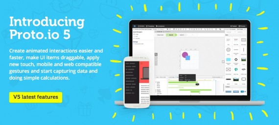
Proto.io (paid) There are several tools available for quick prototyping... About a year ago I played around with Proto.io and have been actively using it since. Really intuitive and simple way to craft quick prototypes, distribute them and collect feedback. Excellent product.

Proto_io_-_Silly-fast_mobile_prototyping_

Jot Pro I do a lot of light-weight product sketching on my iPad and have gravitated to the Jot Pro stylus by Adonit. It's sturdy, accurate, and cheap. I tend to use the Noteshelf iPad application... but anything will do. Side note: Adonit and Evernote have teamed up on a new stylus... I have not played with it yet, but it looks intriguing.

Skitch (an Evernote Product) I use Skitch multiple times per day - almost always via the the Mac OS app - although the Chrome Extension does the job as well. It's a simple, effective way to do quick screenshots, light-weight editing, and sharing. The Evernote integration easily saves images to specific folders (although it can be a memory hog if you're not a premium user).

Social

FaceTime From family to work calls and candidate interviews, FaceTime is tremendous and far preferable to a phone call. But when video is not an option: try FaceTime audio. It's digital over wifi (so saves minutes) and the quality is remarkably crisp.

Photography Suites (paid) So many applications and photo tools - it's impossible to list them all... but I'll try with those that I use regularly: - Path, I still consider Path's lenses and filters to be the best - Camera+, great for shooting photos on iOS - Instagram, the quality of the content stream is remarkable. From friends to special-access accounts like Duke Basketball - Photoshop - Apeture, lightweight editing and management - Skitch, less around photos and more around screen caputres

duke bball

Facebook & Facebook Messenger More and more of my communication has shifted to Facebook messages... and much through the Messenger application.

Hardware

Apple TV & ChromeCast Each TV in our house is connected to either an Apple TV or a ChromeCast. With Apple TV, you have iTunes Radio and the immediate accessibility of movies, Netflix, Watch ESPN, etc. ChromeCast is remarkably simple and priced perfectly. And if you have a ChromeCast, here are 10 tips to get more out of it.

iPad Air I use my iPad Air more than any other device - including my laptop. It is so light and so fast. The most incredible part: it is as powerful as the original Macbook Air (2008). And if you cannot get over typing on the iPad, get a <$100 ultra-thin bluetooth keyboard.

Google Nexus 5 Not enough attention is given to this device. It is cheap ($349 unlocked), fast, light, and runs on native KitKat. I love the form factor and the Google Now / OK Google integration is fantastic.

nexus5

NiteIze Gear Ties These things are brilliant and I go through them like candy... simple way to keep your cables organized. With daily use, they last 6-12 months and are an easy add-on to any Amazon order.


geartie

Mailbox and Innovation Around the Mailbox

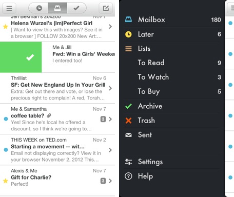
I have intentionally attempted to shift my mobile habits to take advantage of new, well-done applications. I tried to replace iOS's safari with Google's Chrome application. And now I am trying to replace the core iOS mail app with Mailbox. In trying to do so, three obvious points come along: 1. There is much innovation to be done around core experiences. Ones that come to mind: MessageMe for messaging, Mailbox for mail, Chrome for browser, Tempo for calendar, etc.

2. It is really hard to break personal habits. Regardless of whether or not I prefer Chrome to Safari - I am rooted historically and routinely in Safari. I like the Chrome browser a lot, but find the littlest things annoying - not because they are poorly designed or created, but because they are different than where I habitually expect them to be.

This of course is in conflict with point #1 above: innovation challenges habit. And habits are hard to break.

3. It is far harder (nearly impossible?) to break device habits. What I mean by this: if you really prefer Mailbox to iOS mail - you have to go out of your way to use it as a default... and it is even more challenging in the Chrome example. Being built into the core OS is such a huge hurdle to overcome - and while it may not stifle innovation, it stifles adoption.

Of course it is different from OS to OS (Android's flexibility is why apps like SwiftKey are so great and so popular) - and even more complicated with various device / hardware layers.

mailbox app

Google's High End Chromebook Pixel

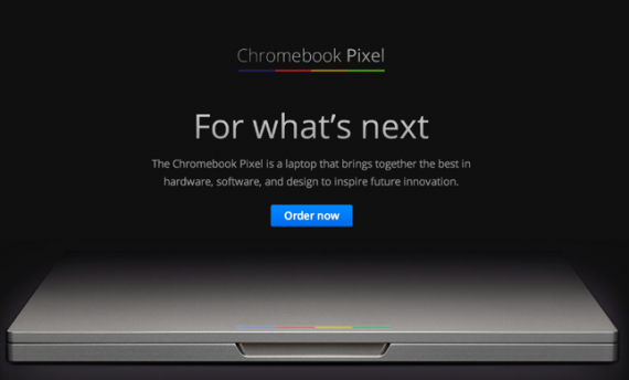
Let me preface by saying that I am typing this on a Macbook (15" Retina) and love the device. And I have previously not been attracted to the Chromebook series for a variety of reasons: namely form, function and unclear ability to replace either my laptop or iPad. But the Chromebook Pixel is different - and I would argue much more important... regardless of whether you consider it attractive or compelling.

Four quick reasons I think it is important to at least learn more about the Pixel. Note: The best write up I found was on The Verge.

1) Google is getting in the high-end hardware game. You may not buy it and you may find it expensive: but it's great looking, matches the retina display, etc. And it signifies a very different move for Google: both in market placement and market entry (see Google Store rumors here).

2) It is entirely cloud based. This continues the Chromebook line and concept. And the pricing has caused debate considering the reliance on cloud. But again: it's important because it signifies a major shift: browser base, software in the cloud (my take here - even on Apple) and tie in to Google's wider world (ie google drive as the memory)

3) SIM card enabled. My biggest want in my laptop is LTE. It's coming of course and will be everywhere. The Pixel has it first.

4) It is touch enabled. And seems to do a good job with that. Like point 3 above, its coming everywhere. But again: the Pixel has it. And again, whether you want to buy a Google laptop or not, it is important in what it represents: cloud, mobility and touch.

Google Chromebook Pixel

Google Chrome for iOS: Two Unique, Nice UI Treatments

With the launch of Google Chrome for iOS, I committed to swapping out my iPhone and iPad's Safari browser (of course I can only do this on the dock - Safari cannot be replaced as the browser from core applications like email, etc). I did this in part because: 1. I wanted to try Chrome (as compared to Safari) 2. I was drawn to the Google account syncing and UI enhancements 3. I wanted to understand whether a browser shift is really doable (considering Safari integration, habit, etc)... no matter how great Chrome may or may not be.

The attraction to chrome is it's gloss: it's really a beautiful product and interface. Two small examples I wanted to highlight:

1. When you open the browser, it inherits the last-opened page and renders it in black & white while the page refreshes. I have no idea why I find this is great... but I really do. It's more 'cool' and good-looking that useful - but it there is a benefit to it: it shows that the page is out of date and reloading.

2. For whatever reason, most iOS applications (both by Apple and third parties) use horizontal sorting - in other words, you navigate by moving right or left (ala the homepage). Google Chrome's 'tabs' concepts moves vertically. Pages layer atop one another and you drag through them to access other open tabs. Based on the speed and touch, it either scrolls or highlights a particular tab. It's a very natural way to sort and is also good looking.

It's Time for a Facebook Browser, Web App.

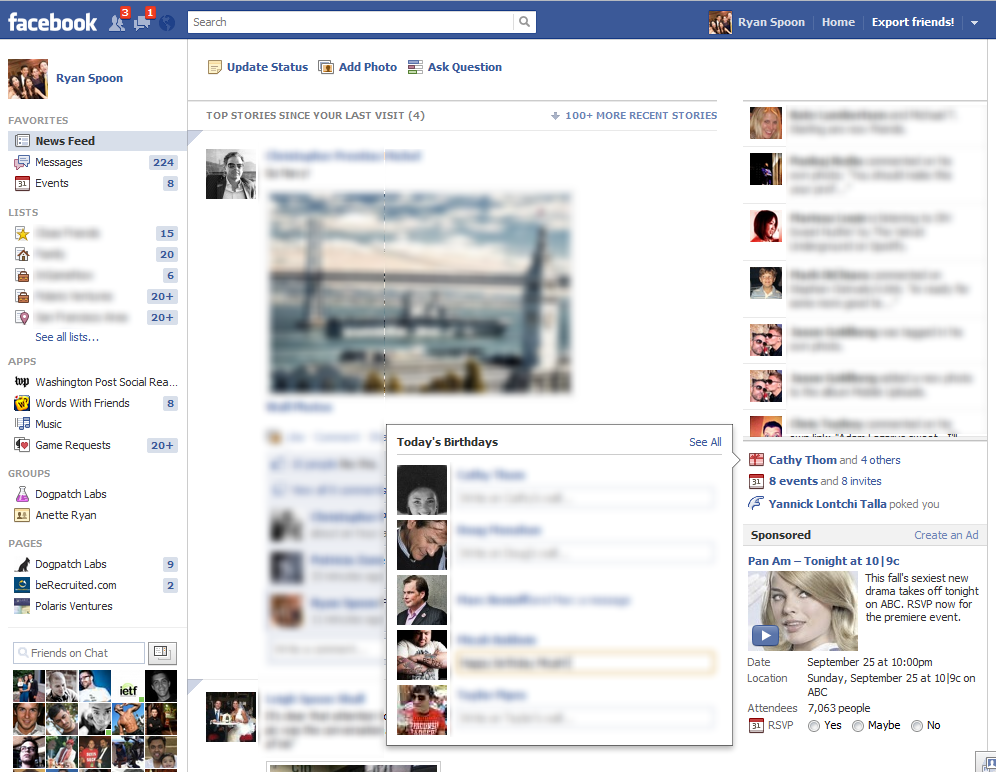
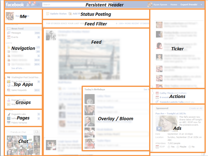
More functionality & features often means more business & complexity. And as Facebook continues to roll out features, the experience can be crowded. To Facebook's credit, the site is remarkably clean considering the long list of features it needs to include. Below is a screenshot of my normal Facebook web experience - and then an overlayed mapping of what each page portion is. The takeaway is: there's a ton of stuff here and it's time for a true Facebook browser and web app.

Chrome, Extensions, Google+ & Facebook.

Anything wrong with this picture?

It's how I am now browsing the web: Google Chrome browser. A ton of Google Chrome extensions. A Google+ header. A collapsable bar of all of my bookmarks.

In reflection, it is pretty interesting. Speaks to how large a role Google and Chrome play in my web experience. And (I think) the opportunity Facebook has to influence my web experience with a toolbar / souped up extension / browser / etc. Their reach on and off Facebook is wide enough that it just makes sense.

Polaris Insights Google Chrome Extension - Download Now!

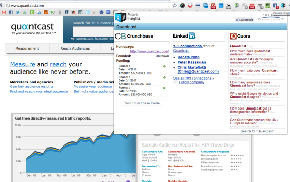
What sites and apps do I use on a daily basis? Quora, LinkedIn, Crunchbase and a slew of Google Chrome extensions (which I've written about before). So why not put all of them together and create a Chrome Extension that reveals: - Funding and company history (from Crunchbase) - Employees and your connections (from LinkedIn) - Topics, questions and answers (from Quora)

... And that's what I did. Along with Matt Basta and Rob Abbott, we built the Polaris Insights Chrome Extension.

- Read more on TechCrunch: Quora + CrunchBase + LinkedIn = Best Extension Ever?

- Read more on ReadWriteWeb: Check Out My New Favorite Browser Plug-In, Built by a Venture Capital Firm

- Download Polaris Insights

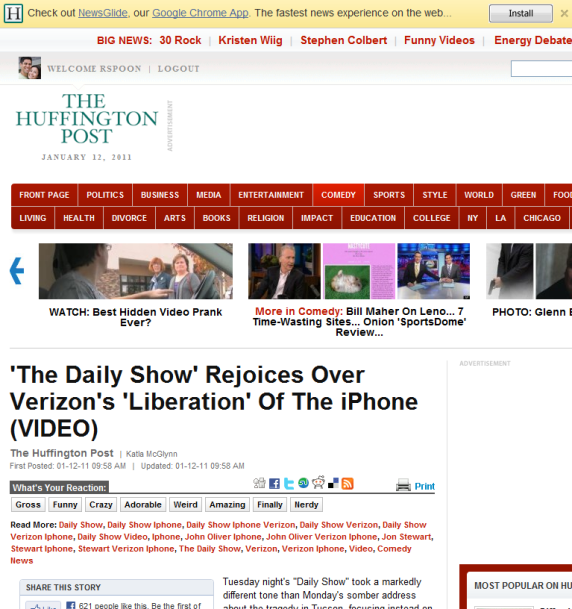
Huffington Post, Google Promote Chrome Application 'In the River'

I write a lot about the importance of marketing and promoting "in the river" - my terminology for engaging users in the most specific and relevant experiences / locations. This concept is increasingly important new platforms (software and hardware) emerge and as those experiences consequently change. Just the other day I wrote about how Evernote has done a masterful job creating numerous applications for each native environment: iPhone, iPad, desktop, Outlook, browser, etc. This will become the norm... and the result is that targeted messaging becomes tougher and more challenging.

Here is a great example from Huffington Post (along with Google & Chrome) - who is always far along the marketing & experimental curve. If you visit their site in the Google Chrome browser, the header is taken over to promote their new Chrome Application: Newsglide. Simple - but brilliant. This messaging would be overlooked if it were a traditional location. And it would wasted real estate if it were a universal promotion. Furthermore, the promotion is native to the experience (a similar action in Firefox would look different).

It wasn't long ago that I commented on Huffington Post's in-experience promotion of their Google Chrome Application (see example here).

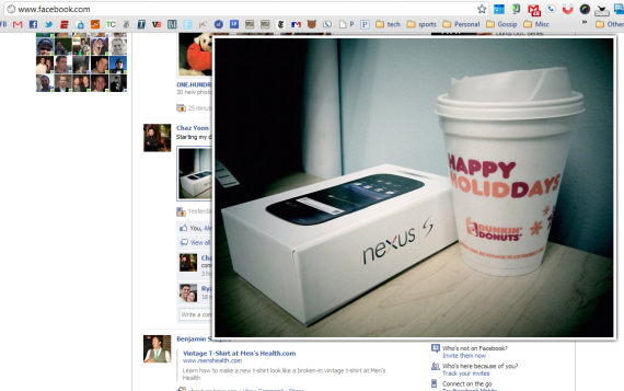
Facebook Photo Zoom Chrome Extension: Applied to the Web?

I have been playing with several Chrome extensions and applications... and while several are great utilities / efficiency improvements, one in particular has made me rethink web experience: Facebook Photo Zoom. It's function is simple: hover over any photo on Facebook and the high resolution version instantly appears:

It is very intuitive: turn the extension on and no other configuration is needed. And from there, the interaction is natural, lightweight and fast.

It is responsive: some sites have tried to integrate big visuals but the interaction is sluggish and therefore painful to use. Perhaps because of its simplicity or perhaps because it is built on Chrome, Facebook Photo Zoom moves as quickly as Facebook.

It prevents distractions: rather than having to visit a new page for every photo, the expansion occurs within the feed.

And it is fun: bigger, higher resolution imagery improves the feed experience and still allows for serendipitous browsing.

I have caught myself on e-commerce sites wondering why this experience isn't duplicated (even in less-bold ways). For product browsing and education, something along these lines makes sense.