My 2013 Digital Habits

It's an annual geeky, blogging tradition: share those products and services that have made their way into your daily routines. It's a simple reflection on those experiences that have become meaningful, those that have become less relevant, and those that others find interesting and useful. Mike Arrington used to publish an annual, very simple list of "Products I Cannot Live without": 2009, 2008, 2007, 2006. And like many others, I did the same. It's fun to revisit them and see which habits have stuck and, much more likely, what's changed.

So continuing the tradition - here is a simple, incomplete version of those products I use habitually in 2013... and notice that most of mobile focused and freemium models.

Personal, Work, Utility

Spotify (Premium) I've been a paying subscriber from day one and have always thought that their pay-for-mobile-model is brilliant... it allows users to get hooked through the desktop & web (their web product is a little-known gem), build playlists & favorites on the best and biggest screen available, and then roadblocks mobility. Smart.

Side note: Sean Parker's Hipster International is a great lesson in the power curation. Forbes has a great piece on it.

spotify

Evernote (Premium) Organize the web, your email, images, and so forth. The Chrome extension is fantastically done. And their mobile application suite gives quick access to important documents from any device, anywhere.

Dropbox (Premium) Like Evernote, it's a product that I use multiple times a day - personally and professionally. And like Evernote, it becomes more powerful (and habitual) as I move between different devices and locations. Between products like Evernote, Dropbox, SpaceMonkey, iCloud, Gmail, etc - I could purchase a new computer tomorrow and be fully setup / connected minutes later.

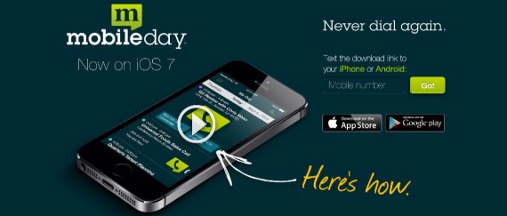
MobileDay Such a simple, time-saving app: one-touch dialing into conference calls.

MobileDay_–_One-Touch_Dial_Into_Any_Conference_Call_On_Your_iPhone_Or_Android

Nike+ Running I have used all of the wearable devices (Jawbone Up, Nike Fuelband, Fitbit) - but, while each is impressive in its own way, I haven't made one part of my daily routine. I continue to come back to the old-reliable Nike+ Running app. The app is well done, relatively accurate, social and fun.

MyFitnessPal Simply and effectively monitor your eating habits and caloric intake. The interface (on iOS and Android) is simple and many foods can be uploaded through bar code scanning. And while MyFitnessPal is part of my daily routine - the power of the application is that it changes your routine. (Note: I am an investor)

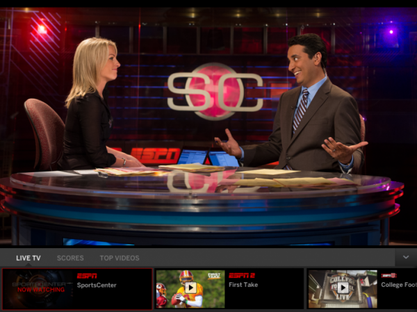
ESPN SportsCenter Of course it's a biased habit, but I use the SportsCenter application several times a day for scores, news, and video.

StoryBots This is less about my daily habit - and more about my three-year old son's... but Dillon uses the StoryBots suite of mobile applications almost daily. Their digital books and learning videos are fun and smart. StoryBots is created by JibJab and has a premium, monthly subscription. A great, related read: the New York Times' Babes in Digital Toyland piece over Christmas weekend. (Note: Polaris is an investor)

storybots

Amazon Prime (paid) Our house runs on Prime... and has for years. From diapers to foods to gadgets. And based on holiday 2013, 20m other households now run on Prime too.

Also: Amazon's Instant Video (free with Amazon Prime) is a remarkably under-the-radar, under-appreciated service. The library rivals that of other services and the kids content is really expansive.

TestFlight (paid) A necessary, efficient tool to provision access to application builds. We use TestFlight internally and externally - from testing to PR. Similarly, I use TestFlight to test and play with friends' or portfolio's applications.

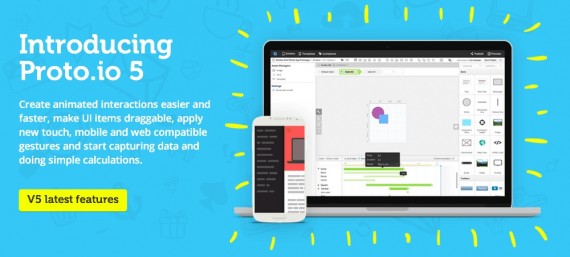
Proto.io (paid) There are several tools available for quick prototyping... About a year ago I played around with Proto.io and have been actively using it since. Really intuitive and simple way to craft quick prototypes, distribute them and collect feedback. Excellent product.

Proto_io_-_Silly-fast_mobile_prototyping_

Jot Pro I do a lot of light-weight product sketching on my iPad and have gravitated to the Jot Pro stylus by Adonit. It's sturdy, accurate, and cheap. I tend to use the Noteshelf iPad application... but anything will do. Side note: Adonit and Evernote have teamed up on a new stylus... I have not played with it yet, but it looks intriguing.

Skitch (an Evernote Product) I use Skitch multiple times per day - almost always via the the Mac OS app - although the Chrome Extension does the job as well. It's a simple, effective way to do quick screenshots, light-weight editing, and sharing. The Evernote integration easily saves images to specific folders (although it can be a memory hog if you're not a premium user).

Social

FaceTime From family to work calls and candidate interviews, FaceTime is tremendous and far preferable to a phone call. But when video is not an option: try FaceTime audio. It's digital over wifi (so saves minutes) and the quality is remarkably crisp.

Photography Suites (paid) So many applications and photo tools - it's impossible to list them all... but I'll try with those that I use regularly: - Path, I still consider Path's lenses and filters to be the best - Camera+, great for shooting photos on iOS - Instagram, the quality of the content stream is remarkable. From friends to special-access accounts like Duke Basketball - Photoshop - Apeture, lightweight editing and management - Skitch, less around photos and more around screen caputres

duke bball

Facebook & Facebook Messenger More and more of my communication has shifted to Facebook messages... and much through the Messenger application.

Hardware

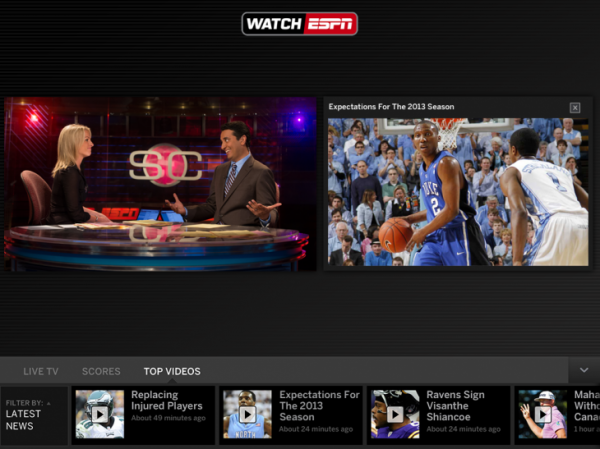
Apple TV & ChromeCast Each TV in our house is connected to either an Apple TV or a ChromeCast. With Apple TV, you have iTunes Radio and the immediate accessibility of movies, Netflix, Watch ESPN, etc. ChromeCast is remarkably simple and priced perfectly. And if you have a ChromeCast, here are 10 tips to get more out of it.

iPad Air I use my iPad Air more than any other device - including my laptop. It is so light and so fast. The most incredible part: it is as powerful as the original Macbook Air (2008). And if you cannot get over typing on the iPad, get a <$100 ultra-thin bluetooth keyboard.

Google Nexus 5 Not enough attention is given to this device. It is cheap ($349 unlocked), fast, light, and runs on native KitKat. I love the form factor and the Google Now / OK Google integration is fantastic.

nexus5

NiteIze Gear Ties These things are brilliant and I go through them like candy... simple way to keep your cables organized. With daily use, they last 6-12 months and are an easy add-on to any Amazon order.

geartie

Introducing the Watch ESPN Live Toolbar

We just released a major update to the WatchESPN app on iOS for iPhone and iPad. The latest WatchESPN version introduces several new enhancements, including Live Toolbar, which enhances content discovery and introduces more interactivity. Live Toolbar – available for iPad only – is designed with three main tabs across the bottom scroll of the screen.

- Live TV Lineup – an interactive channel guide that allows fans to easily navigate between ESPN live programming without exiting video - Scores – allows fans to navigate between live, upcoming and concluded games with scores, stats and video highlights - Top Videos – robust on-demand video offering of the latest news, highlights and analysis. Fans are able to watch Top Videos in spilt screen mode simultaneously with live programming Additional enhancements to the update for iPad, iPhone and iPod touch include:

- Access to ESPN3 for college students and military personnel on the WatchESPN app via on-campus (.edu) and on-base (.mil) Wi-Fi networks - App to app linking to the WatchABC app which enables easier navigation to view ESPN on ABC events

You can download the WatchESPN application here.

WatchESPN_iOSAppUpdate_LiveTV_081513-730x547

WatchESPN_iOSAppUpdate_TopVideos_081513-730x547

More:

- Todd Spangler / Variety: Fox Sports TV Everywhere Service Is No-Show, as ESPN Beefs Up iPad App - Peter Kafka / AllThingsD: Multitask Nation: ESPN Lets iPad Users Call Up Scores, Clips, While they Watch Live Video - Ryan Lawler / TechCrunch: ESPN's WatchESPN iPad App Adds A Live Toolbar With Scores, Stats, And On-Demand Clips - Jordan Golson / MacRumors: WatchESPN Updated With - Split-Screen Live and On-Demand Viewing for iPad [iOS Blog] - Jordan Kahn / 9to5Mac: WatchESPN app updated for iOS 7, adds ‘Live Toolbar’ that lets you stream two videos at once - Janko Roettgers / GigaOM: Good news, college students: ESPN now lets you stream for free to the iPad - Paul Sawers / The Next Web: WatchESPN for iPad now serves up stats, scores and on-demand clips via a live toolbar

5 Quick Thoughts on the iPad Mini

After using the iPad Mini for 48 hours now, I wanted to get some quick thoughts down that answer the most common questions I have heard:

1. Is this just a shrunken iPad? Yes, it is a shrunken iPad. But what's important about the Mini is that it's more than just a smaller screen: it's a perfectly sized device: screen, weight, bezel, thickness, etc. If it was merely a differently sized screen - the Mini would not be as fantastic to use. It's hard to explain just how beautifully it is built until you hold it and play with it... with just one hand. It seems ridiculous to say: but after an hour or two with the Mini, your iPad really feels clunky.

2. How does it fit into my ilife? Simply said: I haven't had a need or desire to pick up my iPad since getting the Mini. With exception of:

3. Is the size really better? Unless you use the iPad as a movie consumption device, I believe it is a better size. Reading is easier. Typing is easier (counter intuitive but true). And the weight makes a huge difference. I have owned the Amazon Kindle Fire and Google Nexus 7 - and I have always believed that the 7" tablets were more versatile and usable than the iPad. The Mini's form factor is the icing: weight, thickness and edge-to-edge screen are as important as the 7.9" screen. It always makes the Mini more versatile in that landscape mode is instantly as usable / useful as portrait mode.

4. What will you travel with? Short travel: iPad Mini. Long travel: iPad Mini + Macbook.

5. How about the screen? This is the single biggest complaint and indeed its the single biggest flaw. However, the Retina display will surely come soon. And, the screen is really adequate because the small size relieves some of the pixelation. Furthermore, it is only acute in fonts - graphics are actually quite crisp and clear.

Microsoft Deal Strategy from 2009-2012: Yahoo, Nokia, Skype, Nook.

This is the front page of Tuesday May 1st's Wall Street Journal. It's a well done graphic overlaying Microsoft's big-dollar entrances into "markets where it lags behind rivals": - Search: Yahoo (2009): Microsoft's billion-dollar+ deal to power search and ads.

- Mobile OS: Nokia (2011): billion-dollar+ deal to push Windows Mobile OS

- Social / Video: Skype (2011): $8.5B acquisition

- Mobile / Tablets: Nook (2012): $605m investment to bolster tablet strategy

It's an expensive but necessary (?) avenue into three massive verticals that, as WSJ notes, Microsoft is far behind in: search, social, and mobile (OS + hardware). It is marks about one of these big, billion-dollar bets a year (four deals over the 2009-2012 period).

Price aside (Skype in particular feels very expensive unless deeper integrations in Office & on XBox emerge quickly), the Nook deal is is the one that strategically feels odd. Windows 7 users love the product - but the Nook is so far behind iPad and Kindle, that it feels as though Microsoft is better served entering the tablet market elsewhere OR focusing primarily on phones and then paying-up when the 3rd place tablet-provider has greater share. Of course that's my take from a very, very distant seat.

"The article, first published on the SI.com iPad application late Tuesday night..."

This cracks me up: ESPN (who has been criticized for not generously citing sources in the past) ran a front page article on UCLA's troubled basketball team. In citing the source as Sports Illustrated, ESPN strangely noted: "The article, first published on the SI.com iPad application late Tuesday night..."

I find it fascinating:

1. this was called out by ESPN ... why?

2. Sports Illustrated published the article to the iPad before the website... and both before the magazine. It clearly was an attempt to push the iPad app / subscription... which seems to be working (#1 in Sports over last week) but doesn't seem nearly as strategic as launching the article on SI.com.

Make Your Content Accessible on Mobile - All Devices, All Formats. ESPN's Gamecast as Example.

I write a lot about tailoring your web experience for the environments where it is (and can) be used. That is particularly important for mobile which has its own UI needs, requirements, opportunities and challenges. Here is the latest example.

ESPN has done a good job creating product & content for specific environments and devices. Example here. While that is an effective treatment - this is not. When 'watching' an ESPN Gamecast on the iPad (which is an excellent product) - it requires you to watch it in landscape mode. There is literally no content and no experience otherwise. Even if ESPN believes that landscape is the best way to view Gamecast, you would think that they would either create a light version or showcase some other content? Very strange.

Balancing Ads, Revenue and Experience, Pageviews.

I write frequently about how mobile web requires a different design and UI than traditional. Great example here. These are two *subsequent* screenshots from the New York Times iPad-friendly website. First, the NYT homepage is taken over with an American Express ad (albeit a really good looking, custom-built ad).

I can tolerate a page takeover. It's neither unique nor inexcusable (they have to make money on a free product). But, after it disappears and I click on an article - I get another takeover.

It too is custom (and I give them credit for that)... but that is two consecutive takeovers and, this last example, is remarkably annoying. It should at least appear on the right column so that I can read the article. Why preserve the social sharing screen for an article I haven't yet had the ability to read?

It's really shortsighted to sacrifice experience, reduce pageviews (both in this session and in the future) to increase eCPM for this specific visit. The eCPM will be terrific: two huge takeovers on my two pageviews... but I didn't even get to a third pageview. Is it worth it?