I find this example so interesting: two fast-growing e-commerce brands working together to solve one another's needs: Bonobos delivers heavily discounted product to Fab, who delivers a user acquisition channel. From afar, I believe example is more similar to how merchants use Groupon / Living Social than how they use Gilt Group: it is more about attracting new buyers than it is for dumping inventory efficiently:

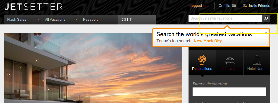
JetSetter's Search Box Promotion
I like the highlight examples of effective "in the river" marketing - the concept of placing product, promotion and marketing messages in relevant, active parts of the web experience. Lots of examples here... Here is another example from Gilt Group's JetSetter (which is one of the better designed and visually appealing websites).
The fundamental JetSetter experience is browsing really compelling, great-looking travel offers. Even with no intention of planning travel, I can waste dozens of clicks browsing JetSetter's delicious offers.
And while browse is JetSetter's primary experience, they are trying to drive search activity and have introduced both a search box and top searches. This is an obvious revelation because JetSetter overlays the message (along with today's top search) atop today's offer. It is bold, colorful and extends onto the offer and the right navigation pane. It also fades in (quickly and lightly) - in the rare case that you missed the unit.
On a side note: the "top searches" concept is interesting because it creates another browse + search experience that, in my opinion, is more shop-able. I believe that most significant travel (cost, distance, time) is *not* booked spontaneously... so the ability to search JetSetter deals for specific locations makes JetSetter more usable.... while still keeping the brand and web-experience in-tact.
The Curated Web. Three Examples: Content, E-Commerce & Social Commerce.
The web is fragmented.That fragmentation gave rise to search. And it's given rise to the role of social within finding. The 'finding' problem exacerbates as content / product grows. Great examples of the problem: eBay, Amazon and iTunes have nearly unlimited inventory and are often painful to explore (for that precise reason). One solution: curation. It is a trend that I have written much about... and it's a trend that will (and should) continue. Three examples:
- Content: my reliance on Twitter and Facebook for news is an example of content curated by my trusted social graph.
- E-commerce: Experts delivering their picks is a compelling way to drive conversions through curated expertise. Below is an example from JetSetter with "Molly Sims Inspired Travel". Each Sunday, the Golf Warehouse (TGW.com) features the clubs and products in the bag of that week's PGA winner. Of course, you can then shop his bag. And here is Nike's Li Na storefront which launched minutes after she won the French Open.
- Social Commerce: much of the movement from e-commerce to "social commerce" is predicated on experience being built atop social recommendations, sharing & findability.
As you try to distinguish yourself from the web's myriad of sites and products, think about how you can apply the concept of curation (experts, friends, taste-makers, etc) to improve findability, drive conversions, and establish marketing / viral programs.

Amazon's MyHabit Launches with "Exclusive Membership" Gimmick. Except for Amazon Users (eg everyone).
Remember when Gilt Group and Rue La La first launched and you had to be "invited"? It was a genius marketing effort that established a brand of high-end exclusivity. It also was important in jump-starting the early viral channels (referrals and rewards). Of course, if you didn't know a registered user, you could "request membership" and, within a day or two, your invite would arrive. It was great positioning and marketing. This week Amazon entered the flash sale space with MyHabit. It is very much like Gilt and Rue La La, etc (and, for what it's worth, is very much unlike how I think they should play in the space).
To position themselves as Gilt and Rue did at launch, they too ask users to register and "request membership". The word "request" obviously suggests membership is selective and not instant (despite the headline "become a member instantly"). There is your exclusive, premium positioning.
But that is entirely pointless because anyone with an Amazon account already has an account: "hint: if you already have an Amazon.com account, you may use that to sign in." And of course anyone visiting MyHabit has an Amazon account.
This makes the marketing / positioning effort insincere and beyond gimmicky (since its an extension of a proven gimmick). Just put a big sign-on button and optimize the hell out of it. Then focus on the products and the experience. That's worked for Groupon and LivingSocial. And with Amazon's brand and massive audience, it's the better way to launch / play.

Redbox's Smart Movie Promotion Aims to Validate Emails.
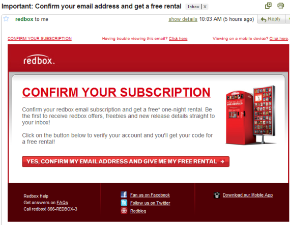
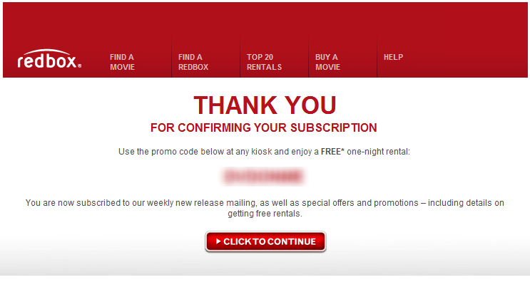
Redbox is a service I love, a product that is terrificly done and a business whose future is murky (negative: moving digital and Netflix as a competitor; positive: Netflix as an example of transitioning perfectly). One of underrated components of Redbox is their email interaction with customers... and in some ways, they are similar to Groupon, LivingSocial, Gilt Group and Rue La La: email marketing drives the business. So it wasn't surprising to me that, after my first Redbox rental, they followed up via email with the following promotion: confirm your email address and receive a free rental (DVD or Blu Ray). They understand the value of a verified, engaged email user... and they are willing to give free product away (they also make some direct revenue on the promotion because of rental 'late' fees). Smart.
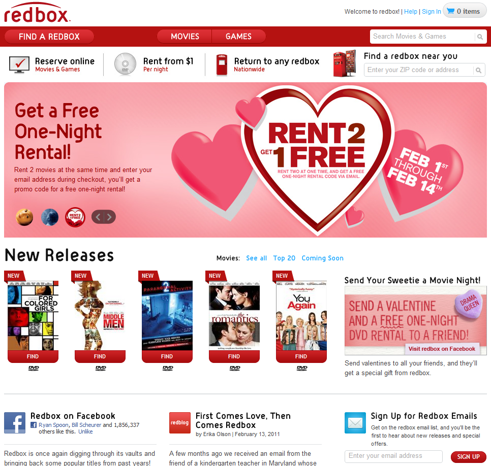
Unrelated: they also do a great job with their website:
- crisp and good looking - four major actions: reserve, learn, find and research - big promotion for Facebook fanpage (1.9m fans!), their newsletter (per above) and the bog - easy-to-navigate list of available movies - with trailers and cast - the ability to send Redbox gifts (ie a Valentines rental via their Facebook app)
And Redbox.com:
It's All About Personalization (2011)
Two years ago (somehow it's been that long), I gave 20 predictions for digital media & e-commerce in 2009. This year, I am going to do it slightly differently and write individual posts about various themes / predictions in 2011. You can follow them at the tag "predictions". Today's is simple: it's all about personalization. I was reminded this yesterday while spending the day at the-very-exciting ShoeDazzle (note: Polaris is an investor, and you can see more about ShoeDazzle on TechCrunch TV). ShoeDazzle has built a business in part on great product, in part on a great & differentiated shopping experience, and also in part on the power of personalized & social shopping.
And I was reminded again this morning by an email from Gilt Group which looks different than their ordinary daily emails. Rather than a list of today's deals, the email noted items available for my specific shoe size (based on a Gilt purchase months ago). Among a slew of unread emails (some important, some not; some shopping, some personal) - Gilt's stood out because it spoke directly to me.

And as folks' like Gilt look for ways to resonate with their customers, drive conversion efficiency and optimize everything from the experience to search results to the pixel's creating an ad unit... personalization will be the differentiator. In addition, personalization has the opportunity to improve more than the middle of the funnel (conversions) - it can affect the top of the funnel through virality.
Facebook, Twitter and the loads of data that we each produce (and the companies sit atop) enable personalization is ways that previously were not possible. Some of those solutions are out-of-the-box scripts and widgets - others will be baked directly into the product, experience and brand.
If it wasn't a core discussion for you in 2010, personalization should be in 2011. And it should be a discussion for each component of the organization: what does it mean for:
- Product - User acquisition: advertising, virality and social - Conversions & retention: email marketing, search, customer support, landing pages
Gilt City's Cleverly Designed iPhone App
Gilt Group has rolled out their new group-buying / coupon site Gilt City to six cities (New York, Boston, Los Angeles, San Francisco, Miami and Chicago). With it comes the Gilt City iPhone app. There isn't much to write about about the couponing model as it is very much like others in the space (see Groupon, LivingSocial, Yelp, etc). Over time, we will tell if Gilt Group is able to win share through unique offerings, integration with Gilt Group, etc.
I did want to quickly touch on the application's design... which as you would expect with Gilt Group, is glossy and very visual. The background of each city page is themed respectively. Below, for instance, is Gilt City San Francisco - which has a vivid picture of San Francisco scenery. Big, splashy images are becoming very popular (see my post on About.me) - and, with a relatively straight-forward product offering, it is one way to stand out, localize the experience and stay on Gilt's brand.
And with the emergence of big screen devices like the iPad, it is again a reminder that design and color are play an important role in the experience:

Optimizing Call to Action Buttons
Smashing Magazine has a terrific guide to designing "call to action buttons." Design and optimization can increase conversions dramatically - just ask (and study!) these conversion-focused leaders: - Social gaming: RockYou, Slide, Zynga, etc - Flash Sales: Gilt Group, Rue La La - Couponing: Groupon, LivingSocial Smashing Magazine lists dozens of examples. I boil it down to the following:
- size and location: think of visiting a grocery store and what catches your eye in the aisle - color and 'clickability': does the button stand out? does it change on hover? - call to action and copy: what are you asking users to do? is it tempting? This dictates size and location...
With so many variables, the only way to optimize is thorough A/B testing. Cycle through messaging, placement, size... collect data and optimize upon that.
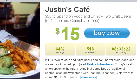
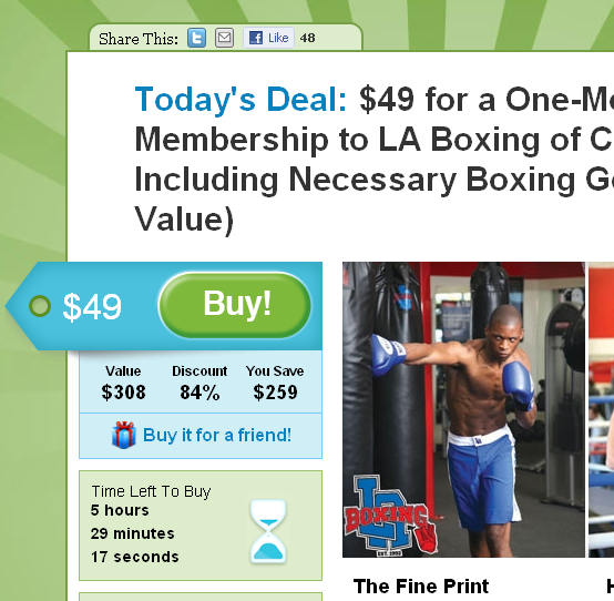
Looking for inspiration? Visit the companies listed above: they are industry leaders in funnel and conversion optimization. Here are two examples from LivingSocial & Groupon. Notice how each call to action has large & colorful buttons, clear messaging and conveys urgency:
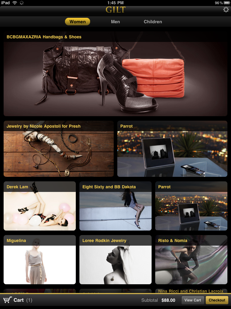
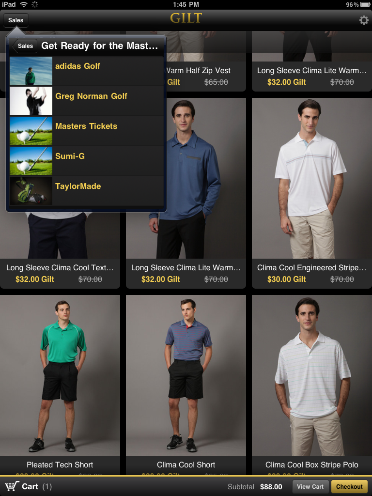
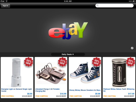
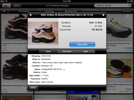
E-Commerce on the iPad: Gilt Group & eBay Help Us Imagine
Not because I shop regularly on Gilt Group or eBay... But I encourage iPad users and folks within e-commerce to download their iPad apps... Because it represents that potential of what e-commerce can look like atop the iPad (or extracted beyond: our new wave of computing / mobile devices).
With its large, crystal clear and touch-enabled screen, the iPad enables developers and brands to think more creatively... and in the same way that we were all encourage to think about consumers in the transition from web to mobile browser / app - we again have that same opportunity. So with Gilt Group and eBay, we have two iPad applications that were available on launch, sit in the iTunes top twenty apps and provide unique, powerful experiences different than the web or iPhone apps. These are good directional glimpses of e-commerce on the iPad:
- super simple layouts with very clear action items: browse and bid/buy - both have huge, colorful pictures - with color, layout and clear actions, both encourage serendipitous browsing - images are highly interactive - swipe them to see additional views - Gilt's navigation is nested and reminiscent of the iPad's email system - very clever - Gilt also uses the push notifications to alert users of new sales (interesting concept for flash sales, low inventory, etc) - Gilt provides an incentive / reward for download: iPad owners get to circumvent the 'exclusive' invite process and register directly
