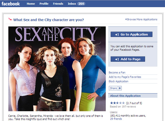
Smashing Magazine has a terrific guide to designing "call to action buttons." Design and optimization can increase conversions dramatically - just ask (and study!) these conversion-focused leaders: - Social gaming: RockYou, Slide, Zynga, etc - Flash Sales: Gilt Group, Rue La La - Couponing: Groupon, LivingSocial Smashing Magazine lists dozens of examples. I boil it down to the following:
- size and location: think of visiting a grocery store and what catches your eye in the aisle - color and 'clickability': does the button stand out? does it change on hover? - call to action and copy: what are you asking users to do? is it tempting? This dictates size and location...
With so many variables, the only way to optimize is thorough A/B testing. Cycle through messaging, placement, size... collect data and optimize upon that.
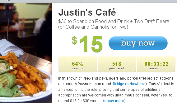
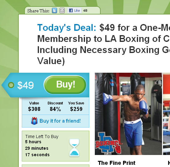
Looking for inspiration? Visit the companies listed above: they are industry leaders in funnel and conversion optimization. Here are two examples from LivingSocial & Groupon. Notice how each call to action has large & colorful buttons, clear messaging and conveys urgency:


