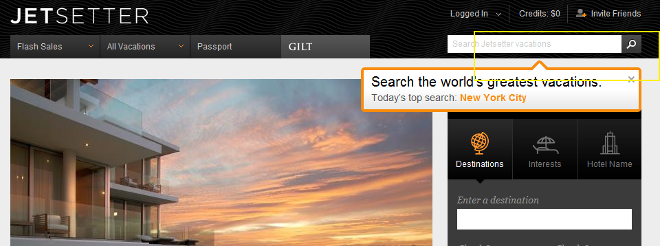
I like the highlight examples of effective "in the river" marketing - the concept of placing product, promotion and marketing messages in relevant, active parts of the web experience. Lots of examples here... Here is another example from Gilt Group's JetSetter (which is one of the better designed and visually appealing websites).
The fundamental JetSetter experience is browsing really compelling, great-looking travel offers. Even with no intention of planning travel, I can waste dozens of clicks browsing JetSetter's delicious offers.
And while browse is JetSetter's primary experience, they are trying to drive search activity and have introduced both a search box and top searches. This is an obvious revelation because JetSetter overlays the message (along with today's top search) atop today's offer. It is bold, colorful and extends onto the offer and the right navigation pane. It also fades in (quickly and lightly) - in the rare case that you missed the unit.
On a side note: the "top searches" concept is interesting because it creates another browse + search experience that, in my opinion, is more shop-able. I believe that most significant travel (cost, distance, time) is *not* booked spontaneously... so the ability to search JetSetter deals for specific locations makes JetSetter more usable.... while still keeping the brand and web-experience in-tact.

