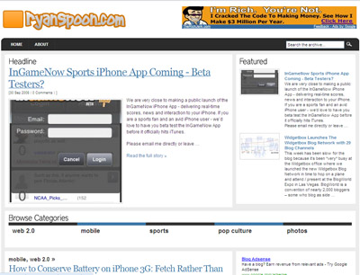
When I first started this blog, it was on a whim and I built it over a weekend on a hosted version of Wordpress. The theme I implemented and hacked-together worked well but didn't scale well with increased amounts of content, advertising, etc. And while much of my readership is via RSS and email, I was bothered by the overflow that become my blog.... so I finally mustered up the time and courage to hack a redesign together over the past few nights. So here it is: a new theme that is more of a "magazine" template. It is based on Arthemia and is very flexible / customizable. There several great features which aren't turned on because I haven't had the ambition or confidence to upgrade to the latest version of Wordpress (any help welcome!).
Lots of blogs are moving away from the old top-to-bottom styles and into more organized, magazine styles (see TechCrunch and Mashable's new looks)... much of this is the ability to better scale, feature advertising / promotions and increase pageviews. As I test out the new theme, I will report on any changes and trends that occur, particularly within:
- pageviews - navigation - SEO - eCPMs / engagement rates
I'd also love your thoughts - like it? Hate it? Improvements? Know CSS and want to help!?


