Google+ Navigation Crowded with Google+ Promotions.

Here's the Google+ right column. It's getting awfully crowded / busy and its one large promotion for Google+ functions / features: - Google's universal notification header - a floating YouTube search tool (when clicked it expands and plays videos in a mini-browser) - my friends and suggested uesrs to add to circles - Google+ invitations (although anyone can now register) - ability to start a Hangout (Google+'s best feature) - ability to create a Google+ page - Google+'s "Games" center and links to popular / featured games

I am not sure how I feel about. Clearly it differs from Facebook and that's in part because Google is still fighting for adoption and engagement. For instance, it is more beneficial for Google to promote tools than it is to insert ad units. However, this is essentially a vertical-ized version of the horizontal navigation bar that rests atop every page. It's cluttered, redundant and frankly ineffective at doing what Google wants it to do: drive deeper usage. For all the criticism that Facebook's Ticker has received, it is clearly a more powerful usage driver than this is.

Starbucks Gives "Behind-the-Paywall" Access.

I logged into Starbucks' wifi this morning and was presented with the below screen. I find it fascinating that Starbucks has an ad for "full behind-the-paywall access. Free." This strikes me as very much an industry term that is neither: - well known - consumer friendly, or - flattering for the content providers (WSJ, ESPN, USA Today, NY Times)

Agree? Disagree?

Three Reasons a Facebook Phone Can Work.

This week we learned of Facebook's internal project (code-named Buffy) to build a Facebook Phone. Much of the tech press laughed: it's too late! It's too crowded! Facebook isn't a hardware company! And so on. Let's not assume failure for three reasons.

1. As I have written before, Facebook a better understanding of what I believe to be a phone's most powerful lever: identity and your contact list.

For most people (which may well be outside silicon valley). Imagine walking into Best Buy, purchasing the phone and walking out with a directory of people, contacts, phone numbers, emails, updates, etc.... simply by logging into your phone. That's really, really powerful. A stub of that already exists through their app and it's a function I use all the time when seeking phone numbers:

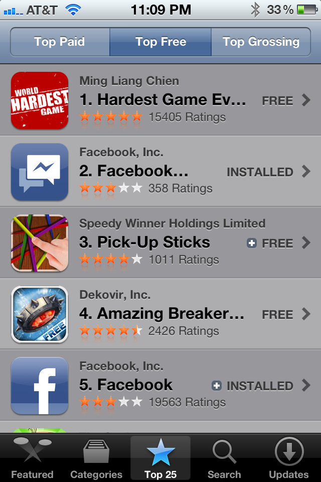
2. Core apps are already popular and/or easily buildable. Facebook's Messanger app is currently #2 in iTunes (think SMS). Facebook is #5 (and the experience would be tremendously better if natively integrated). Other popular functions can all be at the app level: - photos: sharing, filters, etc - contacts: really, really powerful - email: messages + hooks to Gmail, Outlook? - music: app ecosystem will support through Spotify, Turntable, Rdio, etc - calendar & events: hooks into Facebook events + opportunity to build out calendaring tools - games...

3. Pricing. Remember why Android took market share so rapidly: pricing pushed towards zero, undercut Apple and allowed them to reach a wider audience.... an audience who is probably more attracted to and a better fit for a Facebook Phone.

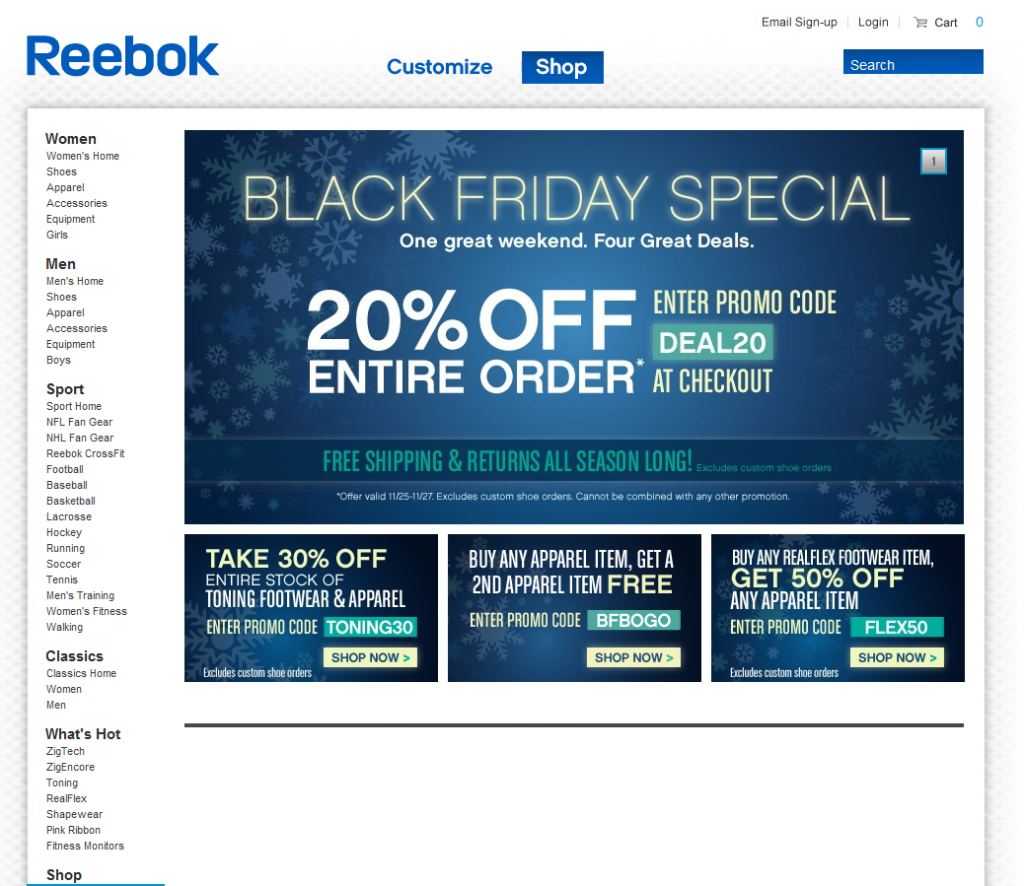
Reebok's Black Friday Promotion

Can you tell that there is a sale?Can you tell it's Black Friday? Even though this is a screenshot from Sunday evening? Fascinating that there is no product displayed whatsoever on the page. The entire page is a promotion for various offers: 20%, 30% and 50% off. I have to imagine the promotion would convert better if product was part creative...

Let's Not Blame Groupon for its Merchants' Mistakes.

I Found the article, Groupon horror: Bakery must make 102,000 cupcakes, via Washington Post Social Reader app (written about here).

The bakery, based in Woodley, received 8,500 requests for a dozen cupcakes, far above the normally 100 it produces a month. Brown suddenly had to make 102,000 cupcakes.

Brown's company only employs eight people, and she had to bring in an outside agency to handle the orders. The temporary agency cost her $19,500, effectively wiping out her year's profits, MSNBC reported.

This is *not* a Groupon horror story. In fact, Groupon did percisely what they are supposed to do: drive immense volume.

Rather, It is a horror story about business mismanagement and the consequences of poor forecasting.

It's a lesson to be learned for all businesses - although this example demonstrates how small / medium businesses can be more dramatically impacted.

ESPN's Twitter Integration Improving.

ESPN is getting closer! I have written a lot about ESPN's usage - and potential usage - of Twitter. I have criticized and applauded. Here is an example of ESPN continuing to improve. It's a minor example, but ESPN has now allowed in-line actions on their Twitter modules (it used to be just one-way reading, mobile example here). You can now retweet, reply and favorite content inline. Novel idea right?!

It is getting closer: ideally this would be more expansive than a widgety module. It would be more deeply integrated, power group chats, include lists, etc... but, it is getting closer!

Evernote's Clean Homepage. What to Learn.

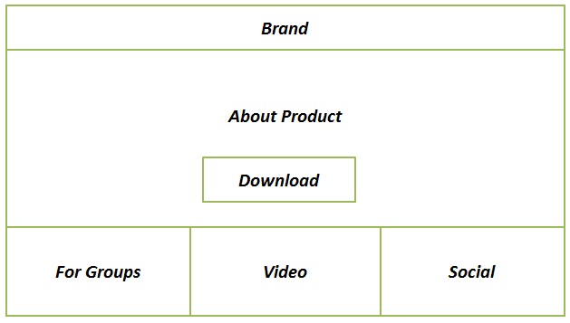
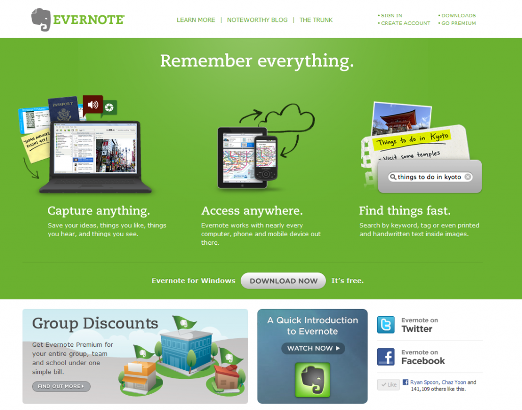
I love Evernote. It's one of the few products I use daily and on every device I own. I also love their homepage because it is super simple and focuses on two single actions: learn and download. Evernote's homepage is broken into four sections:

1. What is it. This has three simple parts: capture anything; access anywhere; find things fast. If you use Evernote, you'd agree that that's a great, simple overview.

1A. Download. The focus is the Download Evernote button which is front and center and the only actionable button on the page.

2. Group Pricing. The base is a suite of three modules that again promote learning. Here, Evernote wants to alert users that the product is both for consumers and businesses / teams.

3. Video Overview. More learning.

4. Social. This does a few things. First, it demonstrates that Evernote is massively popular - which enhances brand / familiarity / willingness to download. For instance, I am 1 / 150,000 Facebook fans. Second, it allows me to follow Evernote in-line (continuous marketing opportunity for Evernote).

Twitter's Activity Stream Speaks Specifically to Me

I give Twitter a lot of credit for rolling out their new Activity Stream.Sure, it's quite ugly... that can be fixed. And sure, it's a glorified newsfeed / timeline... but it's core to Twitter. A few thoughts:

1. Twitter, like many mass services, has a findability problem. In May 2008, I wrote that Twitter's problem was social findability. This helps.

2. The web is based on Ego and this certainly feeds to the ego. It answers in real-time what's happening around ME. That's powerful & addiction.

3. I can Twitter becoming two primary streams: tweets and activity. For publishers, activity could be a more powerful hub. For individuals, the normal stream probably is.

4. For publishers and brands, this could become the first step towards a publishing dashboard. The foundation is being laid.

5. It's ugly. Needs serious UI overhaul. Twitter is usually so elegant and simple... surprised by the visual experience here. Again, it's easily fixable.

NBA.com Demonstrates Common Oversight of Mobile E-Commerce / Promotion

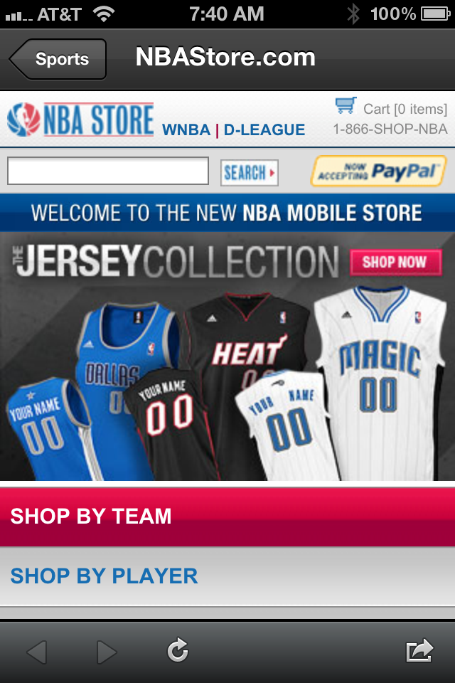
If you read me regularly, you know that I have a major pet peeve around unoptimized (and often dysfunctional) mobile experiences. So often mobile is treated an extension of the web experience and that results in broken mobile experiences... and since so much of our content consumption is on mobile devices, the lack of attention to the mobile experience is both frustrating and foolish. Great example here from the NBA (who I have had lots of social advice for!):

The NBA has 3,000,000+ Twitter followers.

40% of Twitter's users access the service via mobile (not the web).

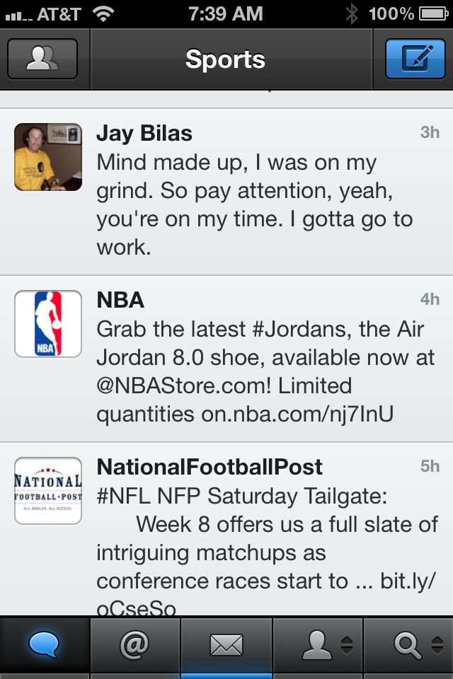
The NBA tweets a link to the newest pair of Nike Air Jordan 8.0 shoes:

Great promotion right? When you click on the link, the NBA Store automatically redirects all mobile traffic to a defaulted storefront / homepage. And thus the frustration: 40% of those who clicked the URL, with the hope of arriving on a specific piece of content, had to give up and exit.

Also funny, when you go the URL from your browser, you get another frustrating experience: a totally untargetted promotion (hello Canadian users!):