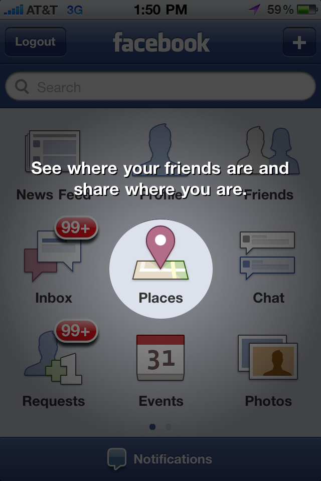
A few weeks ago, I wrote about YouTube's terrific mobile promotion of their new html5 experience. Here is an even better, more eye-catching promotion by Facebook for the new Facebook Places product. As background, to access Places, users had to download the new iPhone app. Upon opening of the new app, the screen animates to highlight the new Places tab and experience. It is great looking but entirely distracting... Which is clearly the intention. I have written before about making sure that new products and enhancements somehow get "into the river" - my reference to ensuring that features are not relegated to the edge of the experience... After all, they then are not core to the experience, rarely used and therefore not impactful. This one way for Facebook to get Places into the river - and considering it's currently a mobile-only product, it is as effective as can be:

