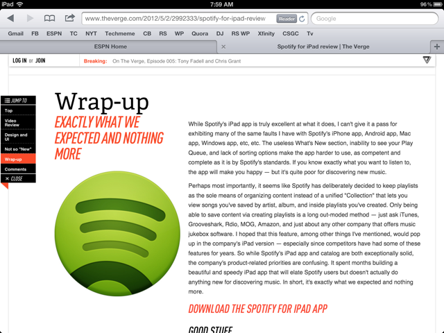
I admire how much The Verge (by Vox Media) has bushed the boundaries on content presentation / visualization. For a blog-like content hub, The Verge looks entirely unlike it's peers: TechCrunch, VentureBeat, Engadget, etc. It's one part traditional blog, one part Pinterest, and one part Flipboard. Where it really shines is mobile - specifically iPad. The screenshots below show my favorite treatment - which I personally have not seen elsewhere:
- There is a navigation bar on the left column (actually more like a table of contents) - As you scroll through the page, the corresponding section highlights (ie Video Review) - But the bar is also clickable - so that you can easily jump from section to section - I imagine over time, you also include small Facebook and Twitter buttons
Of course this is in addition to the persistent header that sits atop the browser. The Verge uses that real estate to promote breaking news, hot articles and membership (Login / Join).


