Jetsetter Mobile App: Effective App Promotion & Conversions

Jetsetter is known for great design (see here). Here is a good example of good design and effective mobile promotion. I have written before that promoting mobile applications via the web is challenging: for instance, conversions are weak due to web to download and data is limited (device, OS, etc). SMS and email are powerful ways to promote applications because they are consumed directly on the device. Good examples by: Sparrow, Redbox, Groupon and Gilt.

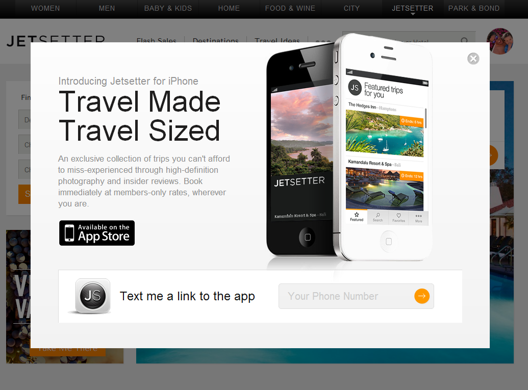
Here is another good example by Jetsetter (whose parent is Gilt). Login and you get the following promotion: - awesome slogan: "travel made, travel sized" - good looking promotion - big action item of downloading the app via SMS (enter your cell number)

Much cleaner for users and more powerful for the brand.
Nike's Game On Facebook Campaign: Data, Nike+ and Great Photos.

Nike is so good: - terrific Facebook campaign during the NBA Playoffs

- smart experimentation on Twitter with Promoted Tweets

- innovative personalized shopping engine (which now includes licensed products)

- and that doesn't include Nike+ and their terrific / innovative integrations with Path, Facebook and Twitter

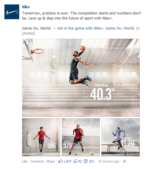
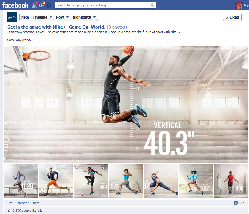
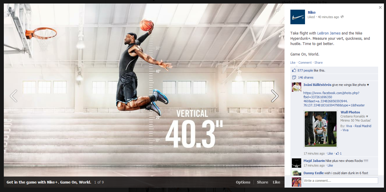
Here is yet another great campaign by Nike. In an effort to promote Nike+ ("the future of sport"), Nike took to Facebook and highlighted a barrage of athletes training and collecting data via Nike+ and/or Nike Fuel. Like most of Nike's social work, it's very visual, fun and unique. It is also on brand and tapping into the personal data / gamification theme. Notably, this was also released the day of the NBA Draft - which is driven by similar data analysis.... and many of those athletes will soon be sponsored by Nike.

On Facebook, Nike does a great job of clustering photos into albums - whereas many brands / pages, highlight individual photos.

Nike and @NikeSF Demonstrate Rich Promoted Tweets on Twitter

As you can tell from the screenshot's time stamp (June 8), this one has been sitting in my blog queue for quite some time. It's still worth posting though!

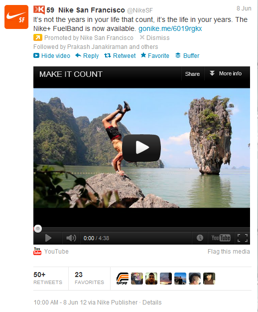
Here is a screenshot from a Promoted Tweet by Nike San Francisco. It's notable beyond the interesting fact that 1) Nike has a geographically driven social campaing (@NikeSF), and 2) they use these accounts to handle local customer service and promote national campaigns (interesting mix) With regard to Twitter... and more importantly... this is a great example of the power of a Promoted Tweet: - hyper targeted (in this case, local) - drives awareness and social activity: follows, replies, retweets, etc - but most importantly, its bigger than just Twitter actions (ie followers and retweets): YouTube is integrated directly and eventually this could be a registration form or purchase widget, etc.

That last point is quite powerful because advertisers do not have to value the campaign purely by Twitter-activity. That will (and should) be included - but it's potential is far bigger.

Apple's Gorgeous iOS 6 Product Page.

So much has already been written about Apple's WWDC and their iOS 6 announcement... and I too will pile on a couple short (and late) reactions. This one really has nothing to do with the hardware or the software... but rather the store page Apple created to showcase iOS 6. I tweeted about it last night:

Having reflected a little more on it - and the many discussions I have had over great product / merchandising pages (from eBay to portfolio to here on the blog) - I think it is worth showcasing this page once more.

A couple quick notes, which will essentially just expand on my 100 character tweet:

1. The page is entirely on-brand for Apple. Familiar.

2. It's a single page. Yet it is very easy to navigate. The icons atop the page move you throughout.

3. It is content heavy... but you wouldn't know it. Secondary elements are tucked away within each feature - for instance, the Facebook section has three sub-bullets which navigate horizontally - meanwhile, the core features navigate vertically.

4. It reads like a newspaper. The headlines are atop. The supporting content is ordered by importance. And the tertiary content (smaller features, developer kits, compatibility) are tucked at the bottom and formatted differently.

5. It's visual. Great looking and easy to consume.

And it's applicable beyond products. This page (it's layout, characteristics, etc) is relevant for merchandise (ie physical product), services (ie subscriptions, SaaS), about-us (ie informational content) and beyond.

Amazon's New, Expanding Navigational Menu

I have covered Amazon's navigational menus before (here, here, here and here). This is yet another update to Amazon's navigational menu: The Shop by Department still exists - and is still ordered the same way (preferencing digital over physical). But instead of being simple links, everything expands on the hover to showcase different product & merchandise depending on the category. Below you see two examples: Kindle (which highlights each model and Kindle related products / services) and Cloud Drive (which is a large promotion).

The plus is that there is more real estate and opportunity to merchandise and promote (for instance, the Cloud Drive unit is far more interesting and explanatory than a hyperlink). The negative is that this is a heavy series of interactions and can be a slow user experience.

Amazon is the king of conversions and monitoring pixels... interesting to watch what happens with this experiment.

Next Generation NikeID Goes Beyond Colors: Patterns & Logos

I spend a lot of time writing about next generation commerce... and we invest in compelling companies and models like ShoeDazzle and Wantful (as examples). For years, people have pointed towards NikeID as an example of true product customization atop a great web interface. I believe I bought my first pair of custom Nike's in 2003 (Nike Air Max 95's). You can even create, buy and share your sneakers from their iPhone app.

It continues to evolve and the newest iteration is interesting for two reasons:

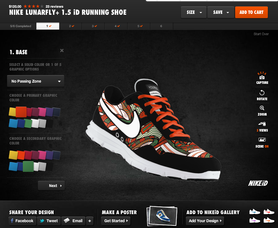
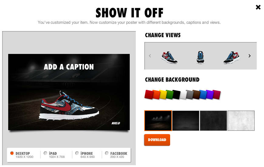
1. It goes beyond 5-10 color choices. You can now choose different patterns (like the one below) and then customize each component of the pattern with various colors... meaning that shoes can look entirely different from one another (beyond colorways). A single shoe model has endless looks.

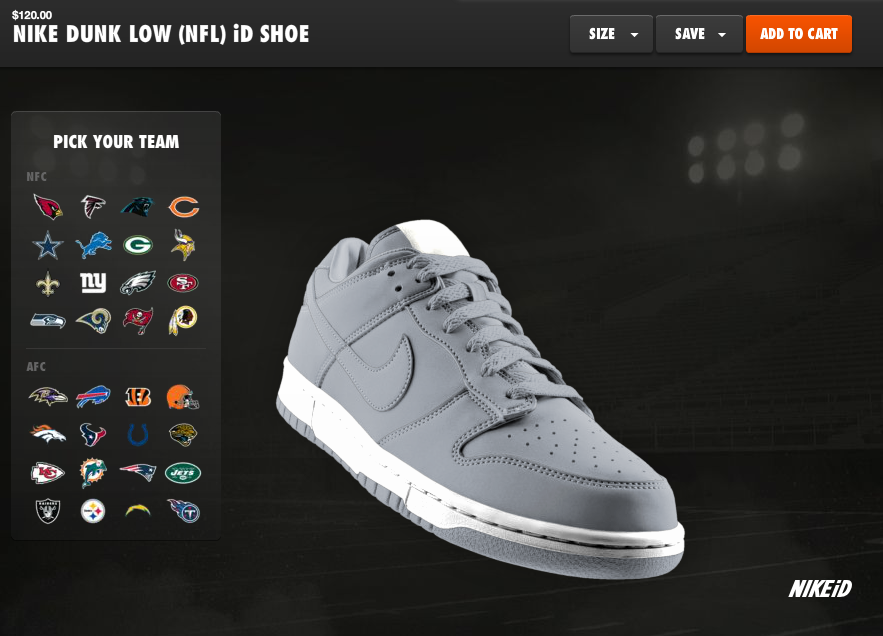
2. Nike just won the NFL contract from Reebok. The obvious launch was the release of their NFL jerseys. But notice in the bottom screenshots that you can now apply NFL logos and colorways to Nike sneakers.... this is a brilliant extension line as there is no cost to Nike, it increases the shoe's value / price, it allows Nike to sell packaged outfits, and Reebok didn't do it.... so it's unique and special.

Amazon Local Deals, Now Promoted Within Amazon Deals

It's old news that big players like Google, Facebook and Amazon have (and continue to...) tried their hand at the local / deals space. To be successful, each has to figure out how to make the crowded space and somewhat commoditized consumer experience work within their brand. Facebook, for instance, has turned Facebook Deals into their new Facebook Offers product.... which is effectively an extension of their Sponsored Story ad products. It's a smart play by Facebook because it distinguishes the platform and the ad product to both consumers and advertisers. What's Amazon's angle? I visited Amazon Deals and, among some heavily discounted movies and toys, I noticed a two-night Vegas stay for over 50% off. Seems out of place... except for the fact that:

1. Amazon is all about great prices and great inventory, and 2. Amazon has become much, much more than movies, books and games

For those reasons, it is not so awkward to place local deals beside product deals.

And perhaps more importantly: purchasing can be as simple as a single click. Like Apple, Amazon has personal and purchase information for most online consumers, and that gives them a significant boost in a space defined by scale and conversion metrics.

Nike Basketball's Beautiful Facebook Timeline In Time for NBA Playoffs

Just a terrific, creative and well-timed use of the Facebook Timeline by Nike Basketball. Coinciding with the NBA Playoffs - and a handful of new sneakers for top stars like Lebron James, Kobe Bryant and Kevin Durant - Nike Basketball is releasing a series of basketball rules: "Every EPIC moment has a story. And every story has a lesson. Lesson No. 1: The deeper the bench. The stronger the squad." Each rule is placed atop a basketball poster that ties into the playoffs and relevant players. Two or three rules are posted a day (so far, 38 rules and posters have been loaded). Nike also mixes in other timely promos like a congratulations to Lebron James for his MVP award and this graphic for the evening's Lakers / Thunder game:

It's clever, fun, on brand and highly visual - which means it is highly engaging on Facebook. It is also something that only Nike can do (the talent, the imagery and the production) and something that really can only be done on Facebook and with Facebook Timeline (no offense to Twitter, but this would be neither as effective nor engaging).

Facebook Offers In The River Promotion

Two trends within Facebook that I have written frequently about: - Facebook Offers: which has morphed from a Groupon-like platform to an extension of their sponsored ad format - In the River Marketing: which is particularly important for large products / platforms like Facebook (examples here: New Facebook Photos and Facebook Places)

Combine those and you have the following series of screenshots: Facebook's In the River promotion of their new Facebook Offers product. When you visit your Facebook page, you are prompted with a takeover atop the status box:

"Welcome to Facebook Offers: Drive people to your busienss with an offer that people can share with their friends." Various examples are cycled through - starting with Red Robin in this case ($5 off).

You can then "take the tour" and Facebook walks you through the various components and how to set up a campaign. Notably, its placed in-line next to the Status and Photo box.... that is prime real estate.

The walkthrough itself is not exactly noteworthy (write a strong headline! Choose a great thumbnail!) - however, the presentation of the tour and the location of the product is important. Furthermore, the final step of the tour is very interesting because it demonstrates the friction of online to offline content and commerce:

"Prepare your staff: Let your staff know about the offer so they're ready to accept it from people who show it from a mobile phone, or in printer form." Easier said than done as this is a far bigger problem than a one-line reminder to tell your staff about the coupon.