Congratulations to Thing Labs, Brizzly

A big congratulations to Thing Labs, the makers of Brizzly, who were acquired by AOL today. Brizzly will continue to exist and be a part of AOL. (Thing Labs is a Polaris company and Dogpatch Labs graduate)

And equally importantly, the Thing Labs team will play a major role at AOL - which I could not be more excited about. Jason Shellen and Christopher Wetherell of Thing Labs, two terrificly talented leaders and product thinkers, will lead AOLs AIM and Lifestream products. From AOL's release:

"The Brizzly team will play a key role in helping AOL provide consumers with the best possible venues to discover and share content with each other. Over time, AOL expects to integrate aspects of the Brizzly service into its popular Lifestream product, its social aggregator and publisher, and AIM, AOL’s flagship messaging platform. The Brizzly team will join AOL’s Consumer Applications Group, where Thing Labs Founder and Chief Executive Officer Jason Shellen and Christopher Wetherell, Vice President of Product and Engineering, will lead the AIM product suite, including Lifestream."

A big congratulations and we are all excited to see what happens with AOL's social products... which now have a killer team at the helm.

More on TechCrunch and ThingLabs.

Quora's Elegant Notification 'Panel'

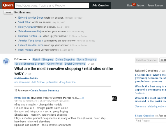
I have written about the design of promotion and notification units several times - pointing at examples from Facebook, YouTube, Twitter, etc. Here is an example from Quora... and while it is similar in its boldness, its very different in its style.

Quora notifies users of updates to questions that they are following. The notifications start on your homescreen and sit above the feed (somewhat similar to Facebook in that sense... but they are expanded by default). When you visit a particular question page, the notifications all sit above the question / answer content.

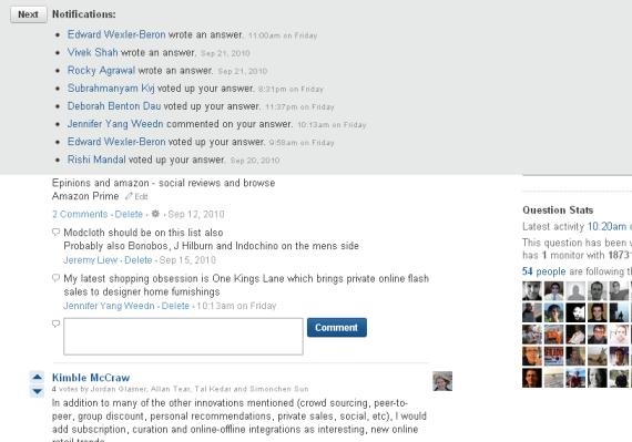
As you scroll down the page, the notifications sit persistently atop the page. It is a design style that is being used more and more... though in different shapes, sizes and formats.

We are seeing more and more persistent units at a page's header and footer. And as pages become busier and busier, persistent 'bars' (for lack of a better term) are good ways of capturing attention. Quora is interesting though because their pages are so clean and simple. But Quora's notification unit is clean and simple itself - and itself an elegant navigational panel and personal newsfeed:

Here are the notifications on the question page:

And here are the notifications sitting atop teh page as you scroll down:

Designing Your Facebook Page's Profile Image

Facebook's news feed is crowded (and more crowded with each passing day). Consequently, visuals play a big role is drawing attention and driving clicks / conversions. This includes feed pictures, profile pictures, thumbnails, etc. With Facebook's new Page Browser, you can quickly get a sense for the imagery that brands and page-owners use.

Some are simple and represent the brand directly (see FootJoy). Some take advantage of the alloted vertical space and are colorful (see HBO's Eastbound and Down)

Obviously the best advice is to test and measure which imagery works best for your brand and your audience.

While their thumbnail is quite different, Facebook's Data page is gorgeous. By cleverly blending the logo into the Facebook page, it looks very natural and clean. While page-owners do not have a ton of room for creativity, this is well done:

Facebook's 'Like Graph' is the Skeleton of Something Much Bigger

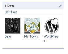
You might have noticed that Facebook profiles now include a "Likes" box below the "Friends" box. It includes a count and list of which pages each user likes: Very straightforward. More interesting is that you can also view "mutual likes": the overlapping likes of that person and you.
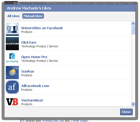
That too is straightforward - but it represents something much bigger. Likes will (and I use that word intentionally / carefully) become criteria for how we browse and search the web. As Likes extend beyond Facebook (you can now like pages, articles, sites, etc), the habits of your social graph will determine your content experience (finding, reading, etc) ... all using your 'like graph'.

It is already happening on websites: for instance, if you visit the New York Times, it will suggest articles read by your Facebook peers. That assumes though that you visited NYT.com or saw the feed update on Facebook. Now imagine a search experience or engine predicated on cross-site likes.

The Power of Statistics & Dashboards (About.me as an example)

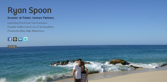
In May of 2008 I wrote that statistics - specifically around referrals and influencers - could be a sizeable business model for Twitter. Last week, About.me launched publicly. It's a gorgeous site creator that allows very simple page creation and automatically pulls in content from your social presences: ie Facebook, Twitter, Foursquare, Wordpress, etc. You can view mine at About.me/rspoon

Much can be written about this - SEO, self-branding, social aggregators, etc. But I want to return to the premise that my 2008 article about Twitter and statistics... because one of the great features of About.me is their "dashboard":

First, the dashboard gets users to return to the site... making it "sticky" in an environment that might not otherwise encourage daily usage (after all, the service automatically updates all of your presences!).

Second, it is addictive... in the same way that game mechanics make other sites sticky and why Twitter's follow count can be credited with some of their early growth.

Third, it encourages promotion. Want more views and visitors? Promote your About.me page via Twitter, Facebook and email (of course About.me makes that easy).

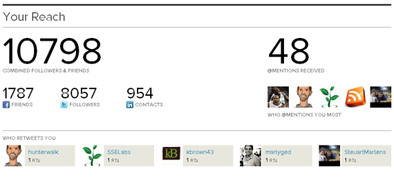
Fourth, it is really useful and interesting... and unique. There are statistics on visits, views, etc - but more interesting, there are stats on the number of status updates pulled in, your total reach, the @replies, etc. Powerful ways to unite the data around "influencers" and your About.me page will emerge over time.

So how can you apply similar mechanics and a "Dashboard" mentality to your experience?

Benefits of Working out of Dogpatch Labs (from an Entrepreneur)

Over the last couple weeks, I have selectively included excerpts form relevant Quora conversations - specifically about Dogpatch Labs, Polaris Ventures, etc. Here is an answer not written by myself - but rather by a Dogpatch Labs entrepeneur, Ming Yeow Ng. The topic is "What benefits can your startup get by joining Dogpatch Labs compared to just leasing an office space at Pier 38?". My response is here - Ming's is below (and in full on Quora here):

"Let me focus on the 2 most important benefits:

1) Without a doubt, here is the most important benefit of DP: http://imgur.com/X2F4a

2) The second most important benefit is really people. It is no exaggeration to say that Dogpatch has easily one of the highest concentration of amazing people anywhere in the bay area. Let me explain why:

- Pool of great entrepreneurs who are top of their game.

Over the last few months, I got onto really good terms with a whole range of excellent entrepreneurs, like etherpad, cardpool, learnboost (amongst many others whom you might not have heard of) For example, I am totally digging having access to the Learnboost team - they are doing cutting edge magic around javascript, and mongodb, and it is amazing discussing these technologies with them. Another example is Rob from EggHaus, who is definitely one of the top few designers in the valley.

- Peers who can take shit and give you shit

Honestly, startup is tough. Overnight successes are fascinating, but most require grinding through several iterations. The group at Dogpatch are not random entrepreneurs - most of us have had our fair share of great successes and major failures. You would get blunt feedback about where you are fucking up and you would get lots of encouragement - cause everyone here knows there is no magic bullet.

- Streaming pool of top investors.

This is really up to you to make the best of it, but lots of top angel investors drop by the lab. Being part of the lab gives you credibility, and it makes getting to know these guys far easier.

- Great events right beside you.

Free beer, fun people within a 20 foot radius, twice a week.

------------

I am actually really looking forward to doing a couple of fun things that hopefully improves the dynamics of the lab even more, like having a big whiteboard where I can pimp what i am good at, and ask for help for things i suck in. When those things gets embedded, i think the lab will be even more awesome. "

Quora and instant Facebook Phone Q&A

Earlier today rumors / news broke of Facebook building a phone (more thoughts to come). See TechCrunch, AlleyInsider, Gizmodo, etc. Without input or verification from Facebook, these remain rumors. And because Facebook represents over 50% of iPhone app usage, it is potentially a very big deal... and the tech world is consequently very curious.

Turn to Quora... where many leading tech thinkers spend time and they too are curious. Questions and answers are in motion - and whether or not facts emerge, the input and debate from relevant people is both insightful and fun. This screenshot was taken minutes after TechCrunch's article went live:

(un)Attractive Foursquare Mayor Offers

Traveling this week, I checked into Boston's Logan Airport on Foursquare. I noticed that a special 'local offer' existed. Hoping it was discounted Dunkin Donuts coffee, I took a look and uncovered one of that strangest Foursquare Mayor Offers I have seen: The mayor of Logan Airport gets Massport 'Swag'... which no doubt means that someone working inside of Logan is wearing an "I Love Boston" sweatshirt.

More seriously: this is a lesson in crafting compelling offers... which in turn drive activity, engagement, sharing, etc. Discounts (see Gap, McDonalds) and giveaways are more attractive, appeal to larger audiences, and likely drive new users / fans / check-ins.

Facebook Integrates Skype Into Friend Finder

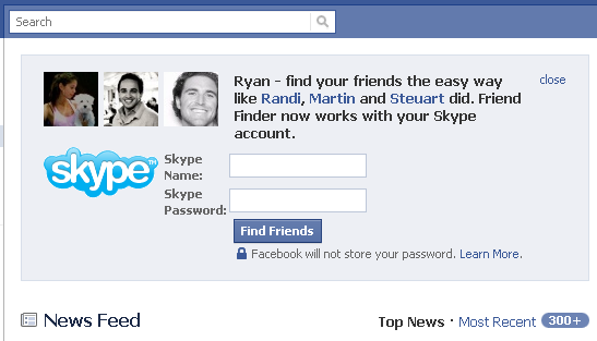
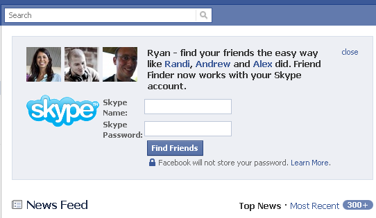
Facebook has put a lot of effort into driving more 'friendships' through their Friend Finder tool. And Twitter has had great success with their new, excellent "Who to Follow" tool. Facebook already integrates with GMail, AOL Instant Messenger, ICQ Chat, Windows Live Messenger, Yahoo! Messenger... and now Skype. And for Skype, Facebook has specifically promoted the integration very heavily.

These examples are from the last couple weeks (sorry for the delayed post), but notice how prominent the units are. They are placed on the homepage and beneath the header / search bar.

As Facebook attempts to drive deeper usage and more friend connections - they must be running out of partners with any reasonably close scale. Skype makes sense of course because: they are one of the few brands / services to big larger (by number of users) and to be a mix of US and international (big focus for Facebook).