iPhone & Android Dents Portable Gaming Industry

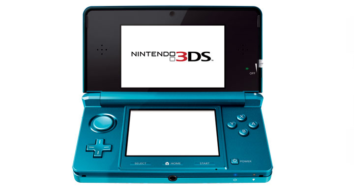
Two years ago, I wrote about the looming death of portable gaming devices... seems like it happened sooner than we thought. Yesterday, the Wall Street Journal covered Nintendo's revamped 3DS handeld gaming device - which Nintendo is hoping will revive their declining gaming platform and business:

"The Japanese company also reported its first interim net loss in seven years, hurt by weakening overseas sales and the strength of the yen. First-half revenue fell 34% to 363.16 billion yen ($4.44 billion) from a year ago."

While the Nintendo 3DS may be a great device (to be determined).... the fact of the matter is that improved hardware won't solve Nintendo's problem. Asking consumers to buy a handheld device, carry that device, and individually buy game titles (at $29 / disc) is unreasonable.

Consumers already carry iPhone's, iPod Touches, and Android Devices - and those platforms now have large libraries of gaming content. The games are far cheaper (free to $9.99) and wildly popular: 14/15 top grossing iPhone apps are games.

We have learned that with Apple and Android - and to a lesser degree Znyga, LOLapps, etc - consumers value gameplay and social more than game graphics and flashiness.

Facebook Begins Promoting "Recent Checkins"

Facebook often uses their sidebar to promote other products and features:- Image labeling - The friend finder tool - Facebook job openings ... etc Today was the first time I spotted integration of Facebook Places - specifically with "recent checkins". The unit shows checkins by your Facebook friends with timestamps and links to the locations / hubs.

I personally hope that this is the beginning of a larger location feed / map... interestingly you will notice that there is not a 'see more' link. Hopefully that is to come.

Great Action Buttons in Mobile Apps (Instagram as Example)

Have a key action you want to highlight for users? You could takeover the application as Facebook did to promote Places. You could create a persistent notification bar as Quora does. Or you could make the key action button really stand out... as upcoming application Instagram does (read about Instagram on TechCrunch. They are a Dogpatch Labs company.)

Instagram is a photography / photo sharing application (download it in the iTunes App Store)... and the most important action is sharing photos. So while there are other important actions (which all get buttons across the footer: feed, favorites, profile, notifications) - the Share button prominently sits in the middle and is raised above the others. It also protrudes onto the body of the application... such that is is always visible and very clear as to what the application's focus is.

Also worth noting: Instagram has a very clever header. It is slightly transparent, contains the photographer's profile and image title, and it becomes persistent only when you scroll through a specific photograph and it's comments. Once you get to the next photo, the header changes. Great looking, unobtrusive and informative.

Sample picture from Instagram - just to give you a taste of the application. It is a picture from Lake Tahoe:

Twitter's Surprising iPhone App UI

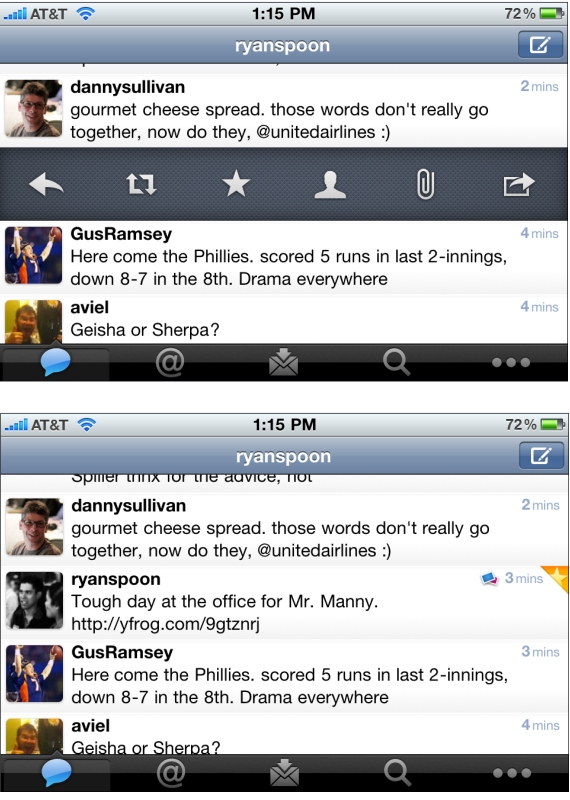
Not previously known as a leading designer, Twitter has been on a roll with their latest iPhone app, iPad app, and New Twitter. Here is a good example of why - but with some learnings / advice on how to design features. Twitter has to accommodate for lots of functionality: reply, retweet, search, favorite, quote, etc. You can easily imagine an application overwhelmed with buttons. Twitter solves this by having the core functions available via footer buttons, a "more" ('...') button and a surprising single tweet pane.

I call it surprising because it was not clear to me that this functionality existed... but if you swipe a tweet to the right, a pane appears that allows for quick functions of that tweet: reply, retweet, favorite, email, user info, etc. It is super useful... but is also surprising because I only discovered it accidentally. And this is a complaint I hear a lot from products trying to solve numerous tasks (no matter how elegant the solution may be). A consequence of simplifying complexity is often having to hide functionality... and that itself can lead to confusion.

It is difficult to boil down layers of options into a simple interface. It is equally difficult to make the interface intuitive and the functionality easy to uncover. That's why it's an art!

One other note: I love the small interactions that Twitter layers in... in the second screenshot, notice the small star that appears is uncovered in the upper right corner. That appears when a tweet is favorited.

ESPN's Persistent Score Panel... Very App-like

There's lots of innovation currently around persistant headers, footers, and bars. I wrote about Quora's notification 'panel' last week. You can also check out Apture (which I had been testing), Meebo, Wibya, etc. As with Quora, the 'bar' phenomenon is making its way to the publisher side. And it is being used creatively to deliver key news (ie Quora :: notifications), navigational flows, or promotional content.

Here is another good example.

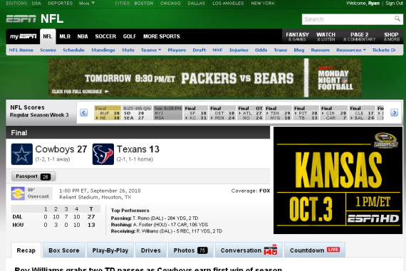
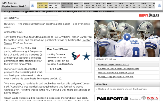
Months ago, ESPN introduced an interactive score panel (almost like the sports ticker that sits persistently on ESPN's TV channels). When browsing content within in a particular sport / league, ESPN now has the that panel lock atop the screen to provide persistent live scoring. The UI is very slick as the bar is glossy, animates nicely and maneuvers down the pages seamlessly.

Expect to see more and more of this around the web (and mobile). The experience itself is very much like mobile applications... and the web itself is starting to look and interact more like apps.

Here is the NFL score header on ESPN

As you scroll down, the scores panel attaches itself atop the screen and follows

The Social Network Movies Advertising on Facebook with Myspace?

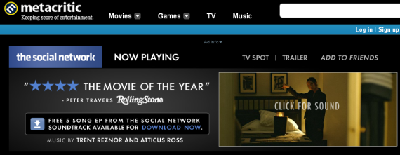
The Social Network movie opens today (Yes: I loved it) and advertisements are appearing across the web. That's not 'newsworthy'... but:

- The ad units themselves look a great deal like Facebook (again: no shock) - And the main ad unit has an "Add to Friends" link (see below):

- when clicked, you arrive at The Social Network's website - ... which strangely lists MySpace, Twitter and Facebook sharing buttons in that order (shouldn't it be Facebook first? perhaps only?)

- If you click the Facebook share button, a lightbox appears to post a MySpace profile announcement for the movie on your Facebook page. And what is with the suggested creative?

Very bizarre... and for a movie dedicated entirely to Facebook - and marketing to Facebook users / fans - you would think this would be better thought through.

Goo.gl Shortens URLs... And Adds QR Codes

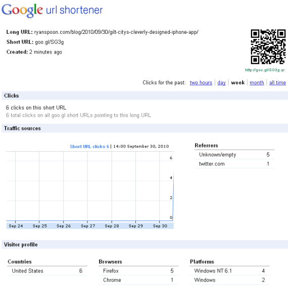
By far the most interesting part of Google's new URL shortener (Goo.gl) is that, in addition to a bundle of real-time stats, the URL's Goo.gl page includes a unique QR code. Clearly Google has plans for this to be a major component of Android and a mobile experience. One other short note: The UI needs some assistance. Bit.ly's one click copy, bookmarklet, dynamic refresh, etc make usage so simple. These are small enhancements that Google can / should clearly implement in short order.

See announcement by Google and coverage at TechCrunch

Gilt City's Cleverly Designed iPhone App

Gilt Group has rolled out their new group-buying / coupon site Gilt City to six cities (New York, Boston, Los Angeles, San Francisco, Miami and Chicago). With it comes the Gilt City iPhone app. There isn't much to write about about the couponing model as it is very much like others in the space (see Groupon, LivingSocial, Yelp, etc). Over time, we will tell if Gilt Group is able to win share through unique offerings, integration with Gilt Group, etc.

I did want to quickly touch on the application's design... which as you would expect with Gilt Group, is glossy and very visual. The background of each city page is themed respectively. Below, for instance, is Gilt City San Francisco - which has a vivid picture of San Francisco scenery. Big, splashy images are becoming very popular (see my post on About.me) - and, with a relatively straight-forward product offering, it is one way to stand out, localize the experience and stay on Gilt's brand.

And with the emergence of big screen devices like the iPad, it is again a reminder that design and color are play an important role in the experience:

The Social Network: Two Conflicting Reviews

Last night I saw a screening of The Social Network and it lived up to the hype / great reviews (100% on RottenTomatoes.com). The movie was well done, well acted, fun, and actually very inspiring (I think - and hope - that young, potential entrepreneurs will find the journey and teams' drive motivating).

But Newsweek's critique of the movie was different... and more of a critique of entrepreneurship in Silicon Valley. Using Facebook, Zynga, and Twitter as examples, the article "The sad truth about Facebook" comments on the valley's culture, the chase of wealth ("giant paydays"), and and avoidance of "serious technology challenges":

"The risk is that by focusing an entire generation of bright young entrepreneurs on such silly things, we’ll fall behind in creating the fundamental building blocks of our economy. The transistor and the integrated circuit gave rise to the last half century of prosperity. But what comes next?"

and

“The old Silicon Valley was about solving really hard problems, making technical bets. But there’s no real technical bet being made with Facebook or Zynga,” says Nathan Myhrvold, the former chief technology officer at Microsoft who now runs an invention lab in Seattle. “Today almost everyone in the Valley will tell you there is too much ‘me-tooism,’ too much looking for a gold rush and not enough people who are looking to solve really hard problems.”

As an investor, I am obviously looking for big thinkers and big ideas. I am looking for businesses rather than features... and ask questions specifically about 'scale' and 'size'. But it is outrageous to discount Facebook, Twitter and others because they are social products and not obviously unique / challenging technologies.

Because the article uses Facebook and Twitter as examples, I will do the same.

Would you label Google or The New York Times as "silly"? Of course not. But in addition to being a hub for online presence / networking, Facebook is make search and advertising social (and potentially more effective)... and Twitter has become a modern news channel for millions of users. These are big ideas with big impacts. And to do either at unrivaled scale is a technical challenge. And both Facebook and Twitter are platforms that enable innovation and business growth (some of which will be small and others big and impactful).

Those familiar with Facebook - or those who watched the movie - know that Facebook was not driven revenues: "Now the Valley has become a casino, a place where smart kids arrive hoping to make an easy fortune building companies that seem, if not pointless, at least not as serious as, say, old-guard companies like HP, Intel, Cisco, and Apple."

Using Facebook and Zuckerberg as representives of a wealth-driven culture is inaccurate and unfair. Similarly it is unfair to say that it - or other software companies - are not as meaningful as big hardware companies is also inaccurate and unfair by any measure. For example, Facebook's traded valuation is roughly 1/3rd of HP's market cap and 1/4th of Intel's and Cisco's. And Facebook is prominently featured in HP and Apple advertisements... and Facebook accounts for over 50% of iPhone app usage.

Again, let's encourage entrepreneurs to think big. But let's not label the software - particularly consumer and social web - "silly". And let's not classify all entrepreneurs as motivated by wealth... nor fault those who are (because that extends beyond the valley and beyond 2010).