8 Quick Thoughts on Facebook's Big Week.

A handful of quick, disorganized thoughts on Facebook's announcements / releases this week: Immersive

The activity ticker is immersive and really amplifies 'viral' potential. I have 'liked' (and listened and read and soon to be much watched, etc) so many more 'things' because each one of those actions is now viewable & actionable (whereas it was previously up to FB to cluster it as 'top news'). It's been fun and addictive. But it also requires a tighter social graph - so I've been unsubscribing from some brands and pages. Relies on the Ticker

The movement to Facebook curated "Top News" and the ticker for the continuous stream is great for publishers / developers... assuming that users do in fact use the ticker (heavily I may add!). Will users watch and engage with the ticker when more content appears in it? Or if developers misuse the ticker?

Publisher Opportunity

Between the ticker and the open graph - publishers should be rushing to take advantage. There are two major opportunities:

- Ticker and canvas apps: increased virality, findability, sharability, etc. Actions will be amplified in ways that the feed couldn't. There is a first mover advantage... see Spotify.

- Open graph: organize your content & actions internally... or become a node within the greater Facebook ecosystem. And the ability to then tie those into the Facebook profile and canvas applications is very powerful. Again, see Spotify:
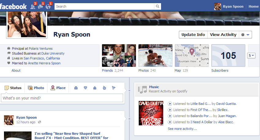
Open Graph: More Than Games

This is an opportunity that opens the ecosystem beyond gaming and digital media. The open graph is an opportunity for industries like e-commerce that previously struggled to drive virality and make engaging on-Facebook experiences.

More than Spotify - Just Wait

Spotify was the marquee integration - and users are complaining that there is simply too much Spotify. That's not a Facebook or Spotify issue - it's a timing issue. More will come. And with the ticker, open graph, etc - the opportunity for new innovations is terrific.

For instance, here's the Washington Post's Social Reader. Between the ticker, the graph and their canvas app - this is truly social news reading. It really shines on the iPad (so give it a spin there).

Timeline is Gorgeous

Timeline represents the shift from newsfeed to identity & memory. That's a big, long-lasting idea. The product video was spectacularly done - reminding me of the emotional connection that Apple and Facetime created with their ad campaign:

We Need Mobile...

Timeline doesn't work on mobile. At least not how it is imagined and was demonstrated. For instance, on the iPad, you cannot scroll across the timeline or move the "cover" photo. It's time for a mobile experience that allows timeline, ticker and ticker's developer ecosystem to really shine.

In-Line Expansions

More to come here... but it is clear that Facebook is looking and behaving more like a browser. The use of expansion units is an attempt to integrate Facebook's ever-growing list of features... without relying on new pageviews.

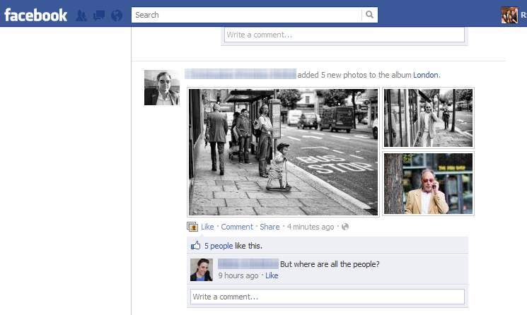
Ahead of Facebook's F8, Changes Galore Roll Out

Ahead of F8, Facebook has rolled out several changes ... which is rather remarkable considering how many updates / features and how significant some are. To do it a couple days ahead of F8 is fascinating because it suggests bigger updates are coming. Tomorrow will be fun. I love the new photo layout... screams mobile! Also like the persistent header

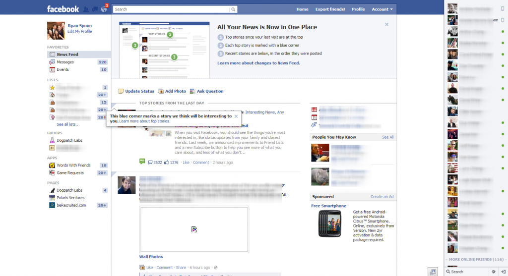
And here is the welcome screen for a user's first experience with the new updates

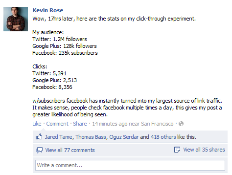
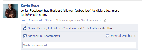
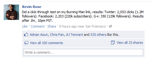
"So Far Facebook Has the Best Follower to Click Ratio", Kevin Rose

I recently touched on the potential importance of Facebook Subscribe, Facebook Subscribe: Opportunity for Publishers & Online Voices... and here is why Subscribe is important and not simply a "me too" product: - it is a natural fit for the Facebook environment - it gives personalities and big voice (subscribe is for personalities what pages is for brands) - it is driving real engagement and traffic (see below)) - which means that users are liking it - both the voice and the reader

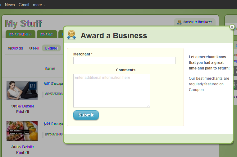
Groupon Aims to Drive Loyalty with Business Awards Flow.

How does Groupon address concerns of loyalty / merchant retention? Build tools directly into the product that allow customers to communicate directly with the merchants. It's an easy, smart way to connect buyers with sellers - without interrupting either flow. The experience (from the language to the graphics) is very positive ("Award a Business"). I am not entirely sure what the award is... and I am not entirely sure what is done with this content... but I applaud Groupon making an effort to address concerns and I always like tools that better connect both sides of the marketplace.

In the River with Twitter Images & Facebook Messenger

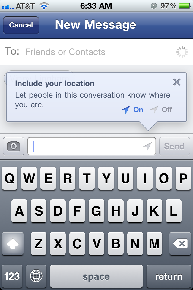
A post I drafted a few weeks ago and never published... better late than never (I think!) Two good examples of In the River promotions for two new, relatively off-stream product launches: Facebook Messenger

a new mobile application by Facebook focused on Facebook Messages. Location is a highlighted feature that is clearly more important on mobile than on the web. After download, Facebook walks users through the app's key functions - and here is how they alert you of the location feature. Impossible to miss (which is important considering privacy implications, a new feature and a small icon potentially unfamiliar to many):

Twitter Images

Very similar: Twitter released a new product feature (Twitter Images). The product concept is simple and familiar - but the act of sharing via Twitter will be unfamiliar. So Twitter displays a pop-up promotion on Twitter.com that shows the basics, the icon and a link for deeper information. Also similar to Facebook's location alert, Images is an important part of future strategy (see my thoughts here) - but also have privacy and partner implications.... so a clear product launch and description is important:

Facebook Subscribe: Opportunity for Publishers & Online Voices

Yesterday Facebook announced their Subscribe feature (you can read more from Facebook here). It is an important step as it changes the relationship of users: friends, followers, two-way delivery, etc. It is also interesting that it comes on the heels of intelligent friend grouping as both impact the way that people think of friendships and building out their graph. Will users reconstruct their graphs? Doubtful.... after 50 friends, I gave up trying on a new slate at Google +. So will subscribe catch up in a 1:1 dominated Facebook world? Not sure from a friend perspective.

But absolutely from a brand / publisher perspective. This is an opportunity for big voices (journalists, bloggers, etc) and the brands that represent them: Washington Post, ESPN, NYTimes, TechCrunch, etc) to better leverage Facebook. To date, Twitter has been easier in pushing content for these types of voices and organizations.... now Facebook has that power too. And combined with the Like Buttons and site-integrations, that is powerful.

The next step needs to be Subscribe widgets and buttons - which work perfectly for the above audiences. Just as publishers integrate like buttons atop each page, there should be in-line opportunities to subscribe to the author.... which is a big, big benefit for the author, the network and Facebook.

Shamelessly: you can follow me on Faceook here

ESPN Brings Twitter into Fantasy Football App. Getting Closer.

In April, I wrote a response to Mark Cuban's "Does ESPN.com have a Twitter Problem". My premise was that Twitter is a huge, (relatively) under-utilized platform for ESPN to break news, engage with fans and share unique content. ESPN doesn't have the perfect solution yet -but Twitter is clearly an opportunity and not a threat. Here is a screenshot from ESPN's fantasy football app (which I used quite a bit this week - it's a big improvement over last year).

It is worth showing because it demonstrates the value Twitter can bring to ESPN properties ... and the fact that great integrations take work.

Twitter is perfect for ESPN's numerous analysts to break and deliver fantasy related news: injuries, predictions, chats, etc. And it happens at a speed and in a format that translates better here than in article format.

However, ESPN (and other content publishers) need think about more than delivering the tweets. As important as having users read is having users interact. Each of the ESPN personalities should be clickable and 'follow-able' directly in line. Readers should be able to reply, retweet, interact and promote ESPN (hash tags, @ replies, etc). Users reading this content are already paying attention - it's an opportunity to turn attention to engagement. And to turn one reader into a follower and so on.

Redbox Delivers Rewards Through SMS Activation, Foursquare

Redbox continues its string of smart, rewarding marketing campaigns. Redbox has provided discounts and rewards for email and site activity - realizing that the value of certain acitvities (validated email address) far exceeds the cost of a free movie or two. Here's another: Redbox is running 10 days of discounts & rewards for users who active their mobile phones through SMS (Foursquare too). Again, Redbox intelligently views this as a way to acquire mobile users / activity. In that regard, it is a marketing promotion that will drive discounted short term activity but has longer term value thanks to deeper customer data / touch points.

Redbox is smart. And worth paying attention.

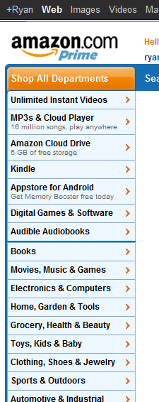
Amazon Navigation Menu Features Dynamic Promotions

In addition to Amazon's navigation menu promoting its digital properties ahead of the core business... notice anything interesting? It features dynamic taglines for three of the core properties: - MP3s & Cloud Player: 16m available songs - Cloud Drive: 5gb of storage - Appstore for Android: the free application of the day

For Amazon - the smartest online merchandiser / promoter - it is clearly an intentional decision to promote only three categories: new, growing categories in highly competitive areas. Amazon could off course feature deals of the day in other categories - but by doing so, it crowds the menu and creates too much noise / distraction in the menu... perhaps most importantly, those core categories are already successful, sturdy and well-trafficked. This is not true for the music, cloud and app businesses.

As you think about navigation across your site / experience - this is an example of less being more and the impact a few pixels and a small tagline can make.